Ventura Foreman
Brand Refresh
2024
SCOPE
Visual Identity Systems
Naming and Nomenclature
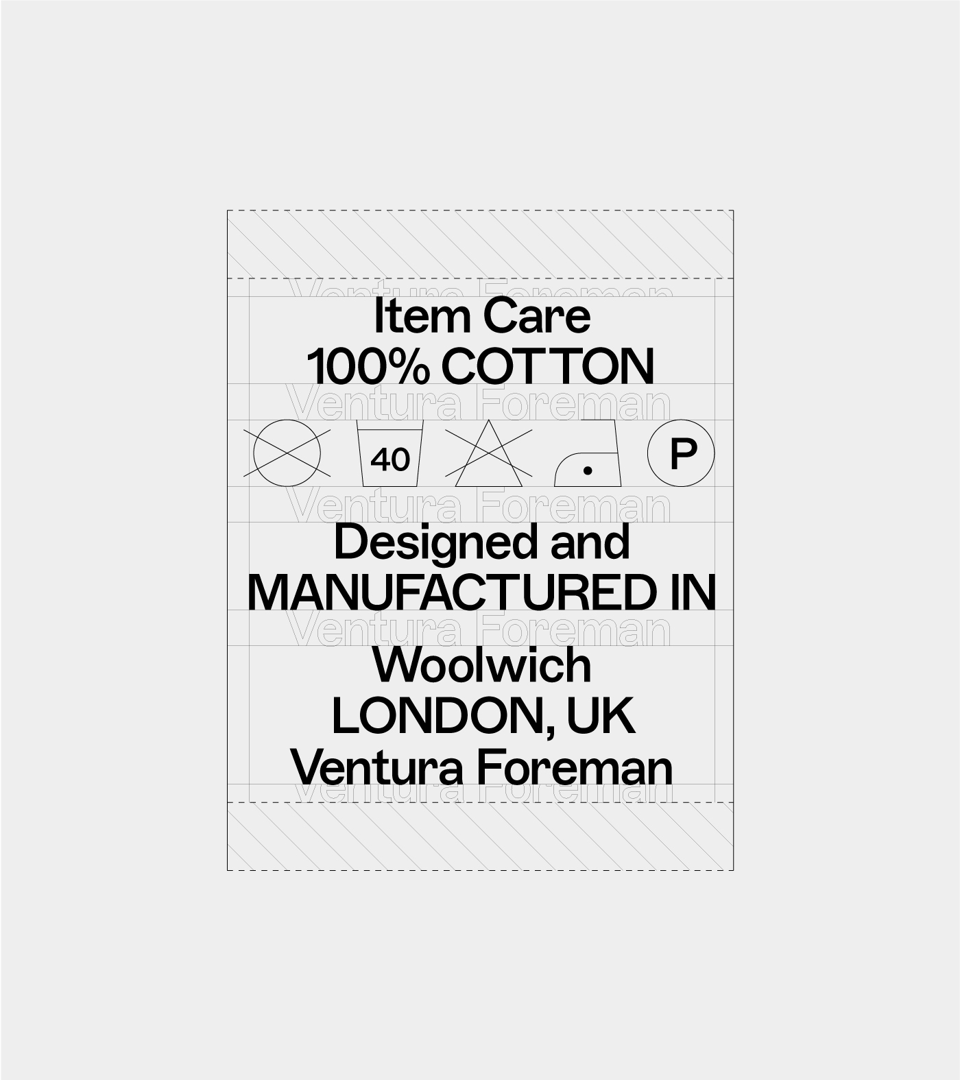
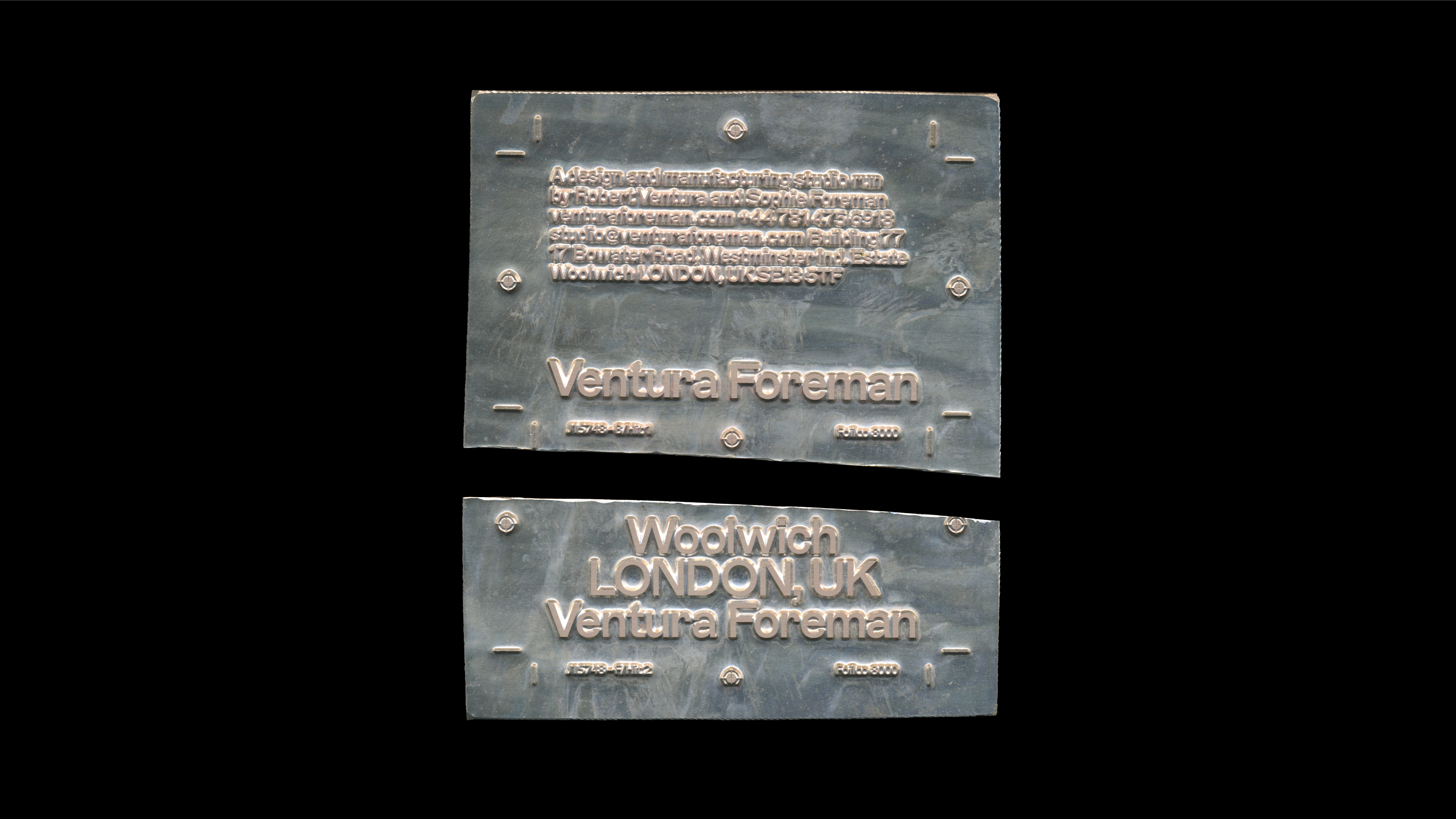
Bespoke Typography and Systems
Verbal Identity and Messaging
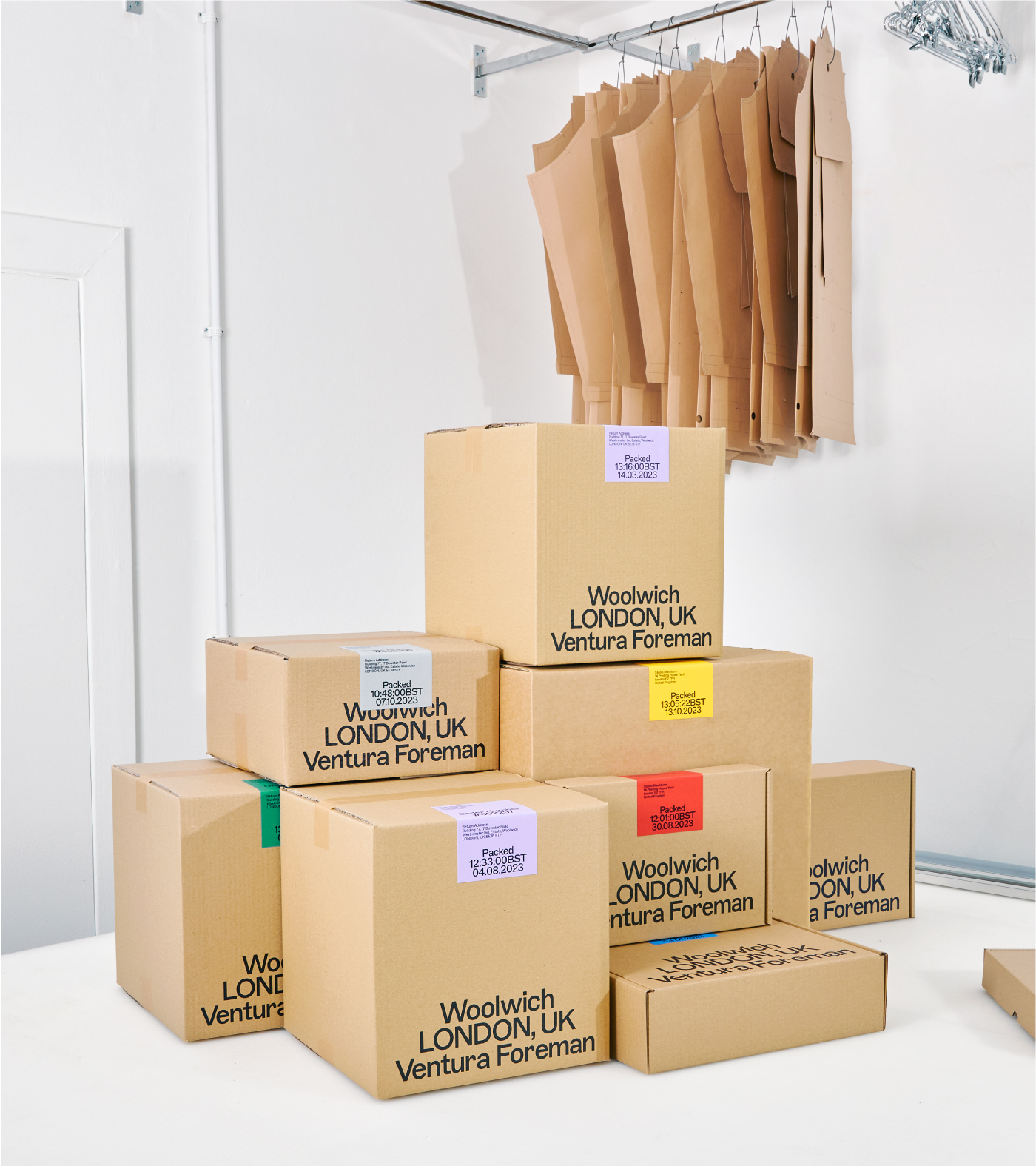
Packaging Systems
Case Study Photography
Alexander John Mcluckie
Garment Photography
Paul Perelka
Toggle
BRIEF
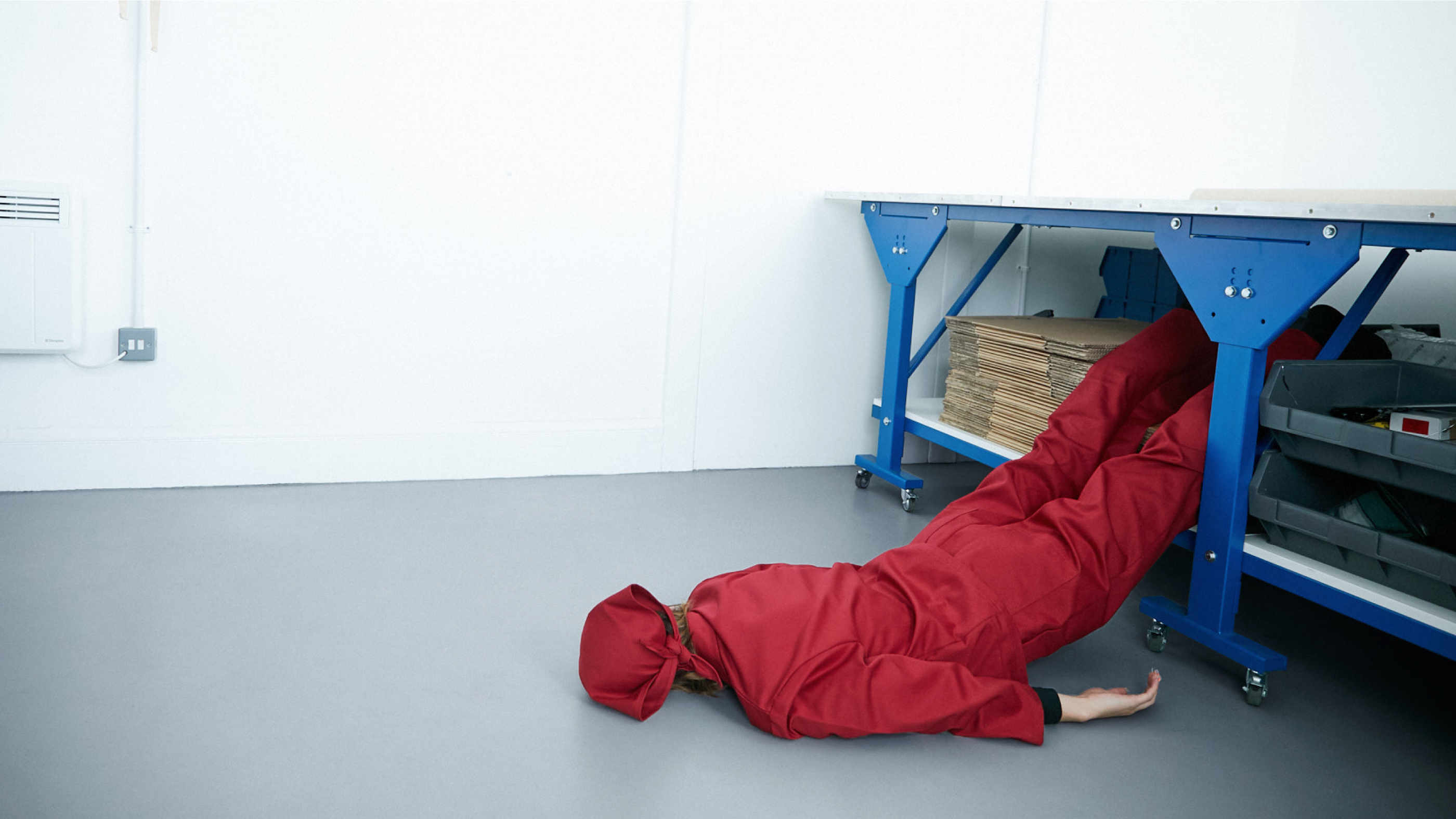
Ventura Foreman is a Woolwich-based partnership specialising in serious, in-house workwear. Their brief was refreshingly honest: they wanted an identity that felt authentic and DIY, essentially asking us to create a brand without making them look like a “brand.” They needed something that felt clean and familiar, but with a sense that something was not quite right.
WORK
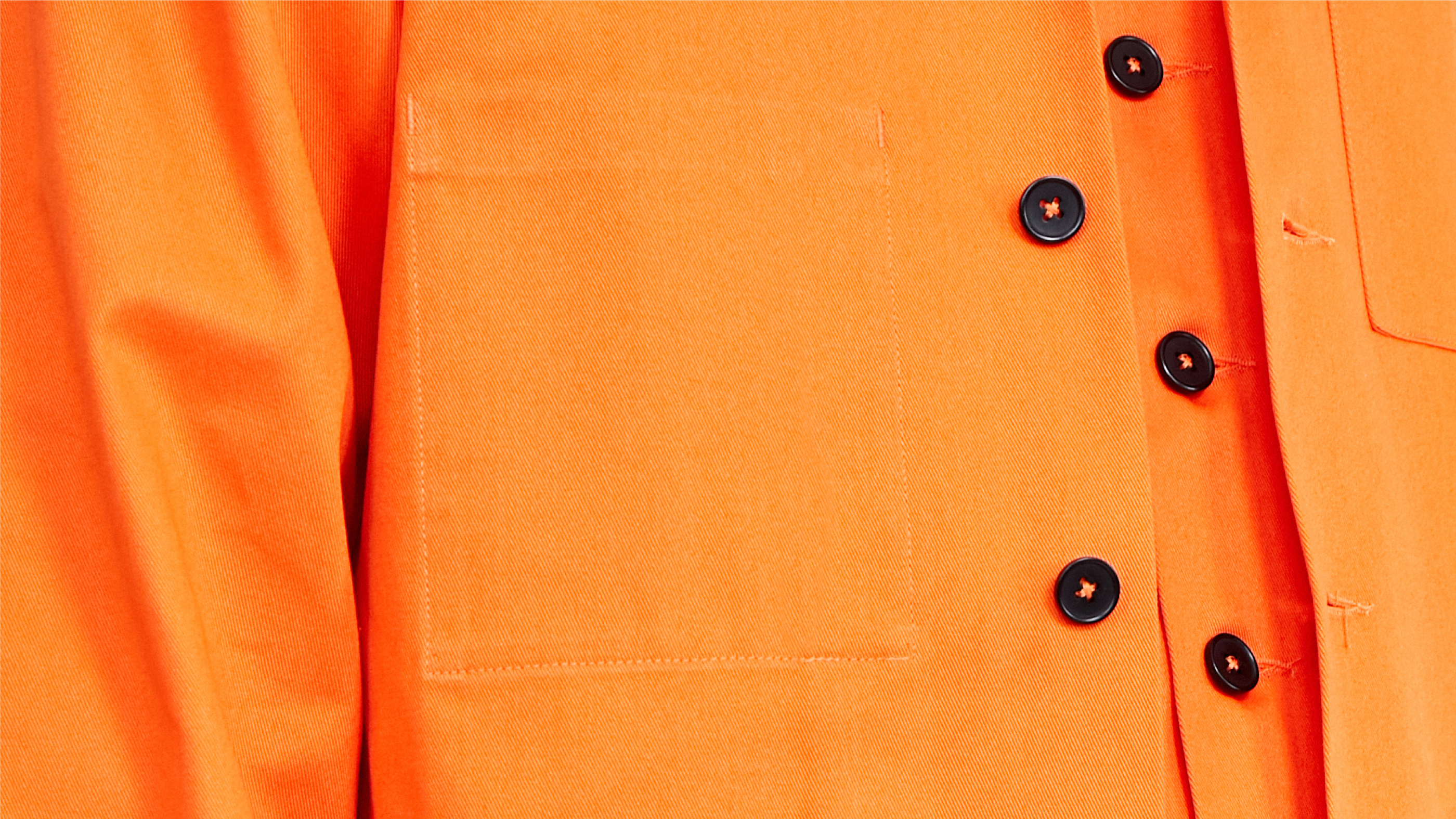
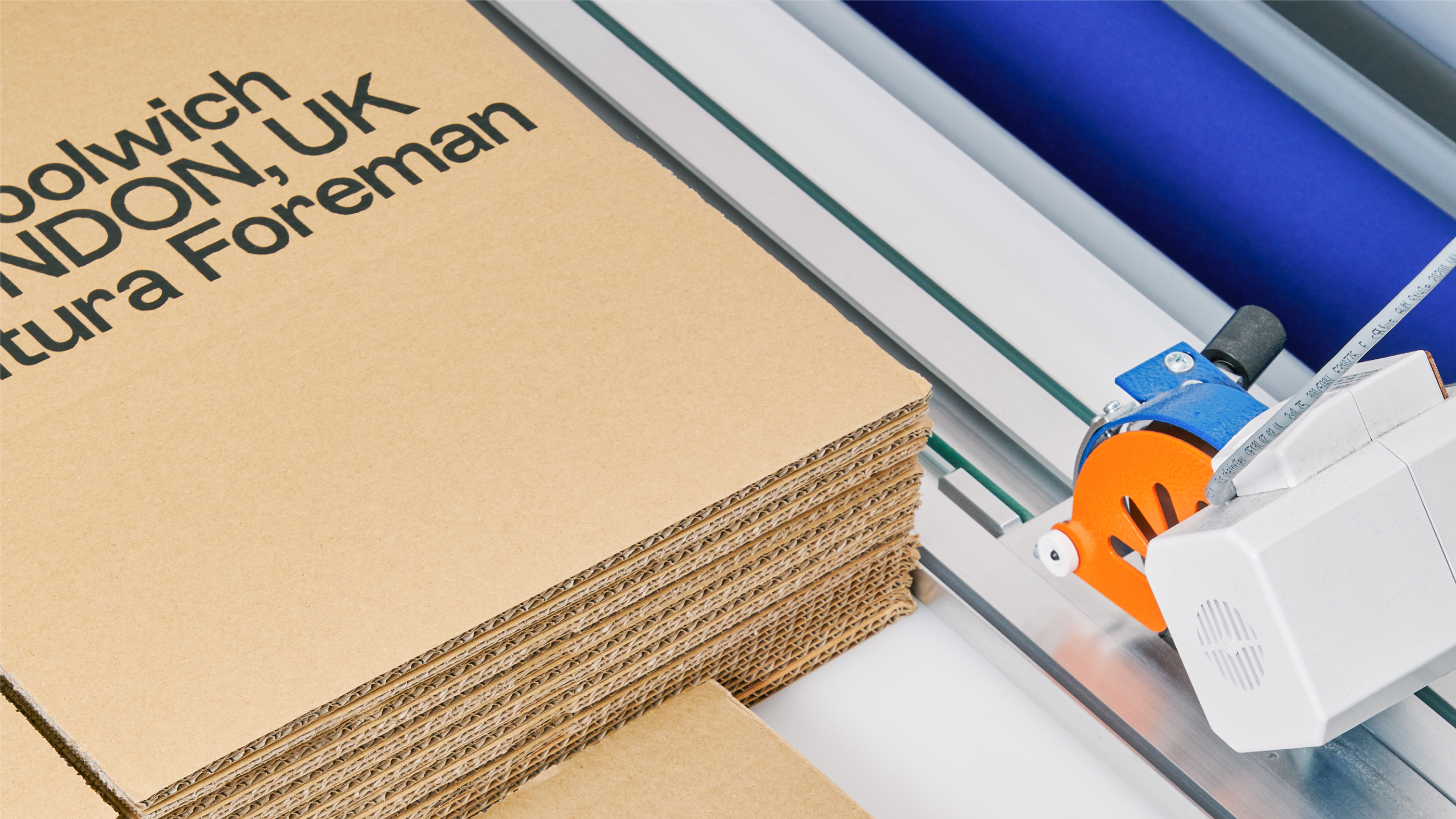
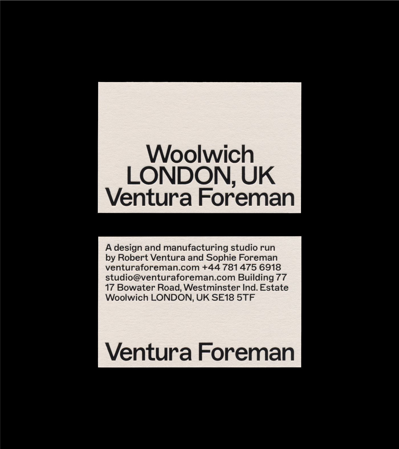
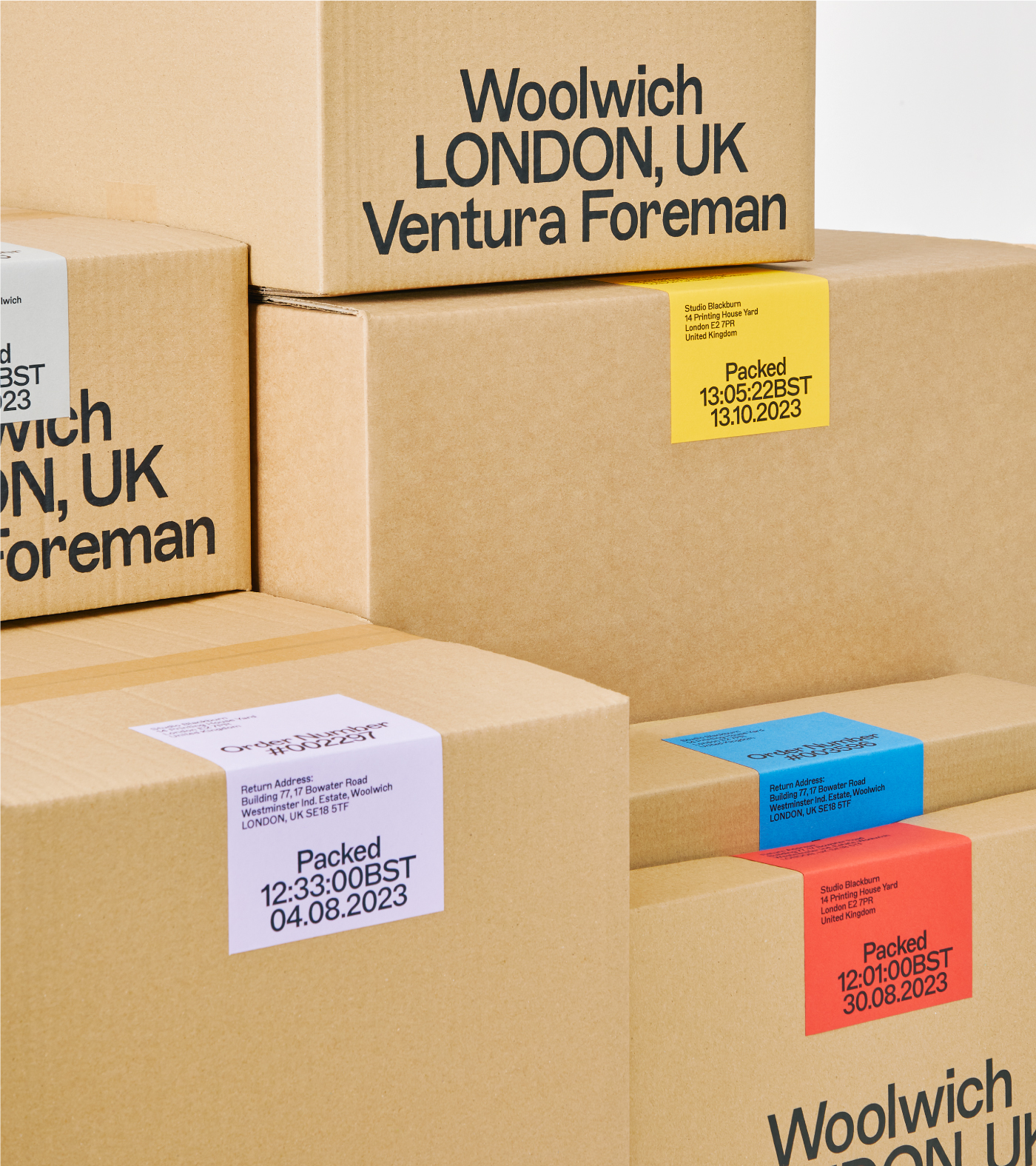
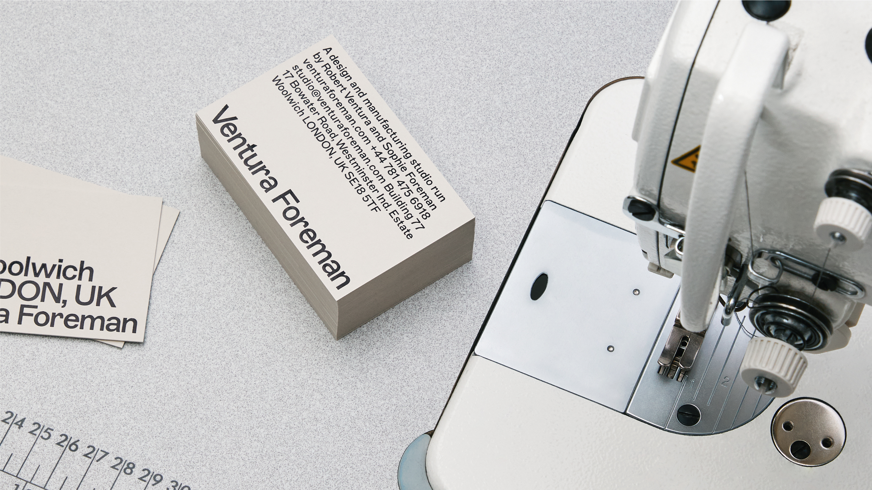
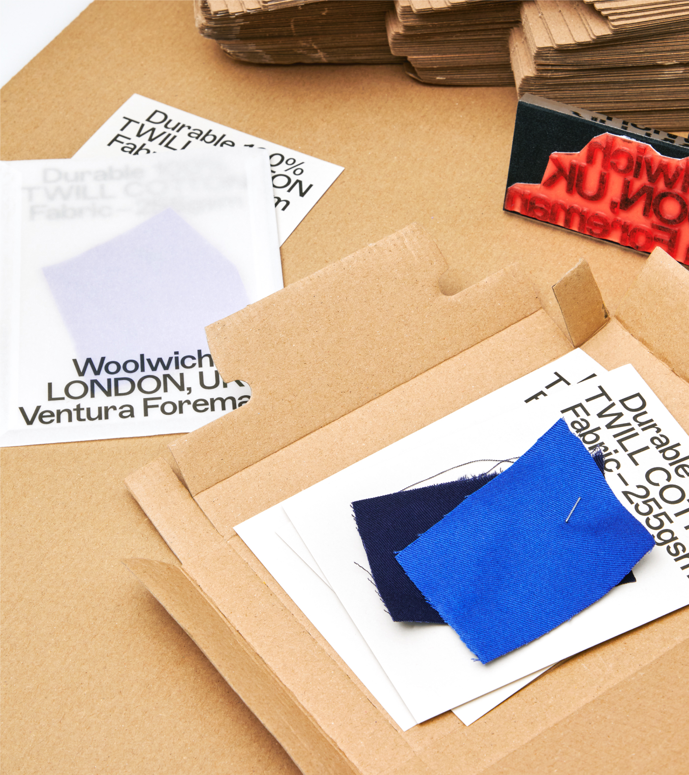
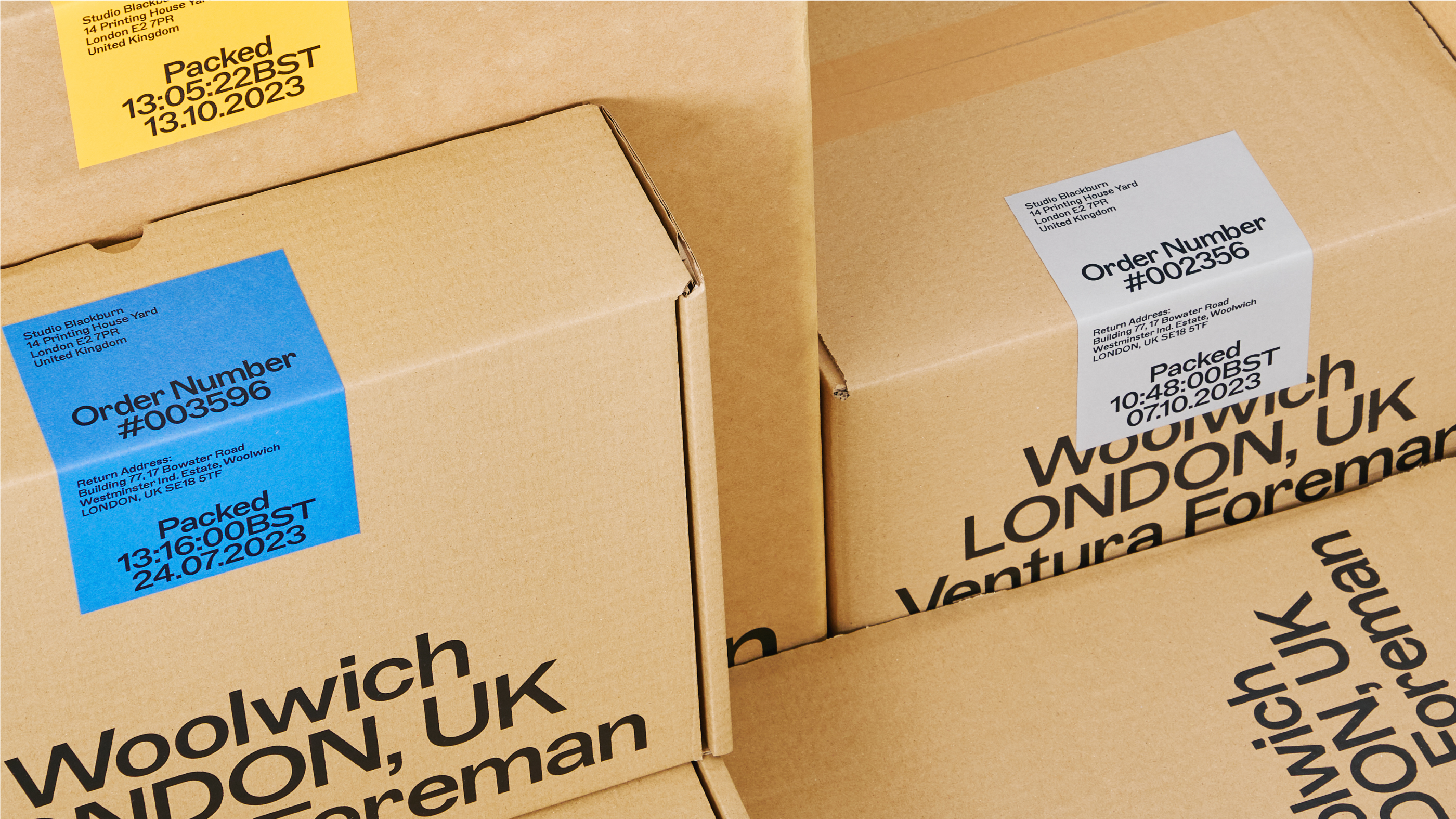
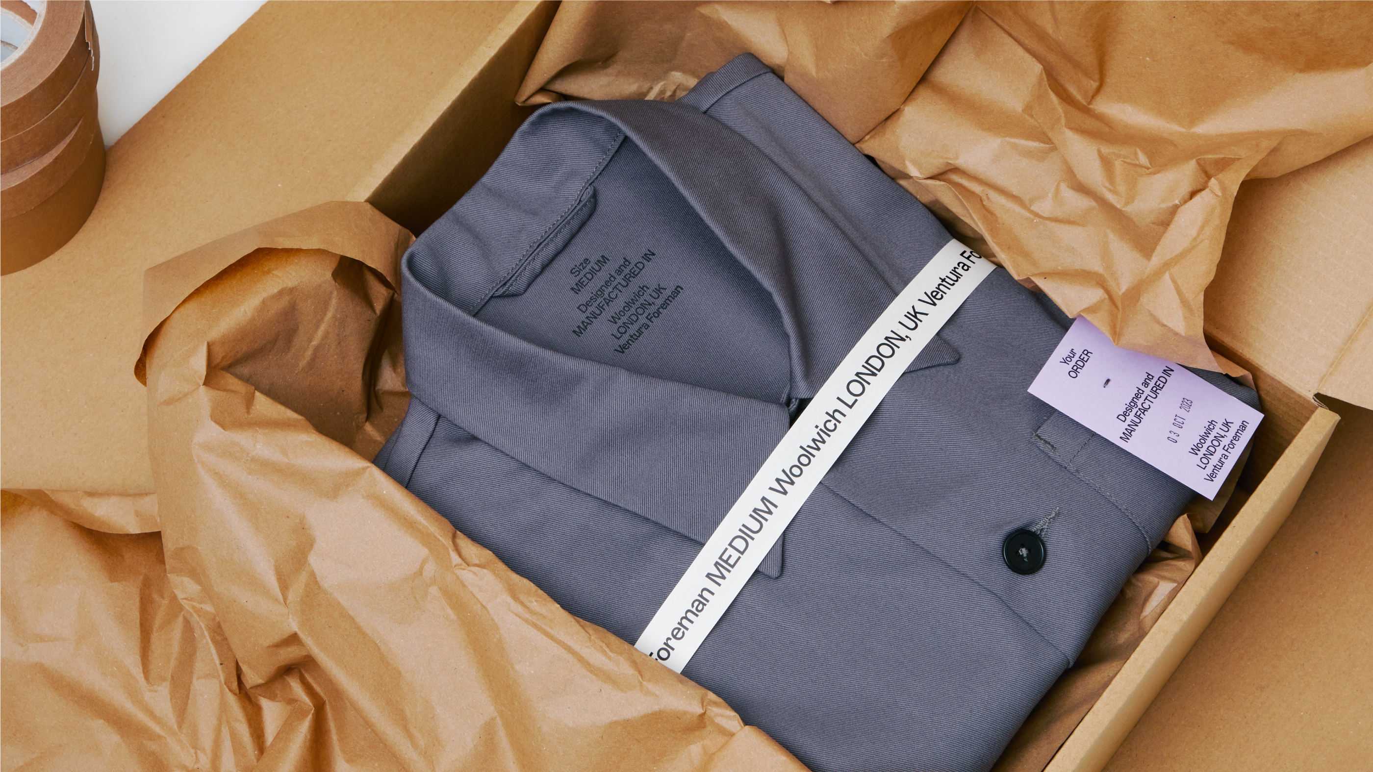
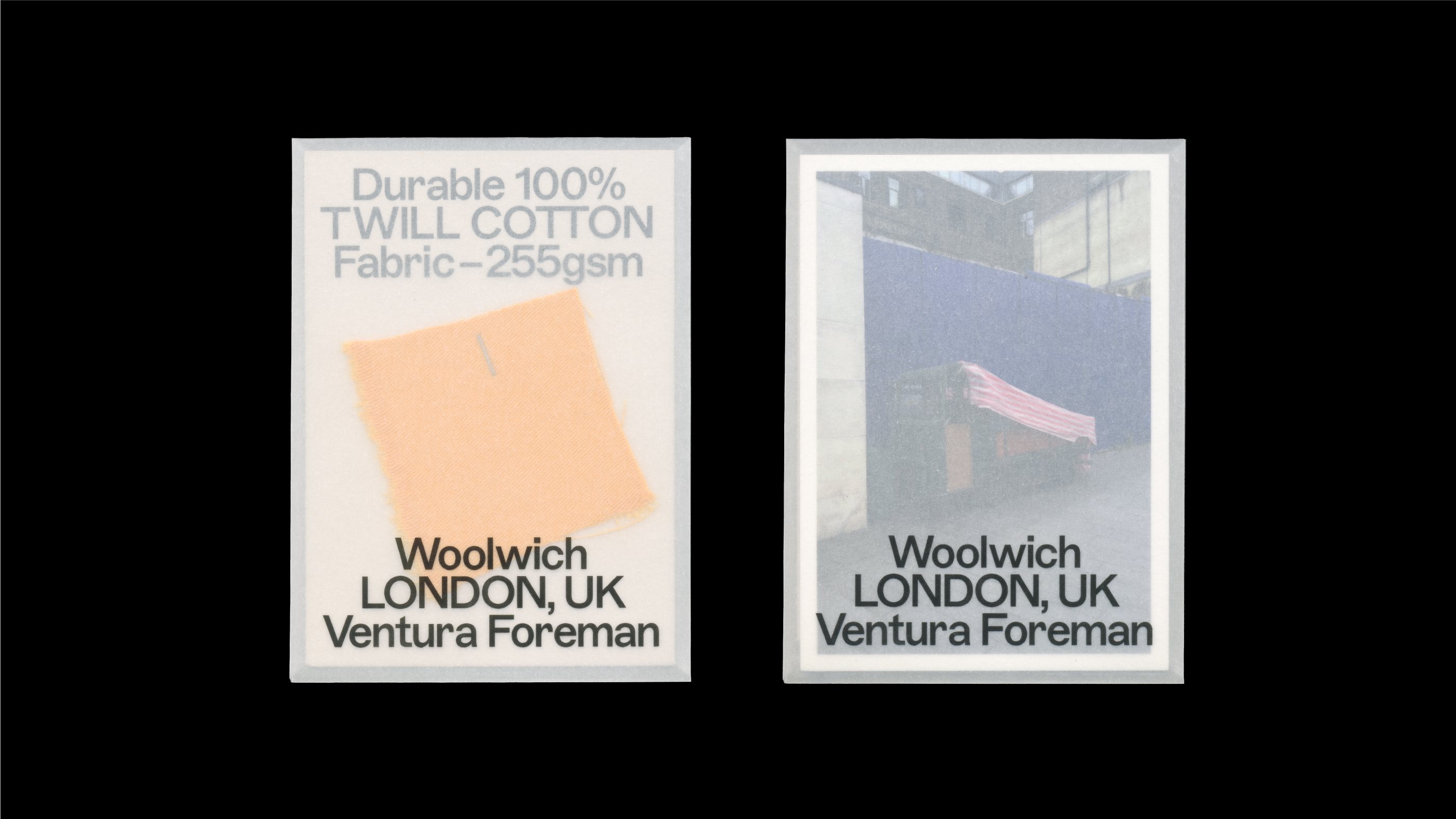
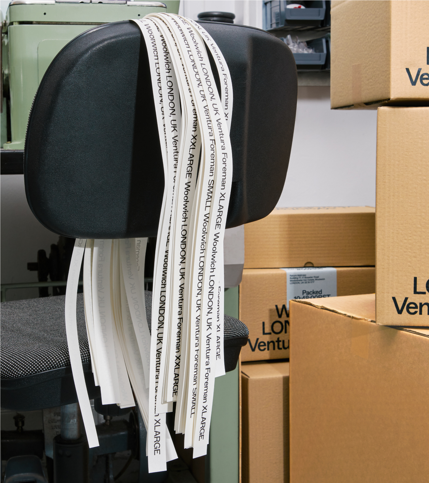
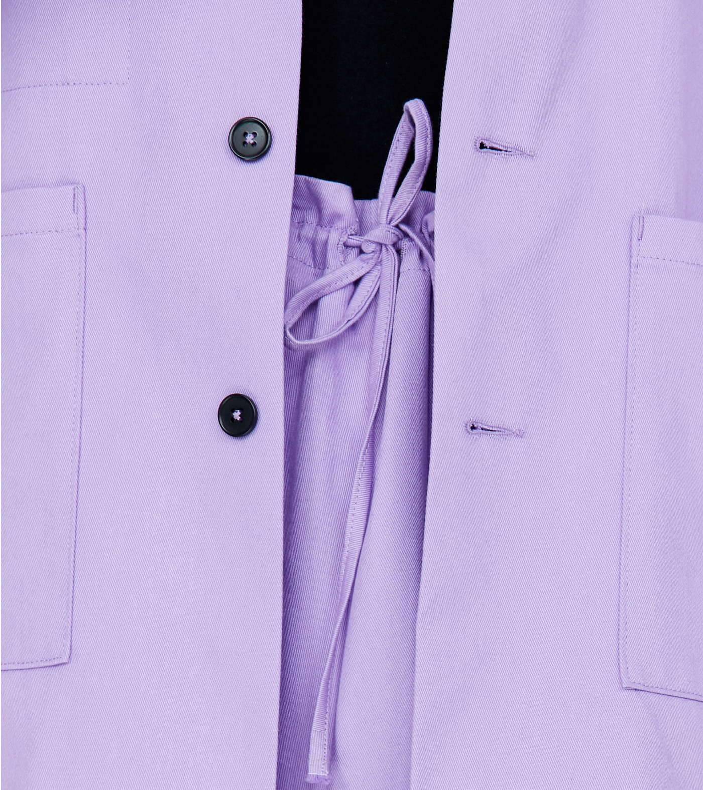
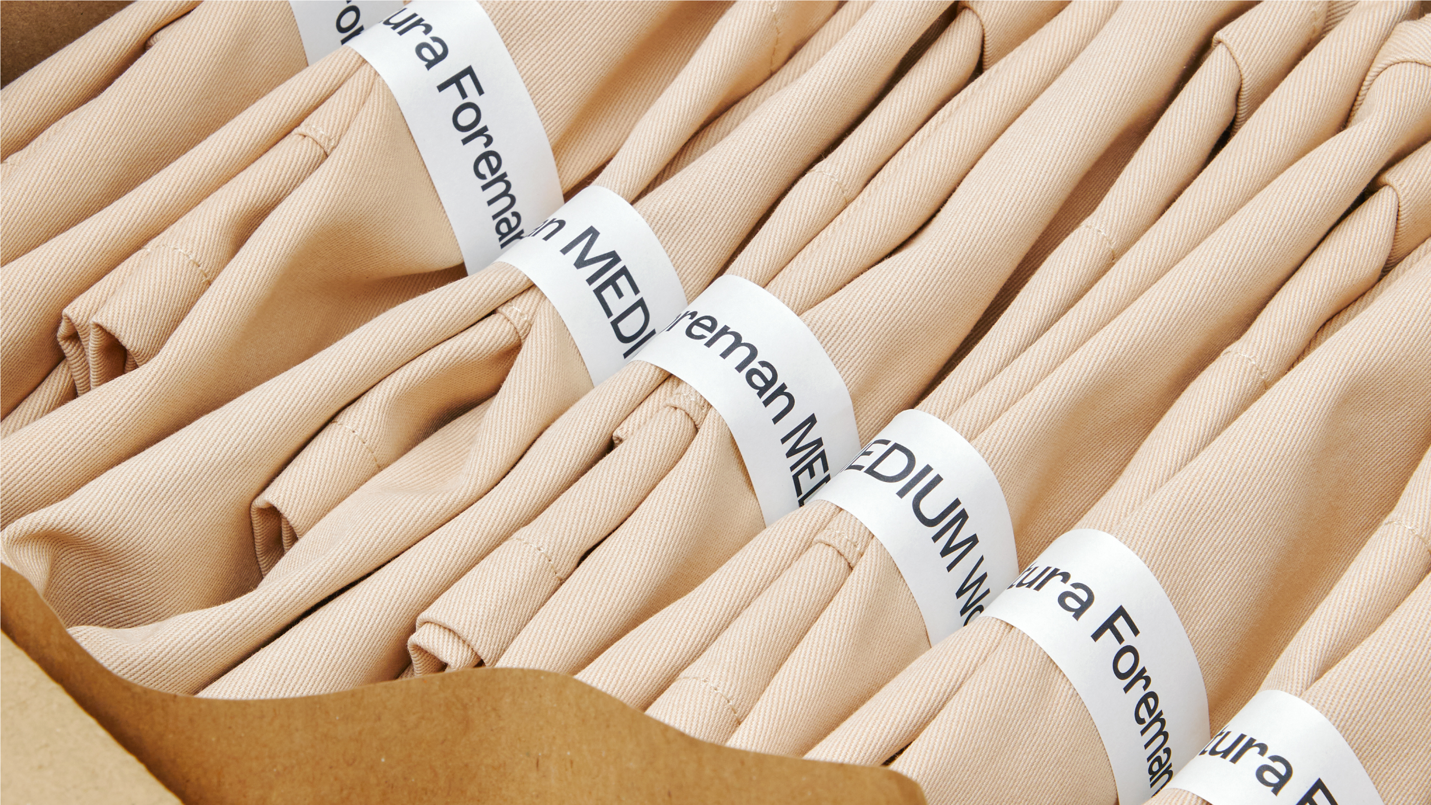
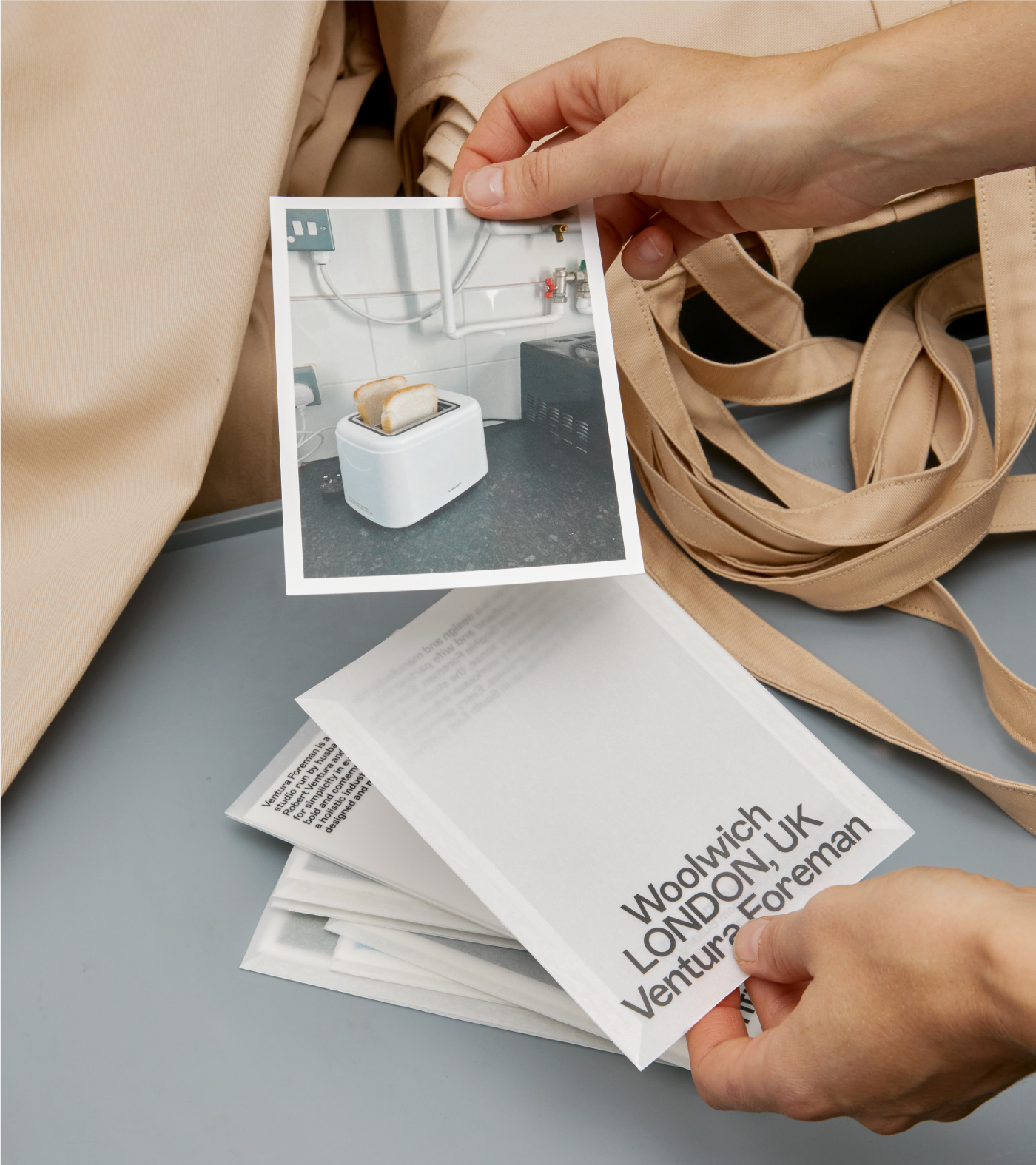
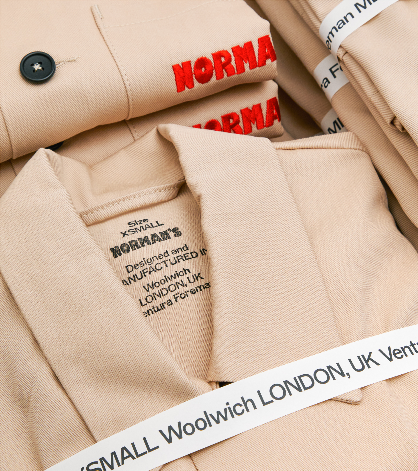
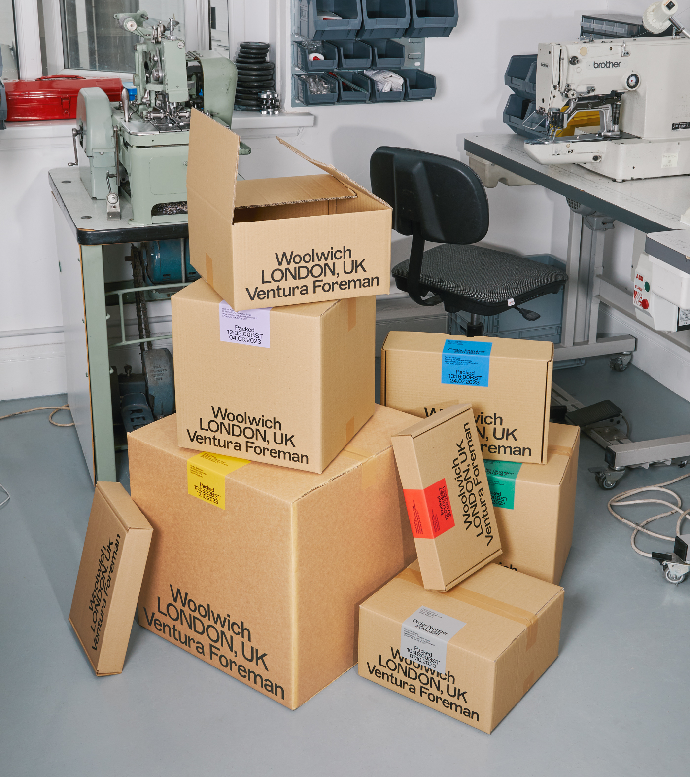
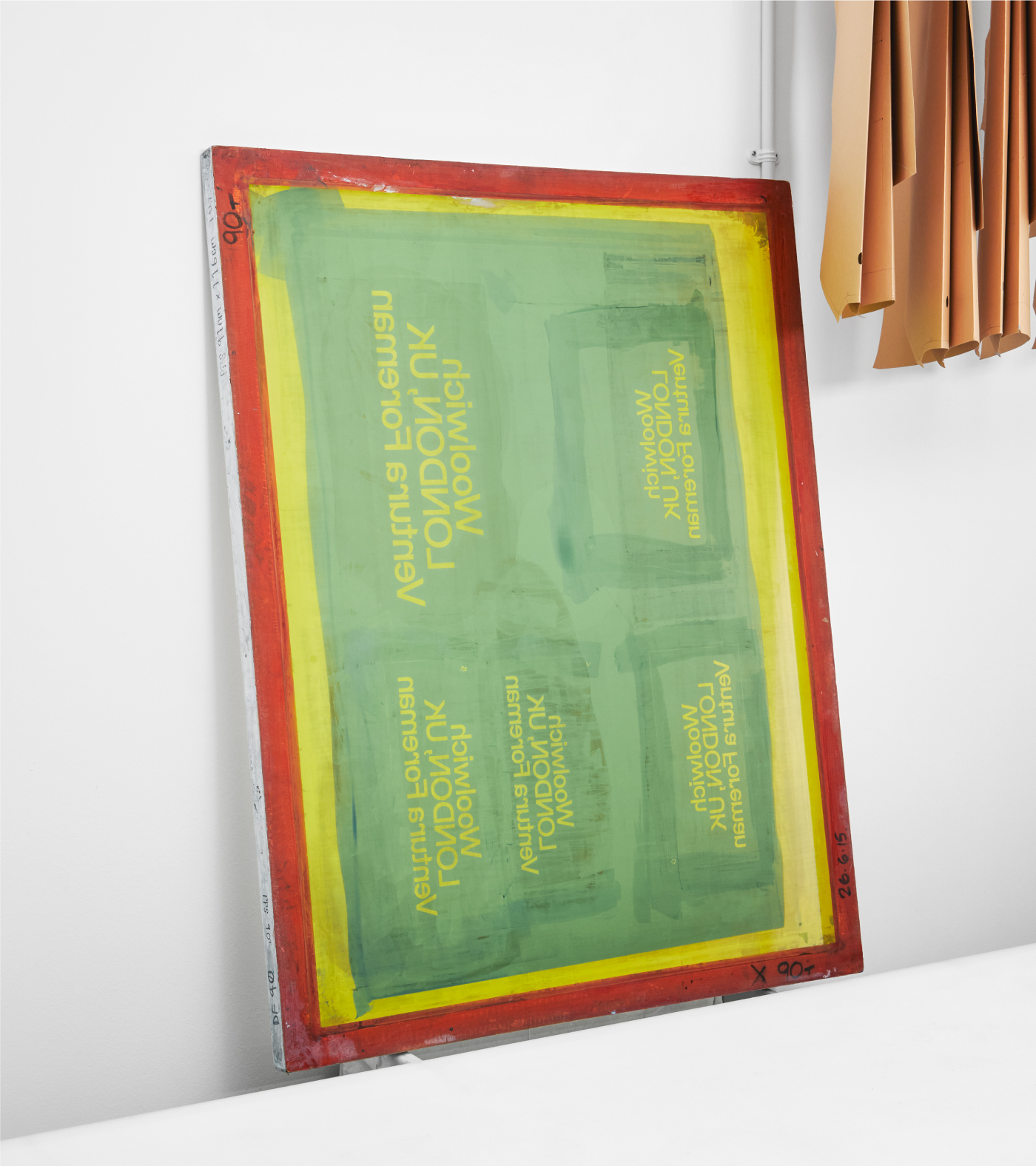
We embraced the “a little bit wrong” aesthetic across every touchpoint. We chose ABC Marfa as the primary typeface: a sturdy, utilitarian choice with subtle quirks that felt perfectly off-kilter for the studio. Unconventionally, we ditched a fixed colour palette. Instead, we used paper stocks and colours chosen to pair directly with the fabrics and clothes being produced at the time.
PLAY
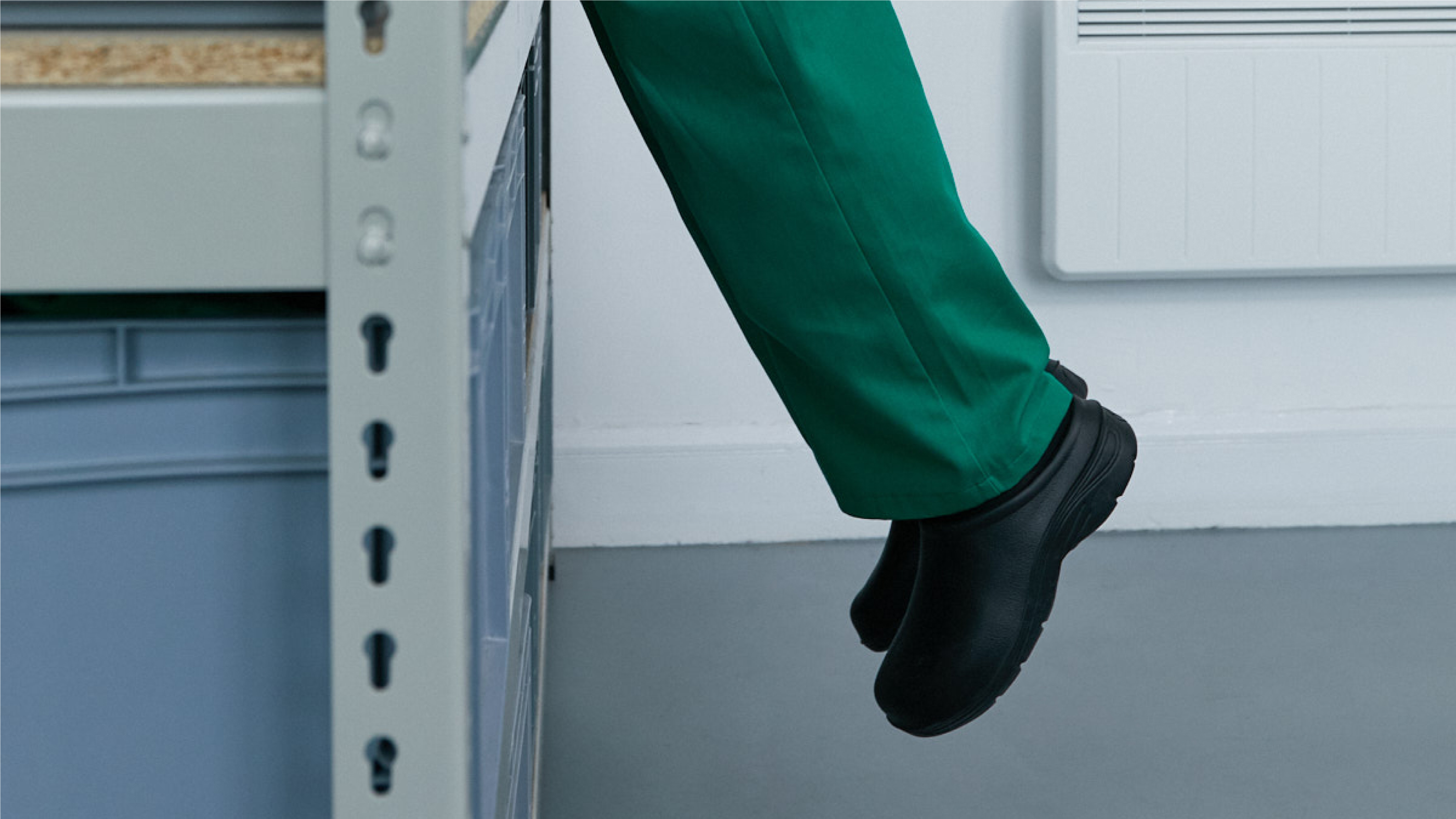
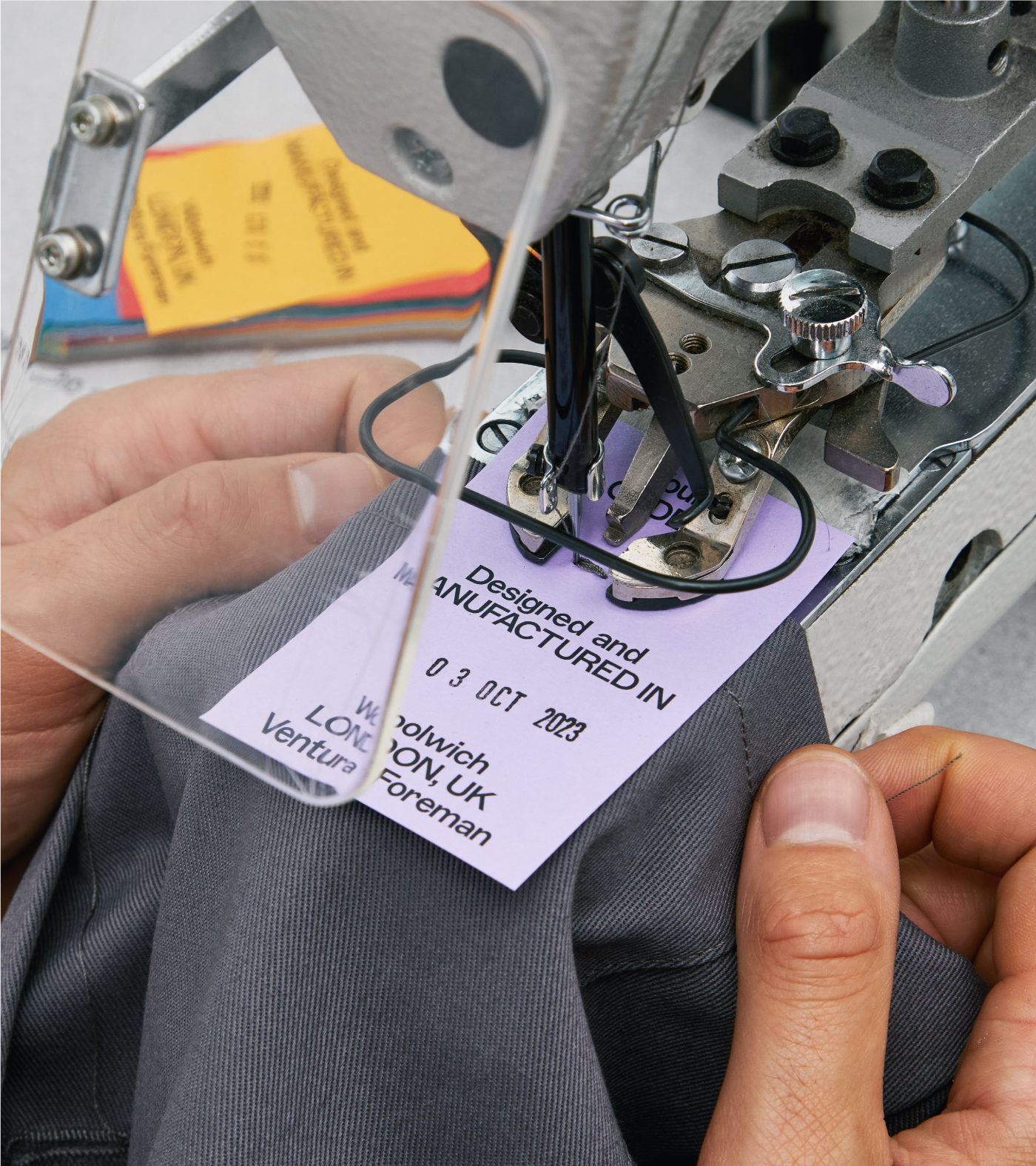
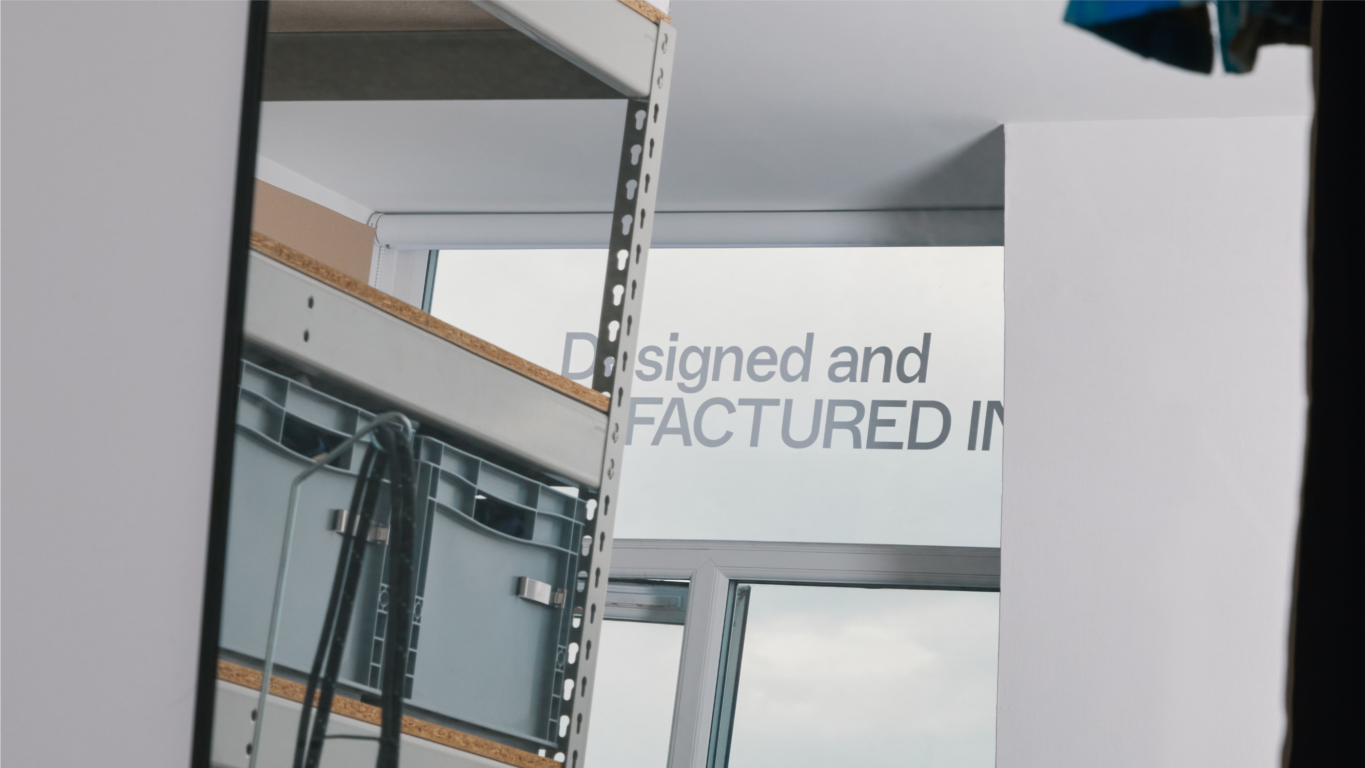
By stripping the brand back to a single font and focusing on the labour of materials, we unlocked a unique typographic system. This feeling of intentional imperfection was applied to everything from the logo to the way labels are attached to the garments. We celebrated their Woolwich roots and augmented their existing DIY aesthetic into a professional identity that remains unmistakably authentic.
“Studio Blackburn completely understood our need for authenticity. They managed to take the DIY aesthetic we had built and elevated it into something with a truly unique personality.”
Robert Ventura and Sophie Foreman
Founders at Ventura Foreman
Toggle
Ventura Foreman
- Visual Identity Systems
- Naming and Nomenclature
- Bespoke Typography and Systems
- Verbal Identity and Messaging
- Packaging Systems
BRIEF
Ventura Foreman is a Woolwich-based partnership specialising in serious, in-house workwear. Their brief was refreshingly honest: they wanted an identity that felt authentic and DIY, essentially asking us to create a brand without making them look like a “brand.” They needed something that felt clean and familiar, but with a sense that something was not quite right.
WORK
We embraced the “a little bit wrong” aesthetic across every touchpoint. We chose ABC Marfa as the primary typeface: a sturdy, utilitarian choice with subtle quirks that felt perfectly off-kilter for the studio. Unconventionally, we ditched a fixed colour palette. Instead, we used paper stocks and colours chosen to pair directly with the fabrics and clothes being produced at the time.
PLAY
By stripping the brand back to a single font and focusing on the labour of materials, we unlocked a unique typographic system. This feeling of intentional imperfection was applied to everything from the logo to the way labels are attached to the garments. We celebrated their Woolwich roots and augmented their existing DIY aesthetic into a professional identity that remains unmistakably authentic.