The Summit Foundation
Brand Refresh
2023
SCOPE
Brand Strategy and Positioning
Visual Identity Systems
Architecture and Portfolio Strategy
Type Systems
Verbal Identity and Messaging
Creative Direction
UX Strategy
Digital Art Direction
Toggle
BRIEF
The Summit Foundation is a family organisation committed to a world where nature flourishes and people thrive. They asked us to revitalise their brand and articulate their role in the complex landscape of sustainability and human rights. The challenge was to find a way to spread their message clearly without falling into the trap of becoming a loud or “activist” brand.
WORK
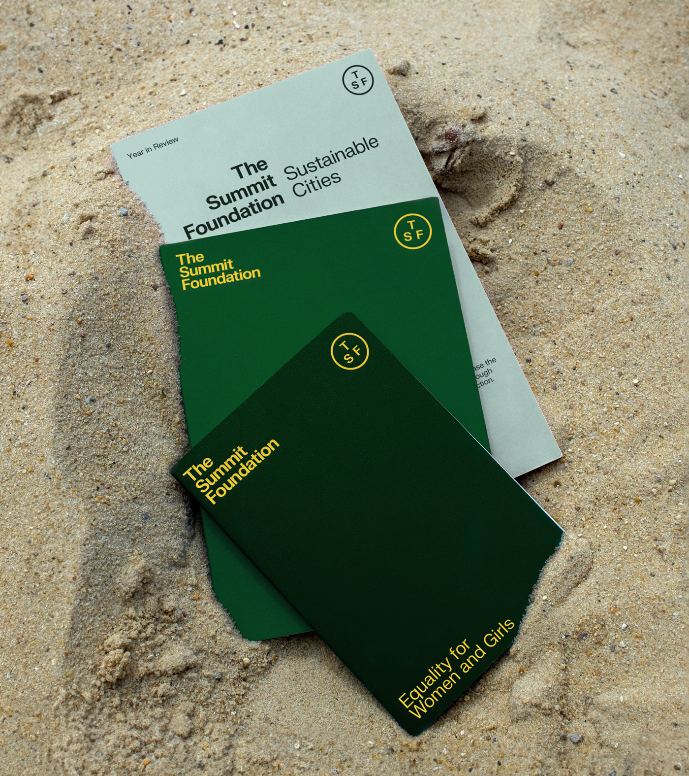
We used the concept of “amplified humbleness” as our starting point. Because the foundation focuses on creative and catalytic solutions to massive global crises, the brand needed to feel like a hallmark of quality rather than a cry for attention. We looked at their three distinct programmes — gender equality, biodiversity, and liveable cities — and found the intrinsic links between them. Our strategy was to create a cohesive family identity that still allowed each individual practice to feel visually prominent and important.
PLAY
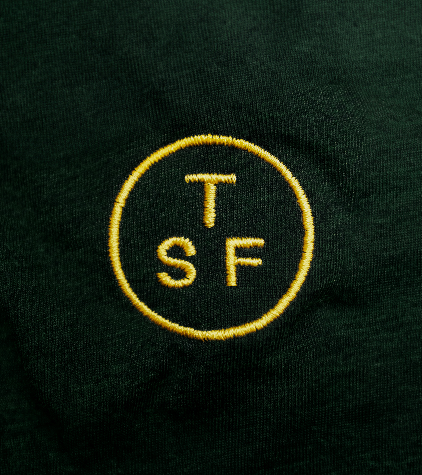
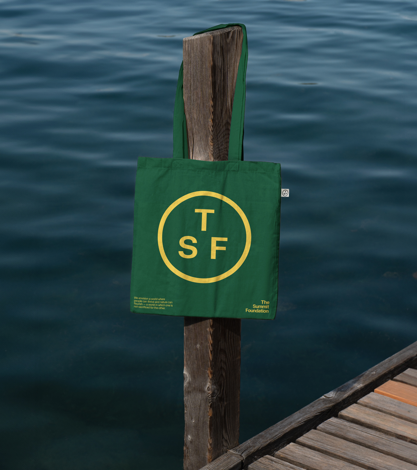
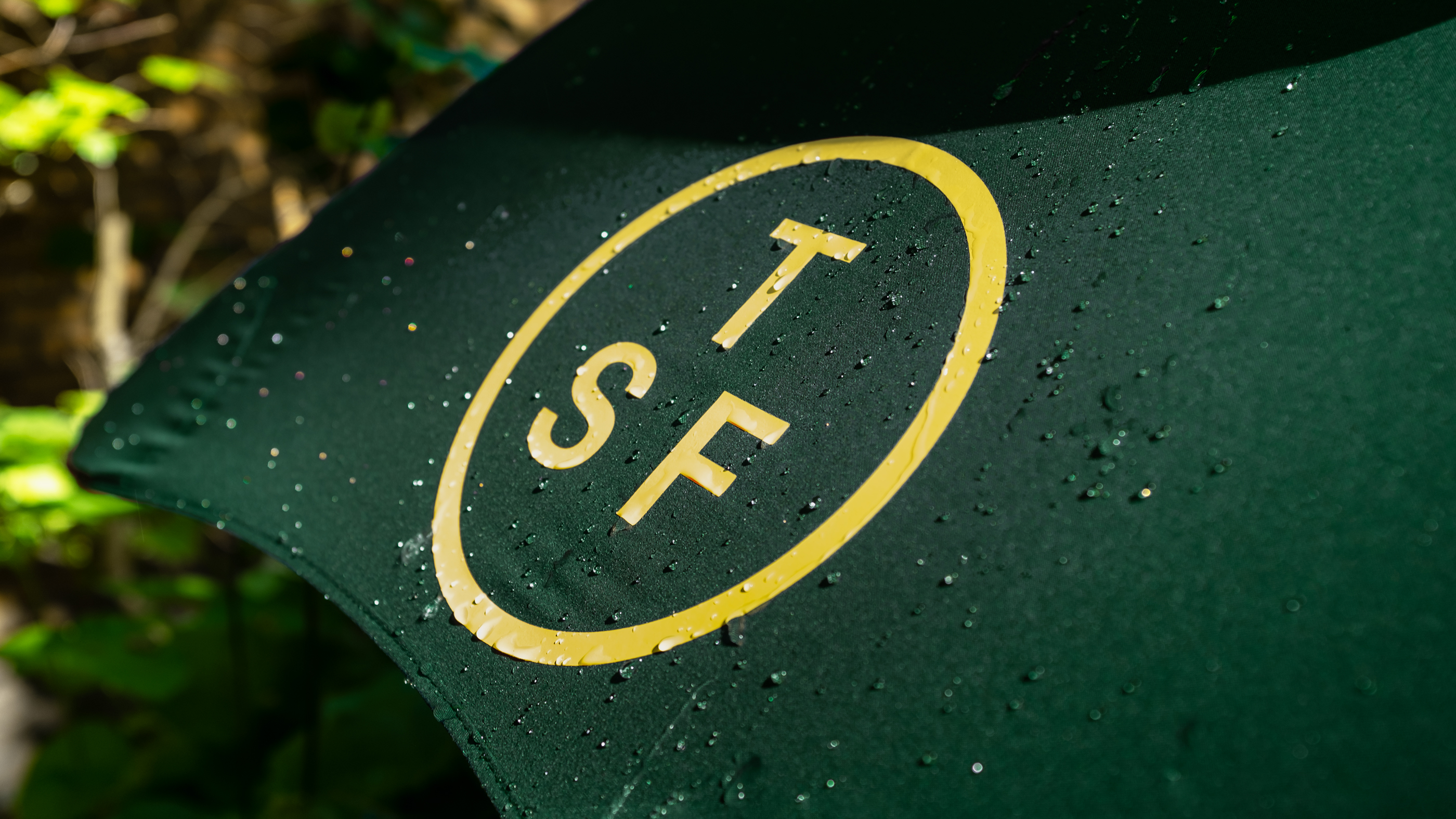
The resulting identity is never fixed. We created a wordmark with two variations that shift momentum, allowing the brand to adapt to its environment. We paired the down-to-earth FK Grotesk Neue with the editorial, calligraphic feel of Reckless Neue Book to communicate the human nature of their stories. To make the content feel ownable and filmic, we introduced a vivid yellow used strictly for typography, balanced by neutral greens. It is a sophisticated and flexible system that proves you do not have to shout to be heard.
“The Studio Blackburn team studied who we were, they deepened and refined their insights until what was reflected back to us began to express our identity better than we had ourselves expressed it. And so, when we arrived at the brand design, that product became born of that process and vested with that insight. Somehow, they had the essence almost from the very beginning.”
Lex Sant
President at The Summit Foundation
Toggle
The Summit Foundation
- Brand Strategy and Positioning
- Visual Identity Systems
- Type Systems
- Verbal Identity and Messaging
- Creative Direction
- UX Strategy
- Digital Art Direction
BRIEF
The Summit Foundation is a family organisation committed to a world where nature flourishes and people thrive. They asked us to revitalise their brand and articulate their role in the complex landscape of sustainability and human rights. The challenge was to find a way to spread their message clearly without falling into the trap of becoming a loud or “activist” brand.
WORK
We used the concept of “amplified humbleness” as our starting point. Because the foundation focuses on creative and catalytic solutions to massive global crises, the brand needed to feel like a hallmark of quality rather than a cry for attention. We looked at their three distinct programmes — gender equality, biodiversity, and liveable cities — and found the intrinsic links between them. Our strategy was to create a cohesive family identity that still allowed each individual practice to feel visually prominent and important.
PLAY
The resulting identity is never fixed. We created a wordmark with two variations that shift momentum, allowing the brand to adapt to its environment. We paired the down-to-earth FK Grotesk Neue with the editorial, calligraphic feel of Reckless Neue Book to communicate the human nature of their stories. To make the content feel ownable and filmic, we introduced a vivid yellow used strictly for typography, balanced by neutral greens. It is a sophisticated and flexible system that proves you do not have to shout to be heard.