So Energy
Brand Refresh
2025
SCOPE
Brand Strategy and Positioning
Core Visual Identity System
Creative Campaign Platforms
Motion Principles
Copywriting
Campaign and Messaging Strategy
Toggle
BRIEF
So Energy wanted to position themselves as the ultimate challenger to the “Big Six.” Building on our 2021 work, this refresh needed to bring more warmth, more clarity, and a lot more character to the renewable energy market.
WORK
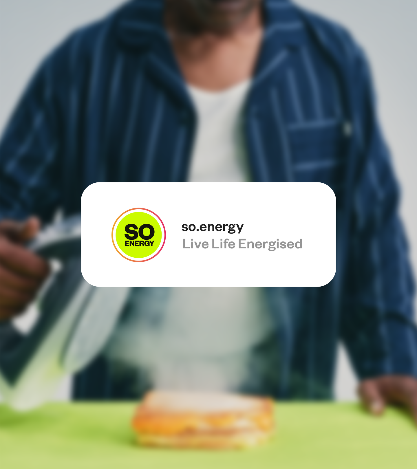
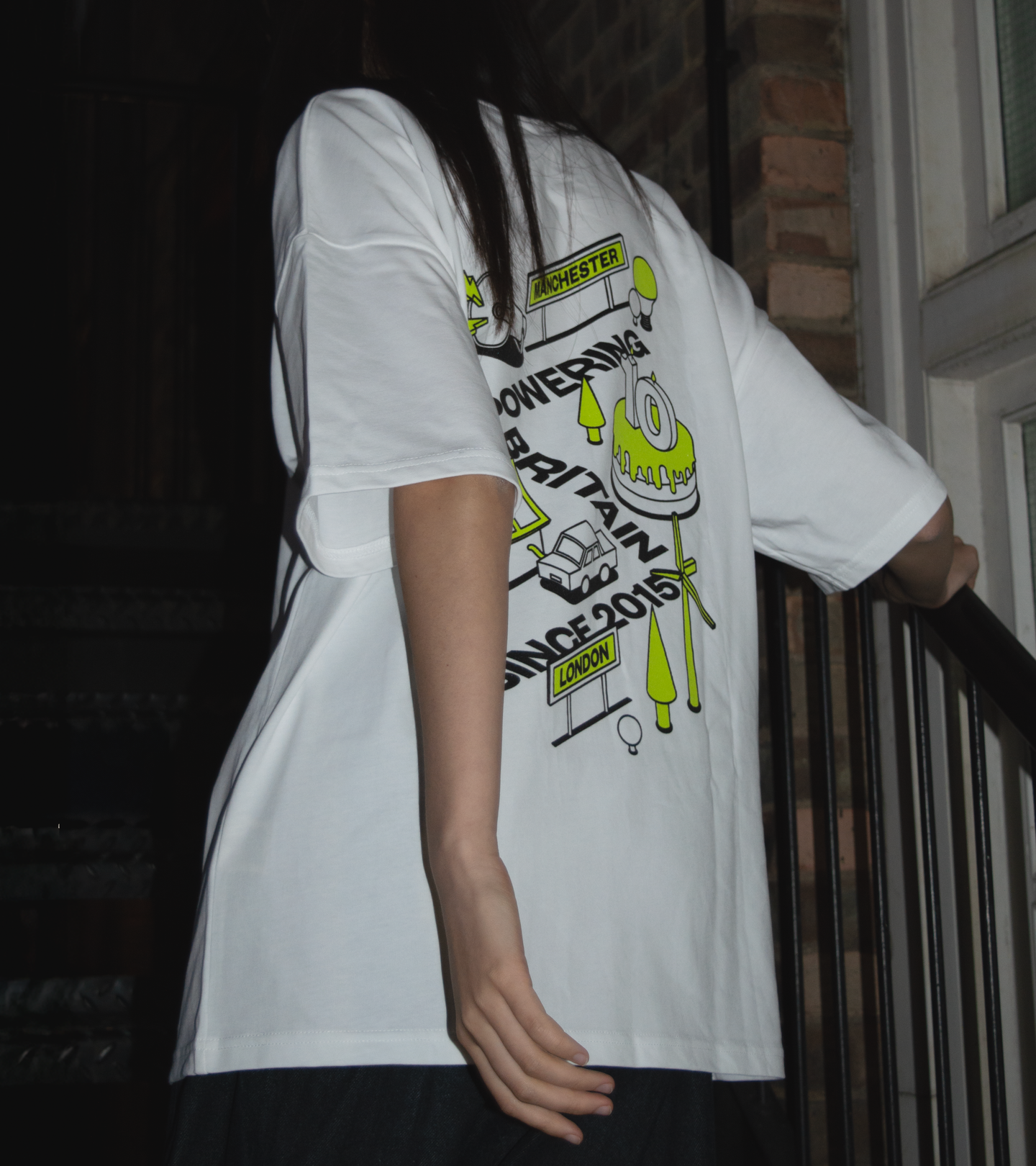
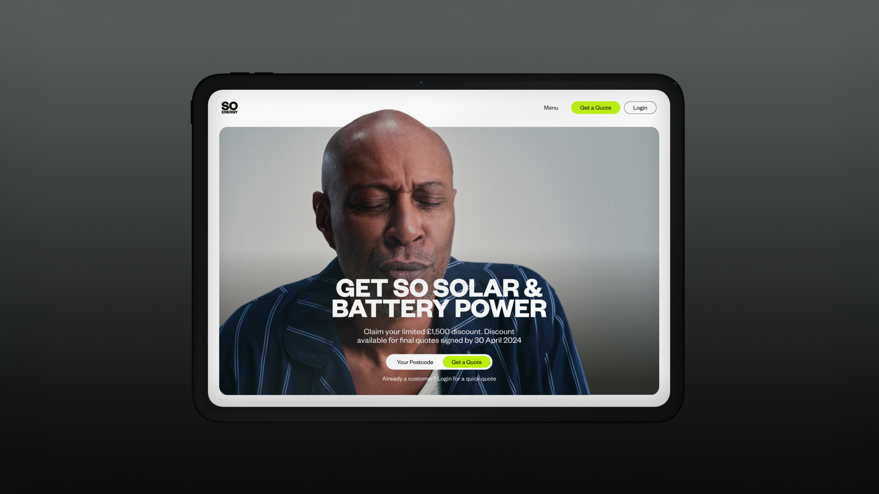
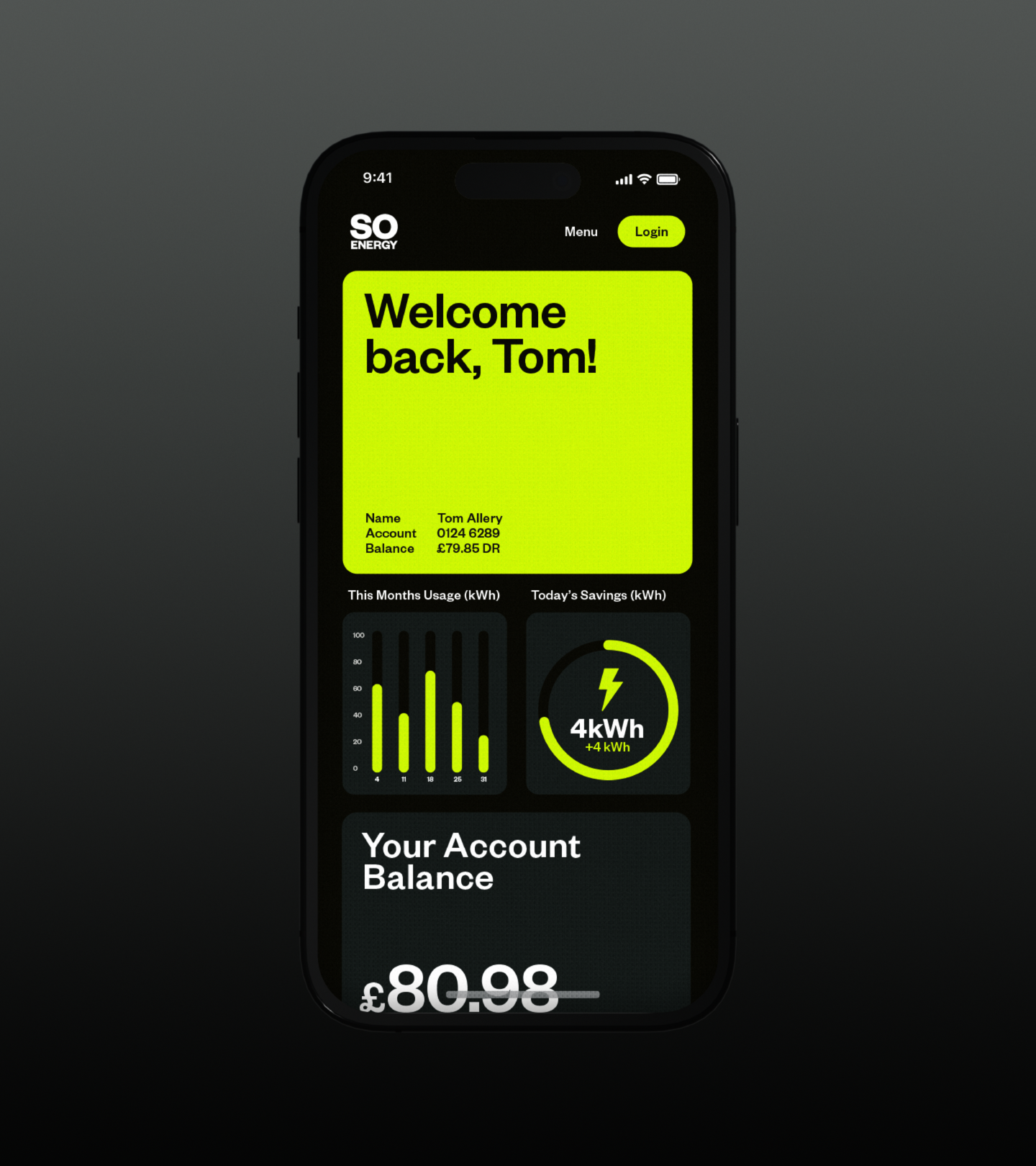
We moved the brand beyond the faceless, complex conventions of the sector. The core idea, “Live Life Energised,” focuses on the outcome rather than the utility. We wanted to show that choosing green energy should be simple, relatable, and impossible to ignore.
PLAY
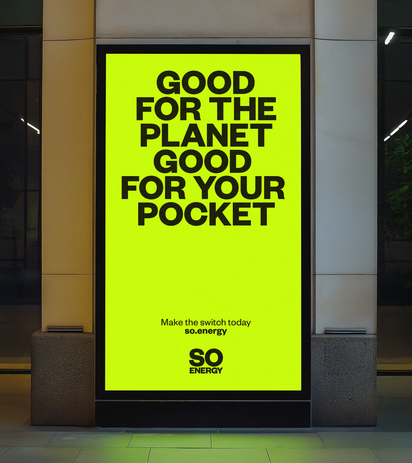
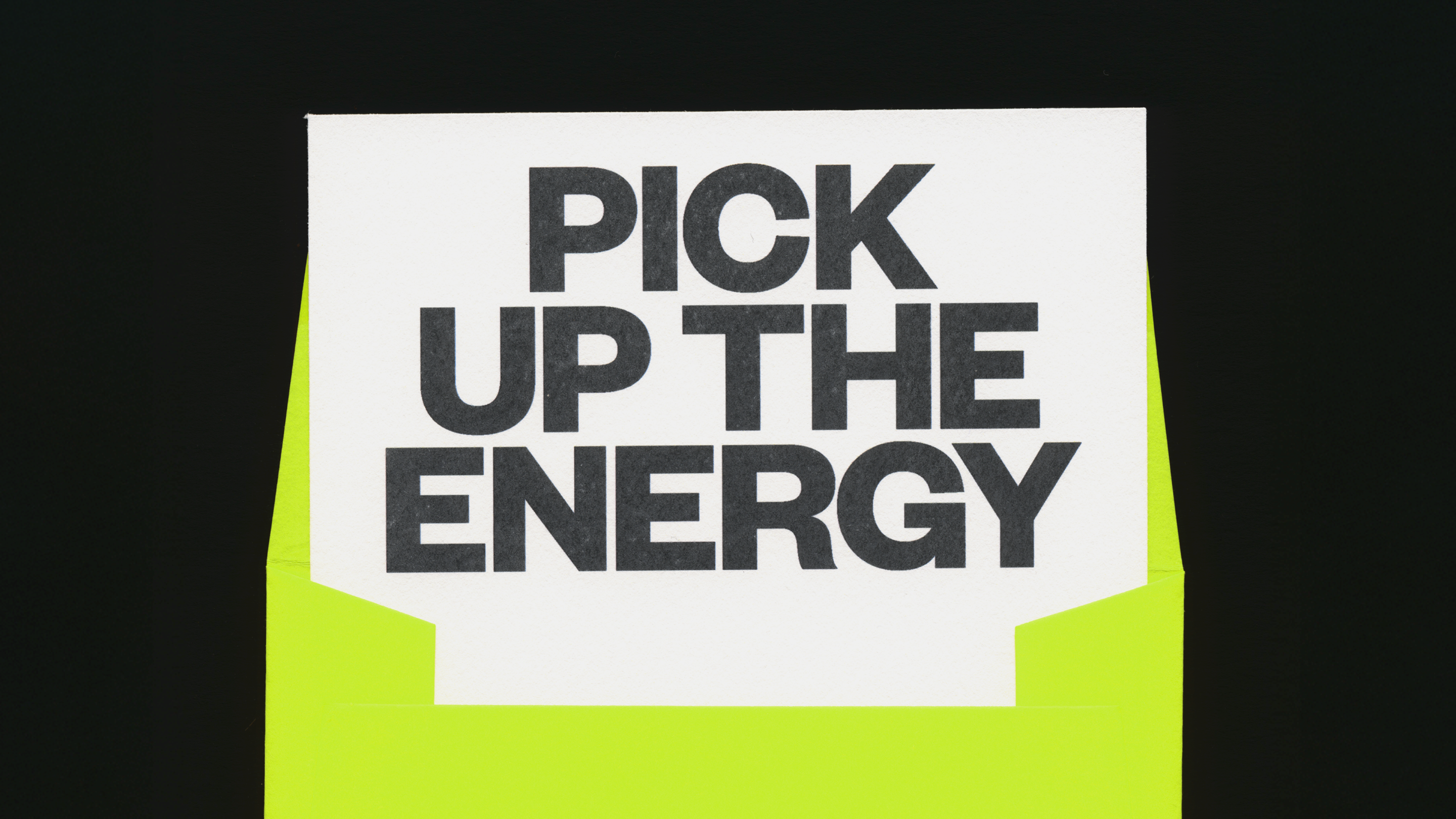
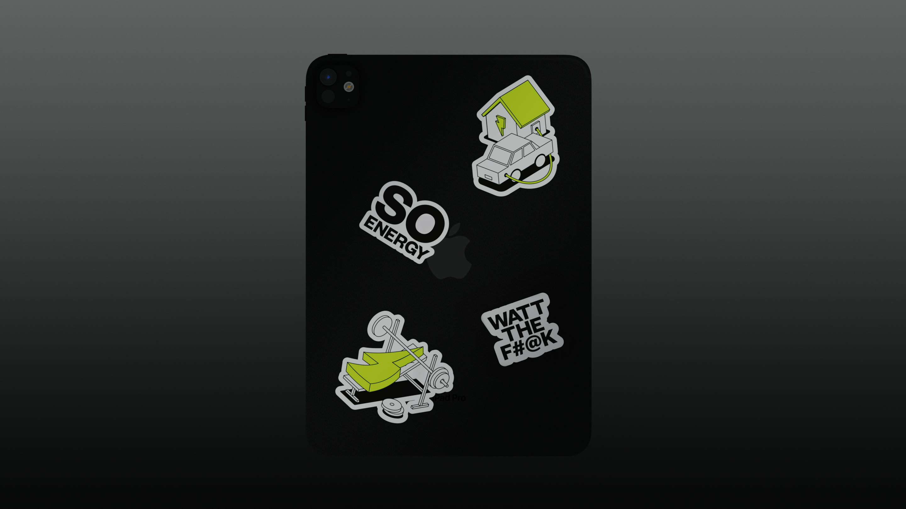
We introduced “Electric Yellow,” a high-vis hue that sits right between yellow and green. It is loud, approachable, and helps the brand pop on comparison sites and social feeds. Combined with a new motion system and friendly illustrations, we created a cohesive language that proves you can do energy while your customers “do them.”
Toggle
So Energy
- Brand Strategy and Positioning
- Core Visual Identity System
- Creative Campaign Platforms
- Motion Principles
- Copywriting
- Campaign and Messaging Strategy
BRIEF
So Energy wanted to position themselves as the ultimate challenger to the “Big Six.” Building on our 2021 work, this refresh needed to bring more warmth, more clarity, and a lot more character to the renewable energy market.
WORK
We moved the brand beyond the faceless, complex conventions of the sector. The core idea, “Live Life Energised,” focuses on the outcome rather than the utility. We wanted to show that choosing green energy should be simple, relatable, and impossible to ignore.
PLAY
We introduced “Electric Yellow,” a high-vis hue that sits right between yellow and green. It is loud, approachable, and helps the brand pop on comparison sites and social feeds. Combined with a new motion system and friendly illustrations, we created a cohesive language that proves you can do energy while your customers “do them.”