
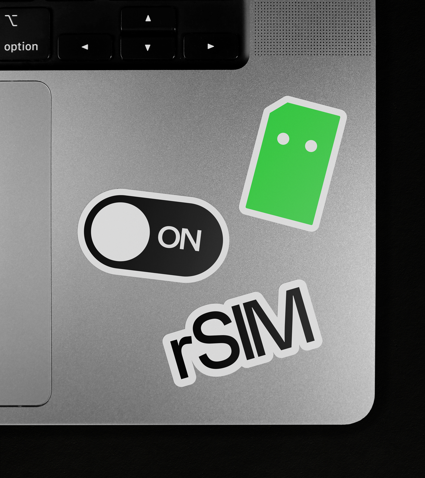

rSIM
Brand Identity
2023
SCOPE
Visual Identity Systems
Verbal Identity and Messaging
Motion Principles
Digital Art Direction
Brand World Building
Naming and Nomenclature
Toggle
BRIEF
rSIM is the world’s first truly resilient SIM card. In a sector where connectivity is critical for safety and security, rSIM needed a brand that felt as dependable as the technology itself. We teamed up to support their mission and build a brand anchored in the idea of being “Always On”.
WORK
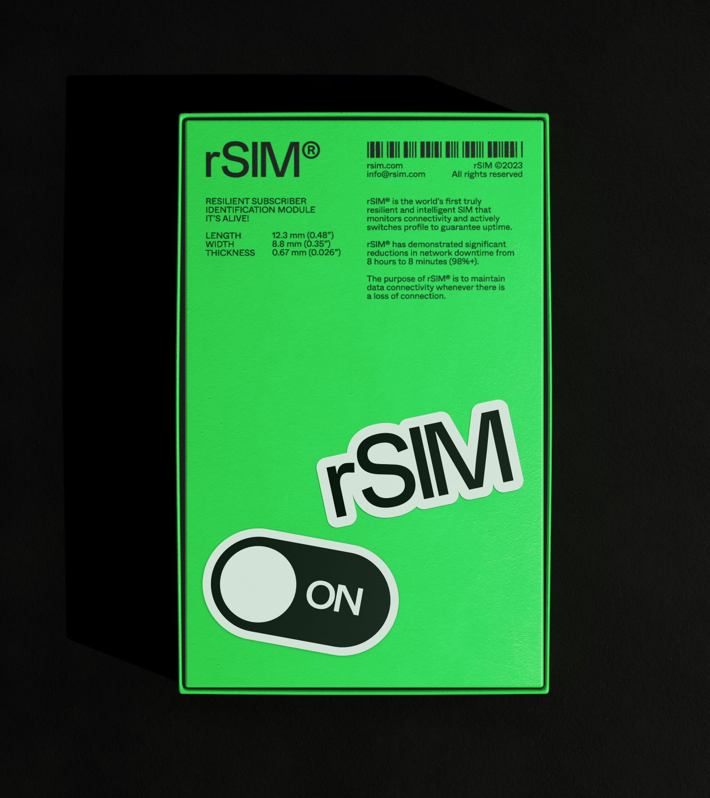
Technology can often feel empty and soulless. Because rSIM is a truly intelligent product, we wanted to avoid the sterile B2B clichés. We developed a core strategy based on the concept “It’s Alive” — the idea that if the SIM card thinks for itself, it essentially has a pulse. We moved the brand beyond convention to create a benchmark of character in a technical field.
PLAY
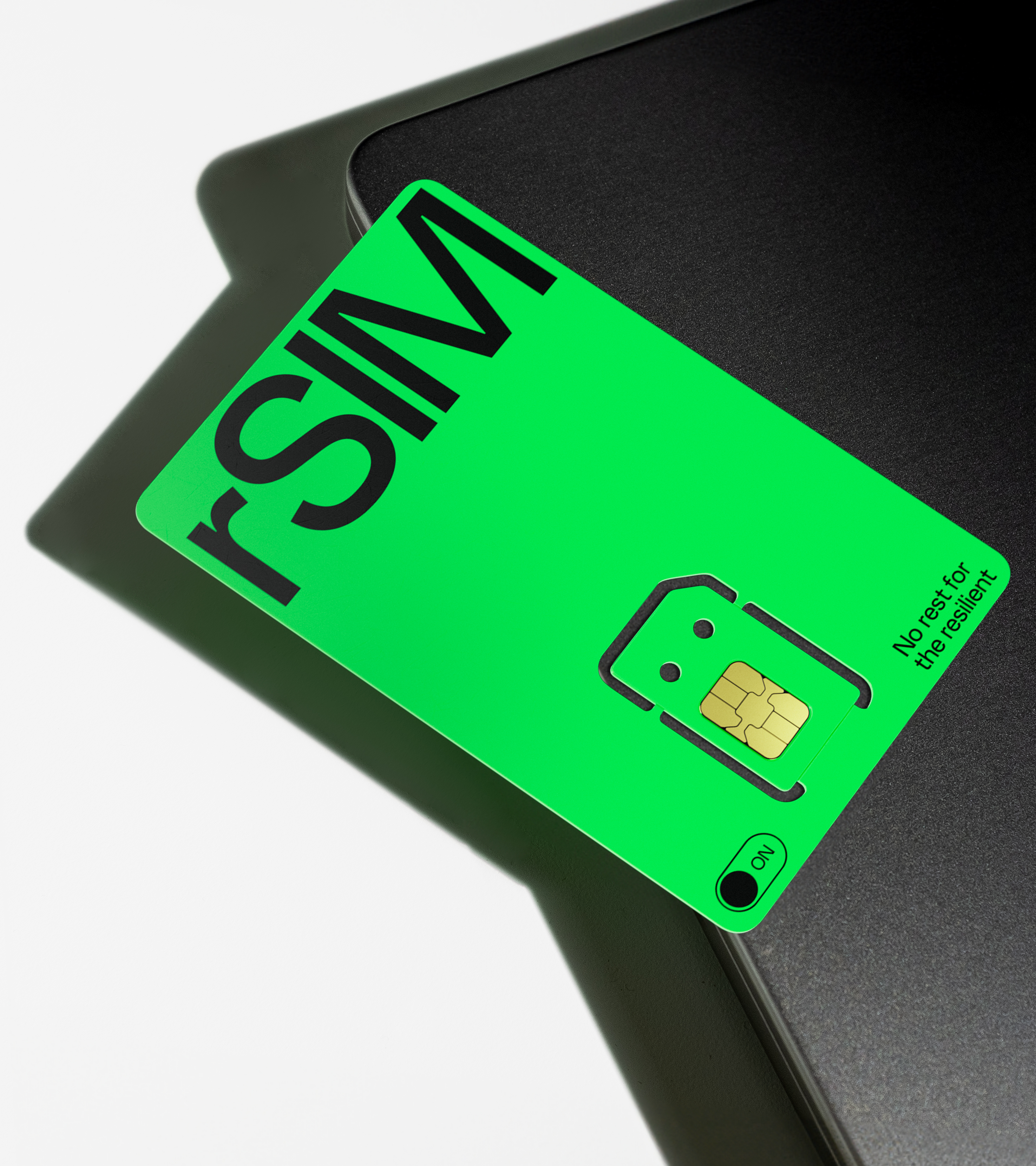
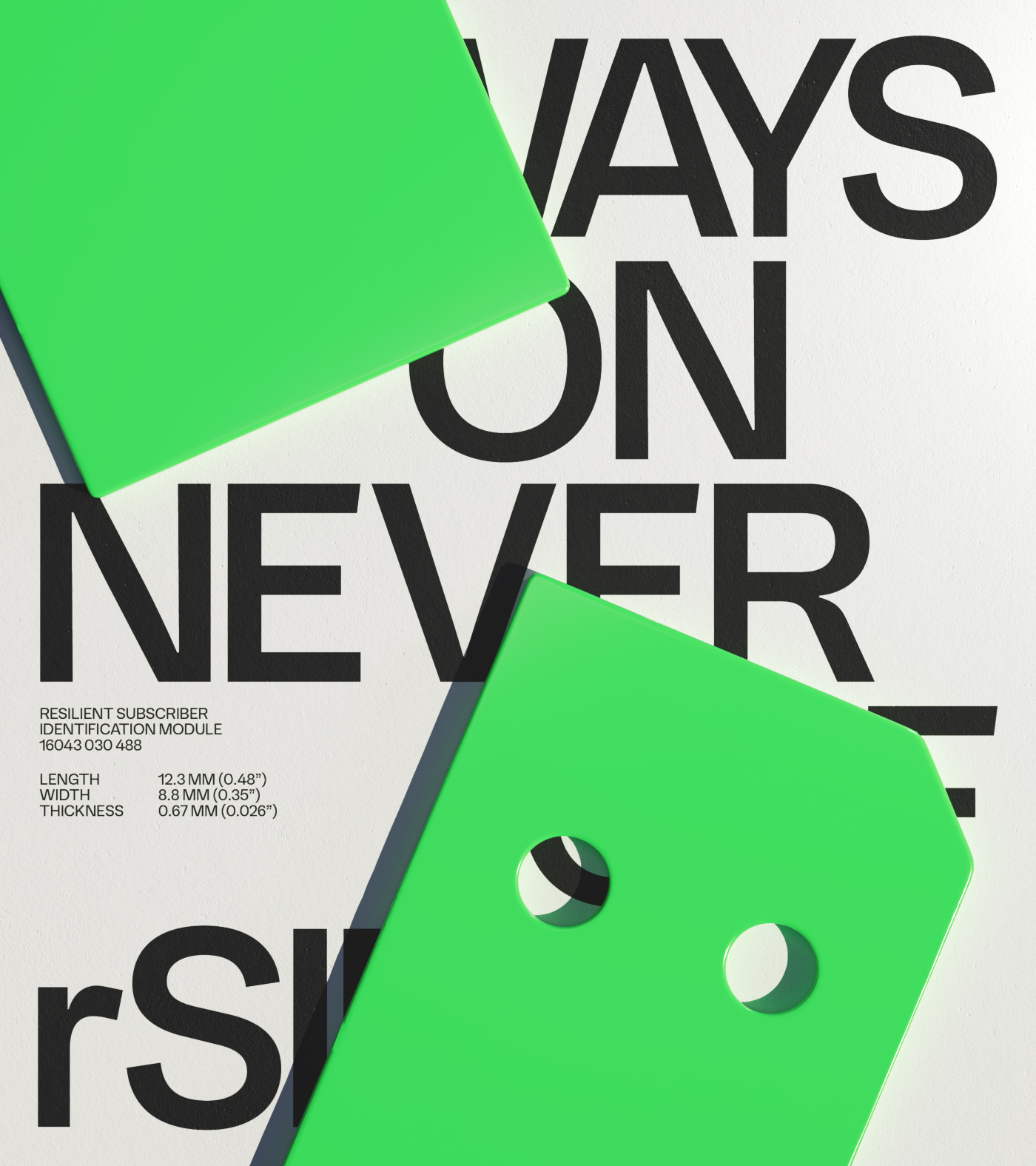
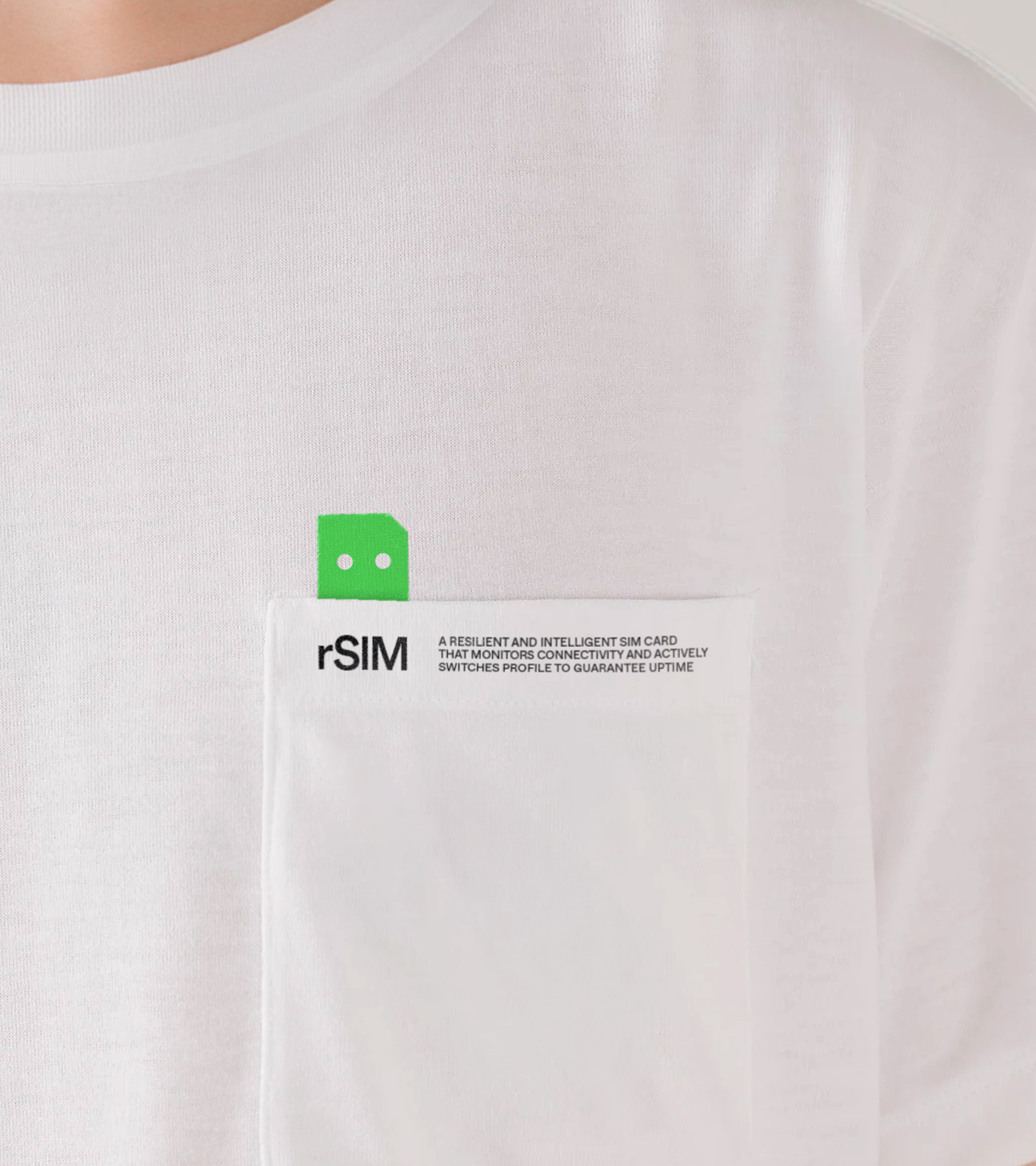
We brought the card to life with a high-energy visual system. The primary green was inspired by the “On” buttons and status lights that signal life across the tech world. Through the use of expressive animations and bold typography, we gave the product a real personality. It is a brand that does not just sit in a device: it thinks, it acts, and it stands out in a crowded market.
“Studio Blackburn did an amazing job creating the new rSIM brand identity. Although rSIM is very much a B2B proposition, they brought a stronger balance of consumer and business influences that gave the brand real distinctiveness and helped it stand apart. In a short space of time, rSIM has been recognised globally as the benchmark for resilience in our sector.”
Richard Cunliffe
Director at rSIM
Visit rsim.com
Toggle
rSIM
- Visual Identity Systems
- Verbal Identity and Messaging
- Motion Principles
- Digital Art Direction
- Brand World Building
- Naming and Nomenclature
BRIEF
rSIM is the world’s first truly resilient SIM card. In a sector where connectivity is critical for safety and security, rSIM needed a brand that felt as dependable as the technology itself. We teamed up to support their mission and build a brand anchored in the idea of being “Always On”.
WORK
Technology can often feel empty and soulless. Because rSIM is a truly intelligent product, we wanted to avoid the sterile B2B clichés. We developed a core strategy based on the concept “It’s Alive” — the idea that if the SIM card thinks for itself, it essentially has a pulse. We moved the brand beyond convention to create a benchmark of character in a technical field.
PLAY
We brought the card to life with a high-energy visual system. The primary green was inspired by the “On” buttons and status lights that signal life across the tech world. Through the use of expressive animations and bold typography, we gave the product a real personality. It is a brand that does not just sit in a device: it thinks, it acts, and it stands out in a crowded market.