Olympic Museum
Brand Refresh
2024
SCOPE
Brand Refresh
Identity Systems
Motion Principles
Creative Campaign Platforms
Toggle
BRIEF
Home to the world’s largest Olympic collection, the Olympic Museum needed a refresh that bridged its 2,000 year heritage with a digital future. The goal was to create a strong emotional connection for visitors in Lausanne and audiences around the world, ensuring the Museum maintained its influence in the cultural sphere far beyond the world of sport.
WORK
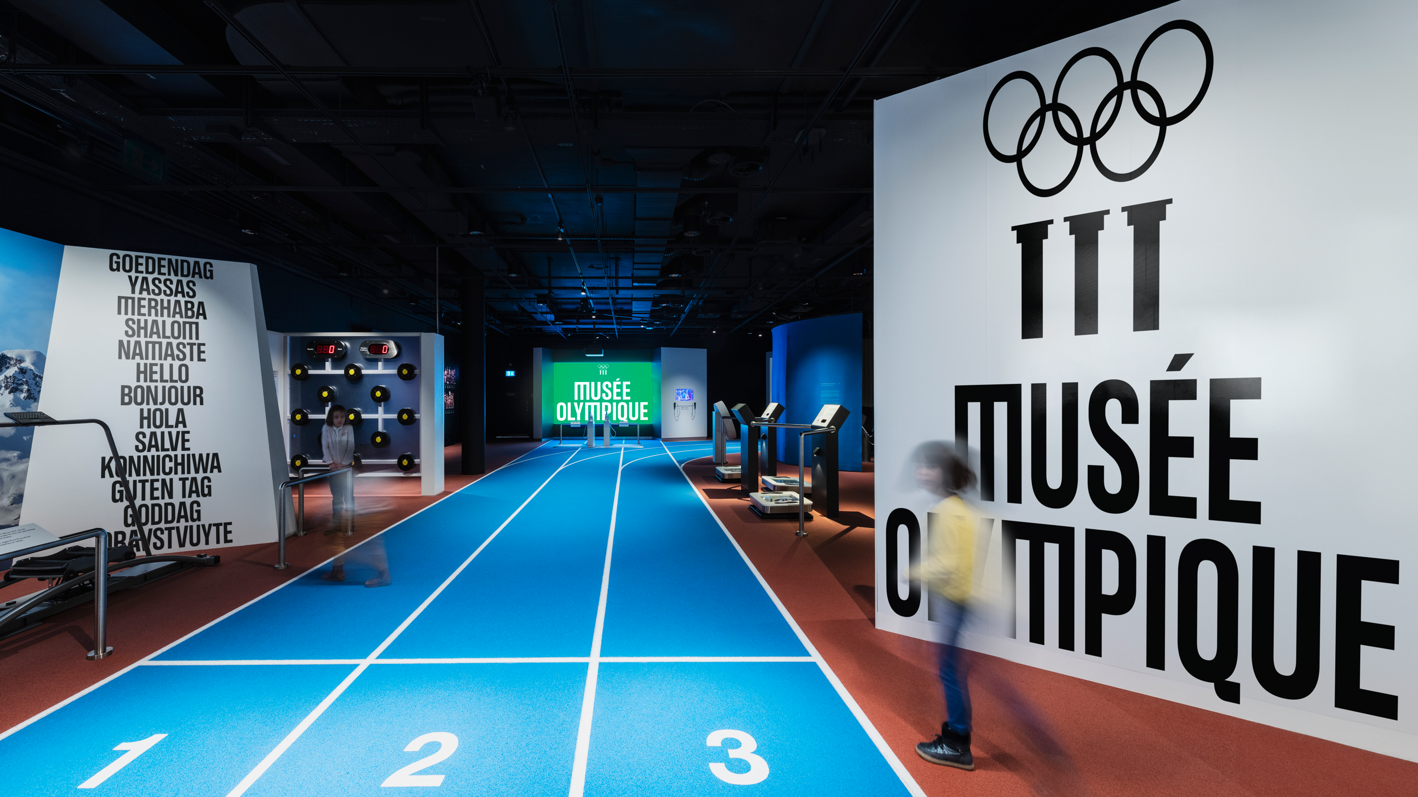
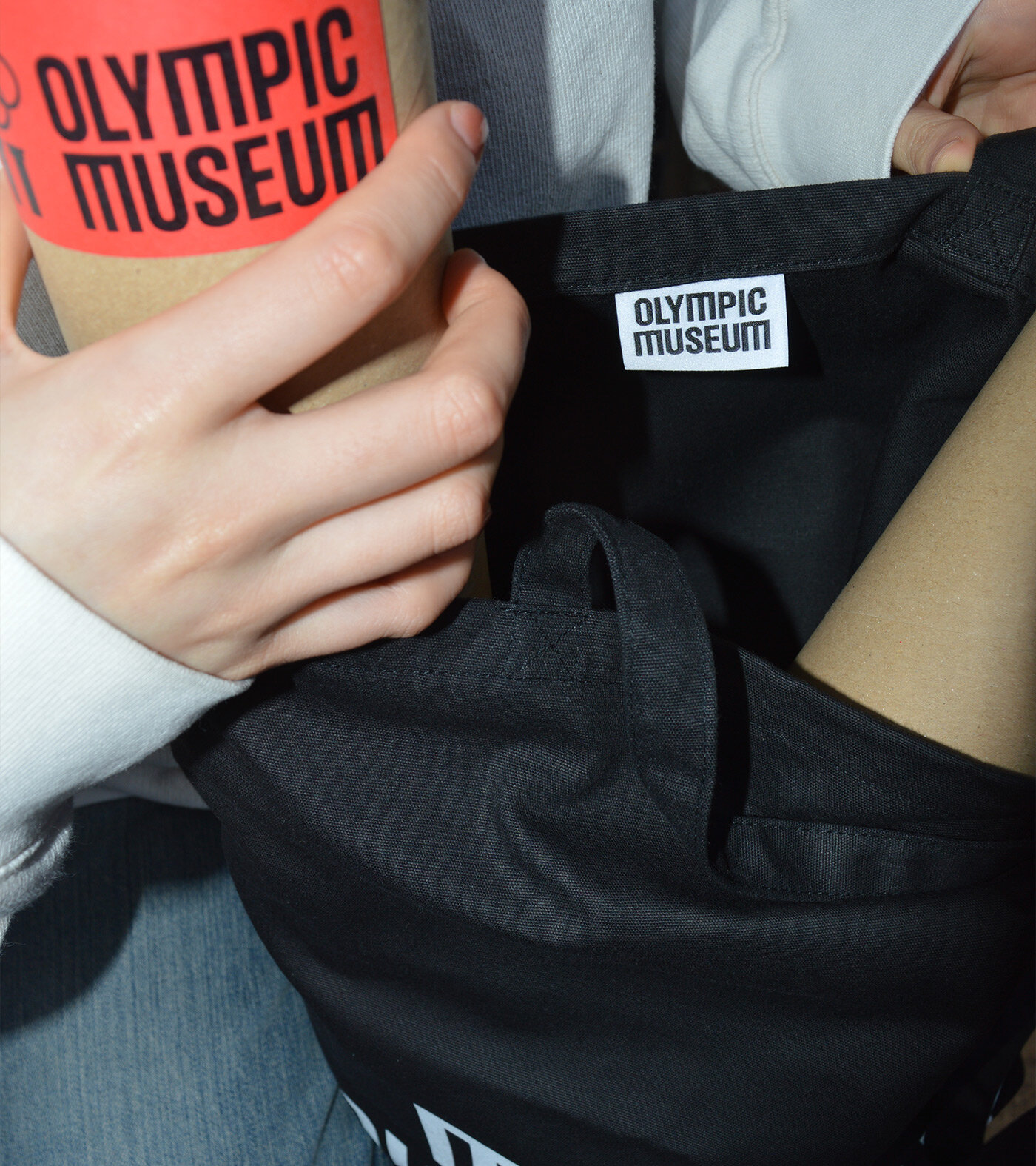
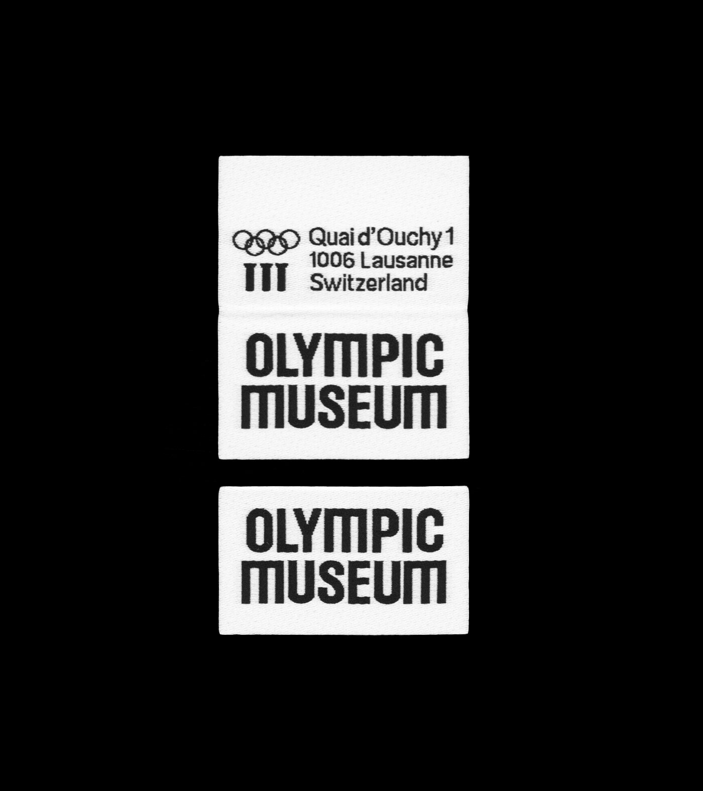
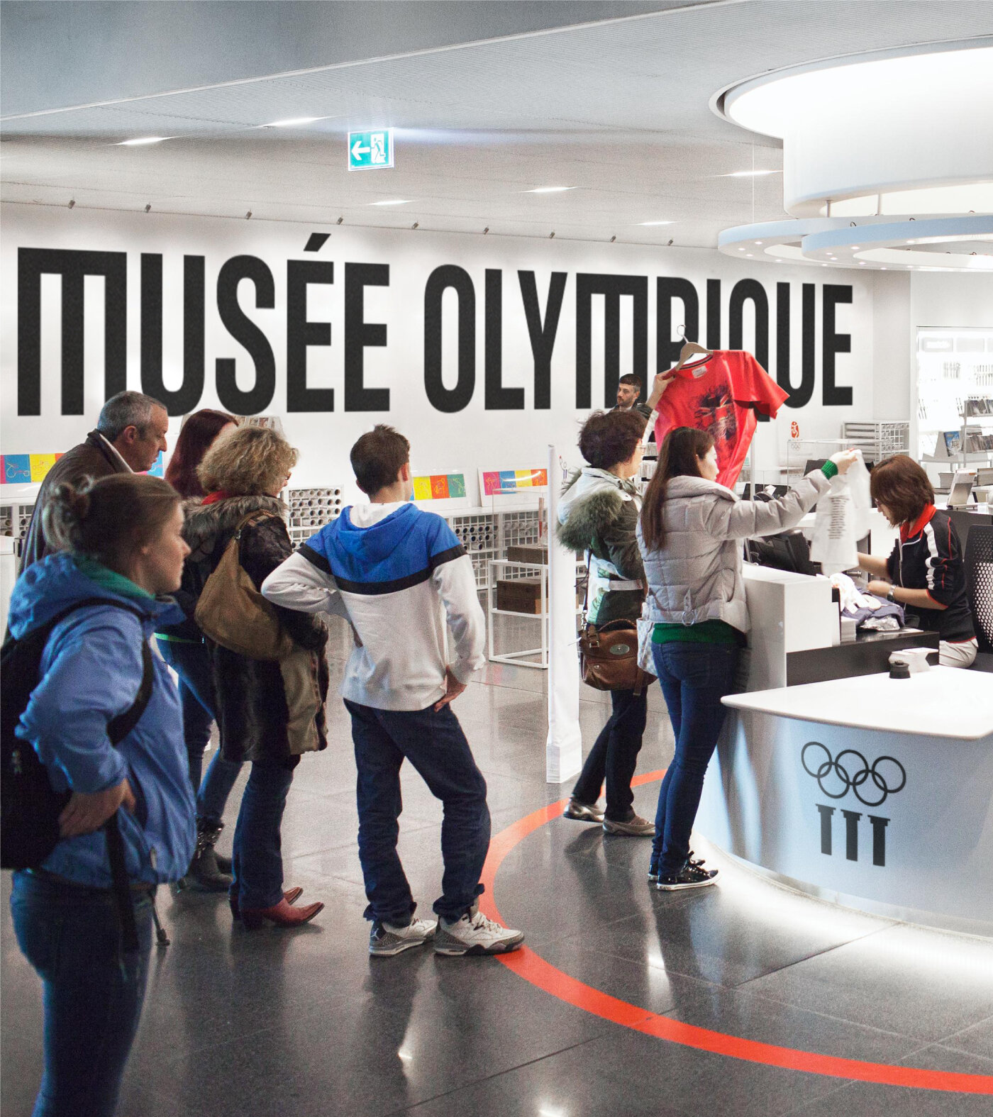
We started by rationalising the brand architecture. We moved away from the “TOM” acronym and dropped “The” from the logo to create a cleaner, more modern presence. Since the majority of the future audience will experience the Museum remotely, we designed the identity to perform as well on a screen as it does on a gallery wall. The system had to be flexible enough to work seamlessly across three languages: English, French, and German.
PLAY
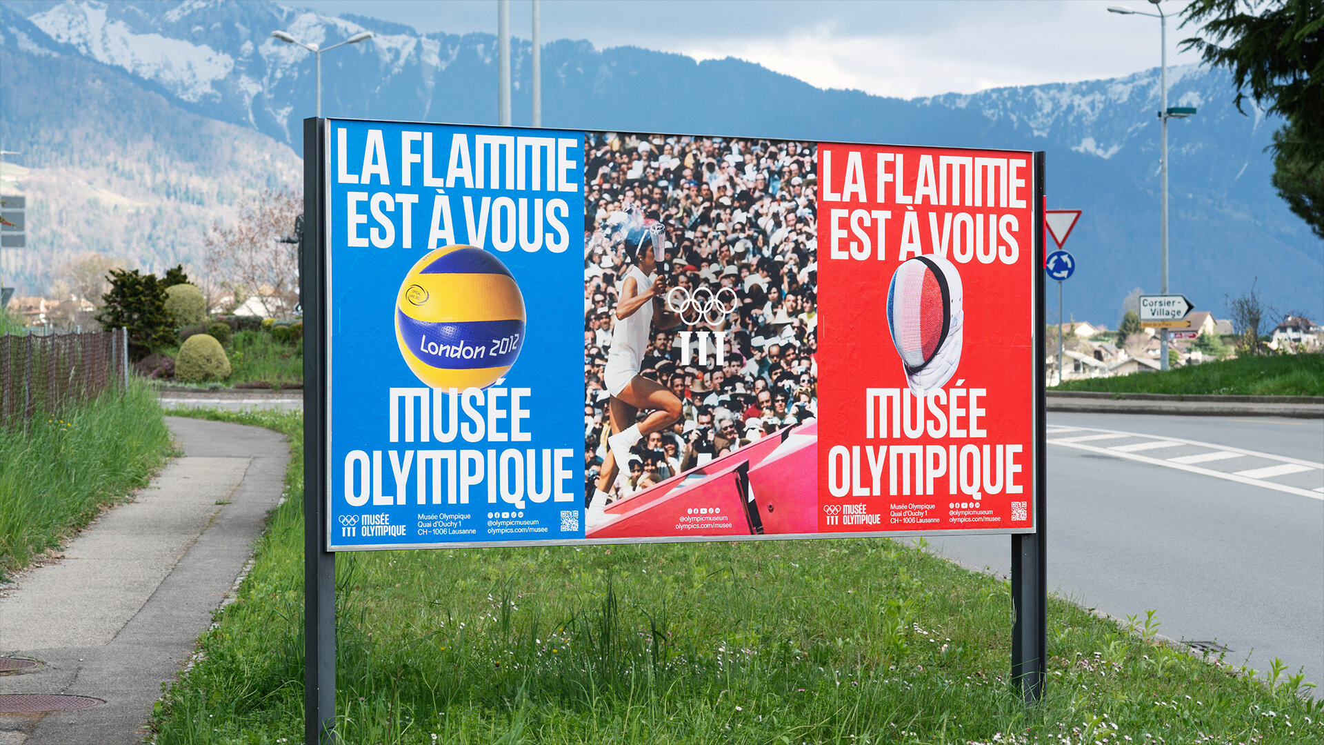
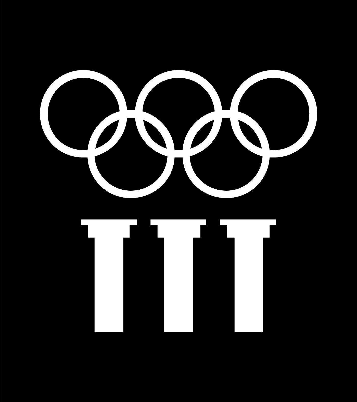
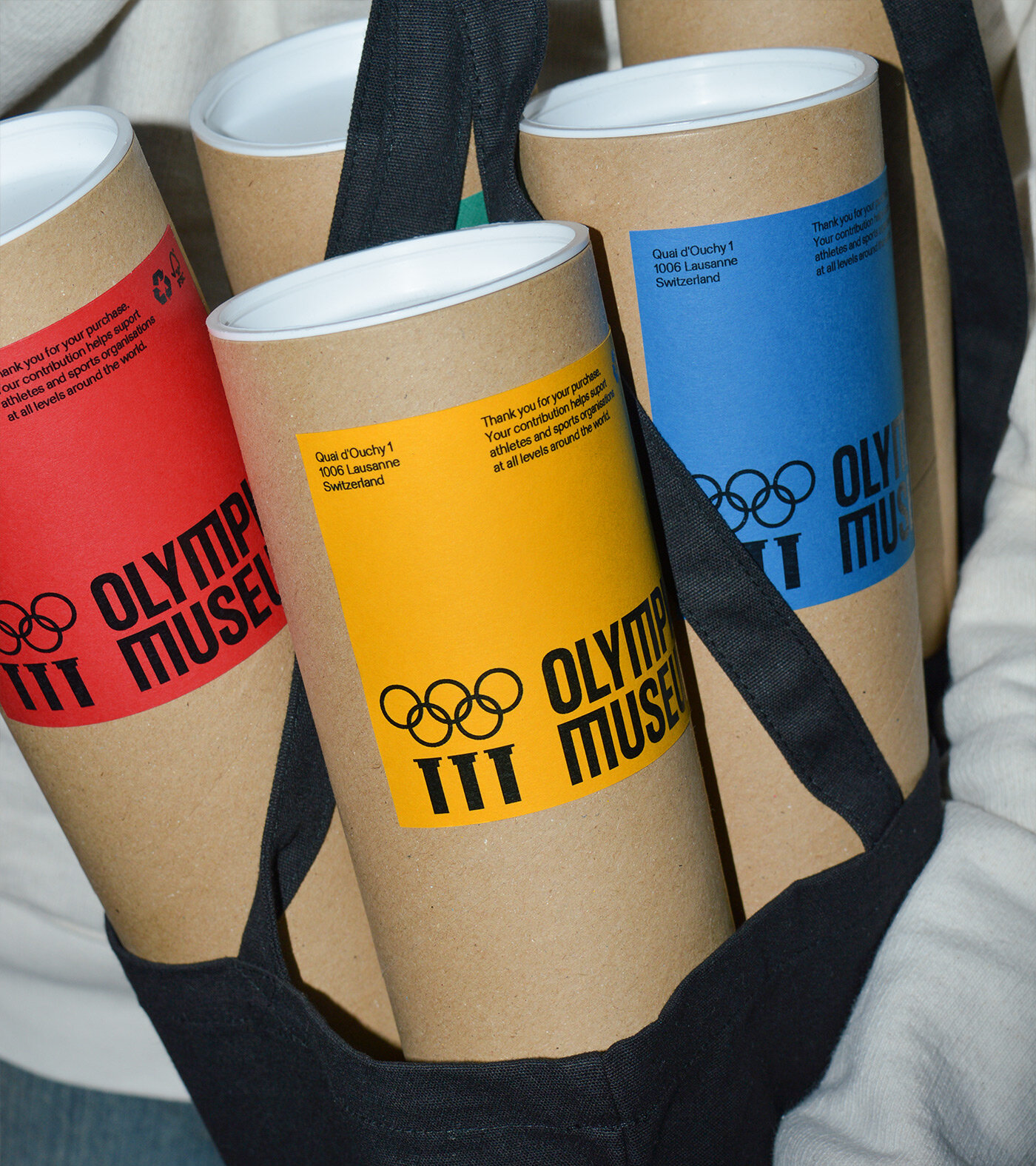
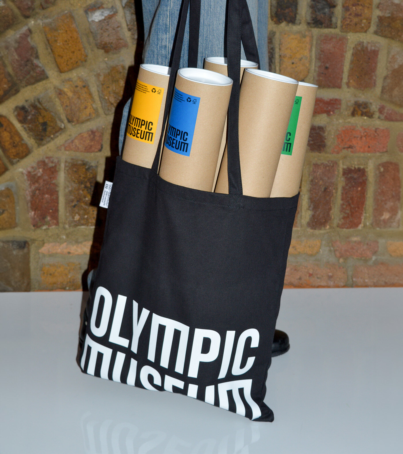
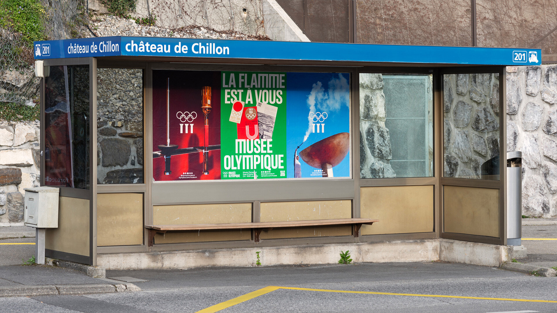
We delivered an expressive identity system that captures the power and emotion of Olympism. A key feature is the customised “M,” a subtle contemporary twist on the refreshed Olympic Museum Symbol. To keep the brand active between exhibitions, we created an ongoing poster series that celebrates specific artefacts against the vibrant backdrop of the Olympic ring colours. It is a system that stretches from sophisticated to playful, reminding the world that the Olympic flame is for everyone.
Toggle
Olympic Museum
- Brand Refresh
- Identity Systems
- Motion Principles
- Creative Campaign Platforms
BRIEF
Home to the world’s largest Olympic collection, the Olympic Museum needed a refresh that bridged its 2,000 year heritage with a digital future. The goal was to create a strong emotional connection for visitors in Lausanne and audiences around the world, ensuring the Museum maintained its influence in the cultural sphere far beyond the world of sport.
WORK
We started by rationalising the brand architecture. We moved away from the “TOM” acronym and dropped “The” from the logo to create a cleaner, more modern presence. Since the majority of the future audience will experience the Museum remotely, we designed the identity to perform as well on a screen as it does on a gallery wall. The system had to be flexible enough to work seamlessly across three languages: English, French, and German.
PLAY
We delivered an expressive identity system that captures the power and emotion of Olympism. A key feature is the customised “M,” a subtle contemporary twist on the refreshed Olympic Museum Symbol. To keep the brand active between exhibitions, we created an ongoing poster series that celebrates specific artefacts against the vibrant backdrop of the Olympic ring colours. It is a system that stretches from sophisticated to playful, reminding the world that the Olympic flame is for everyone.