M&S Food: Nutrient Dense
Packaging Identity
2026
SCOPE
Packaging Systems
Core Visual Identity System
Art Direction
Research and Insight
Toggle
BRIEF
Studio Blackburn worked closely with the M&S Food team to bring their new health focused range, Nutrient Dense, to life. This was not about launching just another health range: it was about expressing what health means for M&S. We needed to translate the heartbeat of the concept into a visual language with total conviction.
WORK
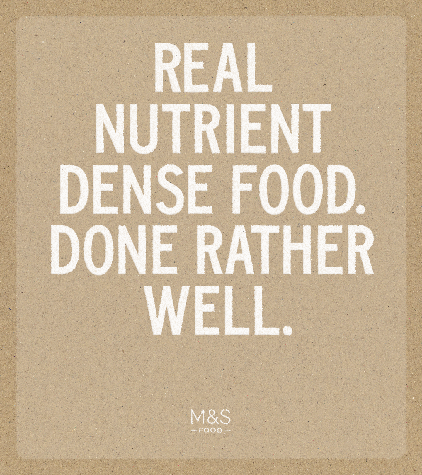
Consumers are more informed than ever: they read labels and they value transparency. Our role was not to lecture but to respect that awareness. Following the Dieter Rams philosophy of “less, but better,” we stayed disciplined. We anchored the range in two truths: hard working nutrition and the classic M&S “tiny bit marvellous” feeling. By stripping away the non-essential, we created a brand that stands firmly behind the quality of the product.
PLAY
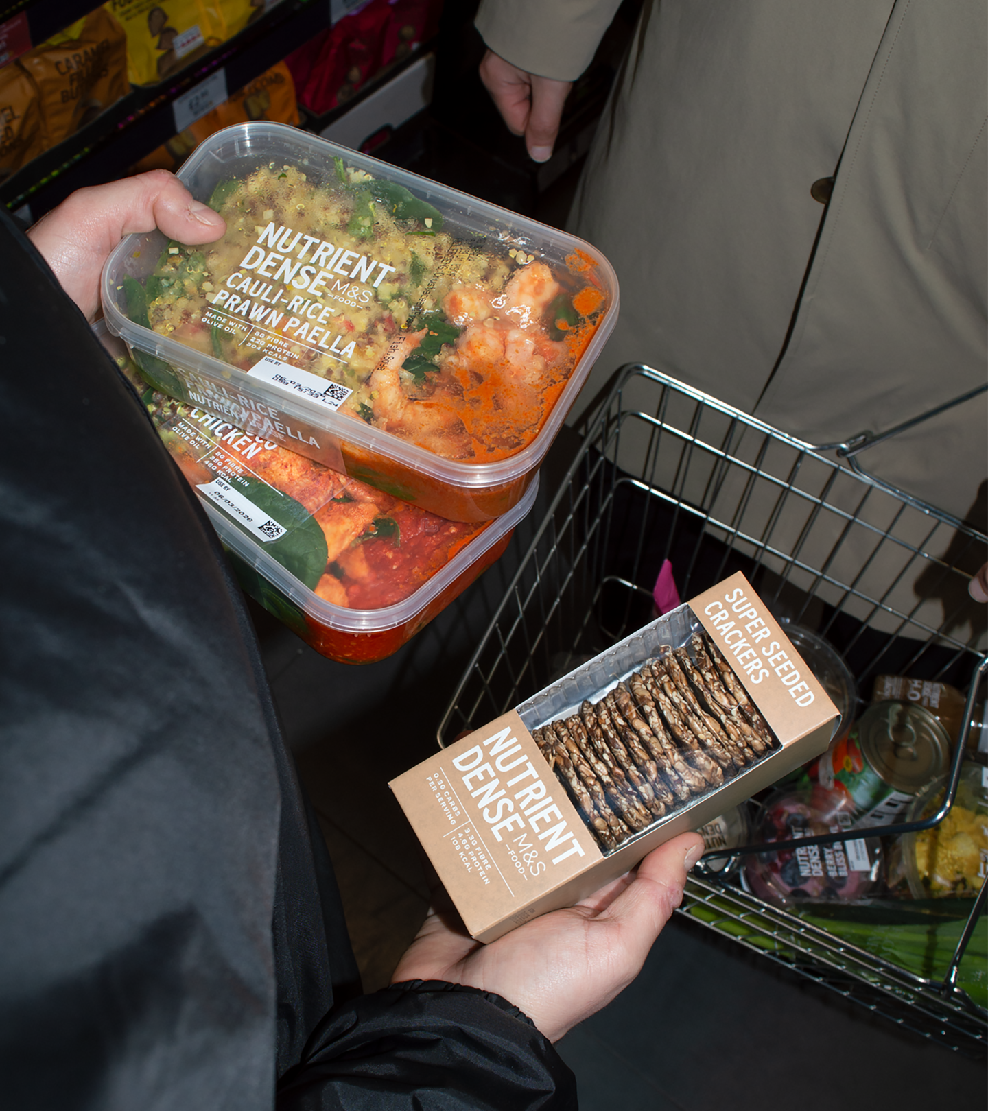
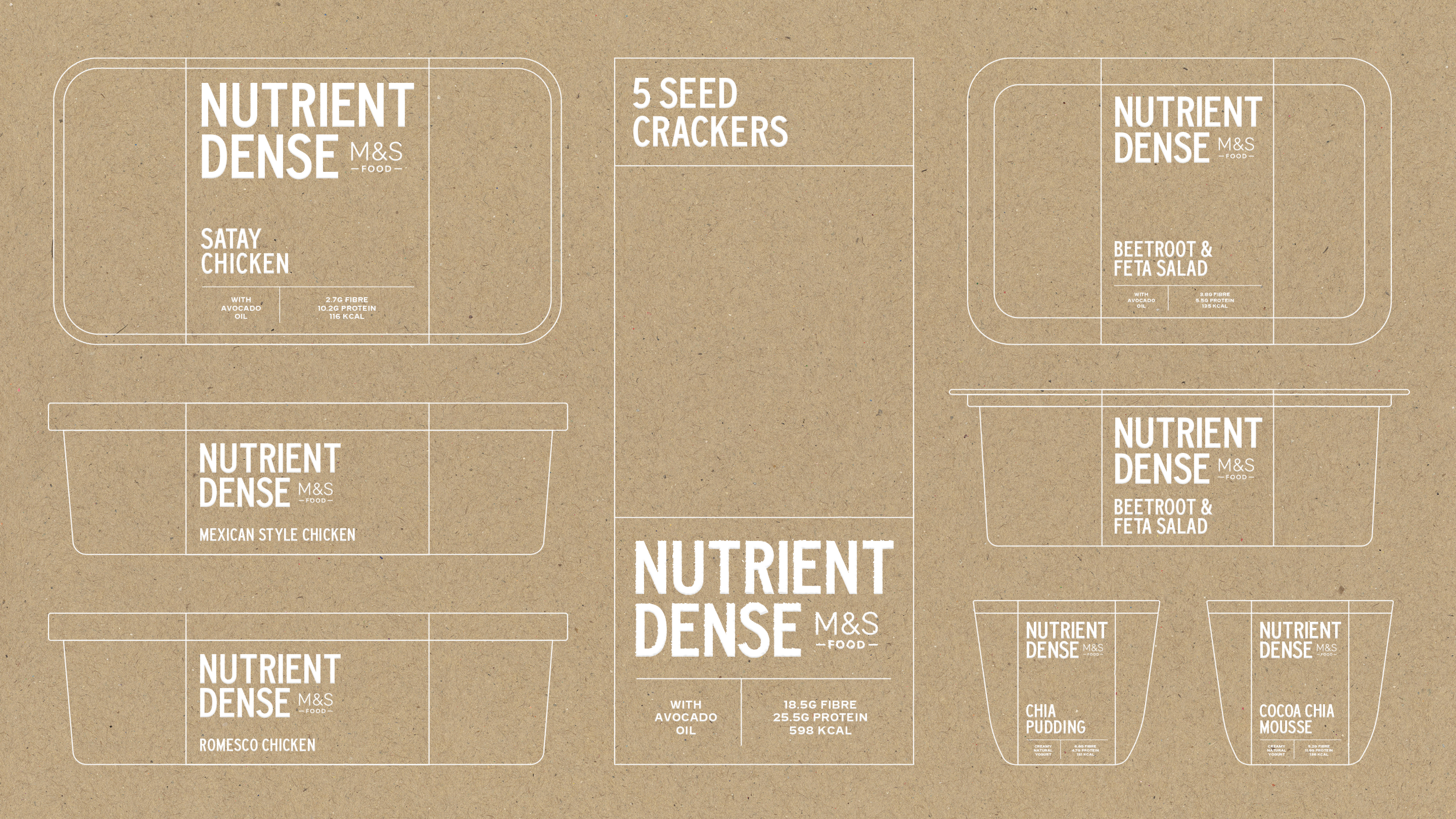
The visual identity is deliberately restrained. It is present but never shouty, allowing the food to do the talking. We created a system that is executed beautifully without being performative, providing super-clear navigational cues that make the range effortless to shop. It is a masterclass in functional elegance that proves good design, like good food, is all about balance.
Toggle
M&S Food: Nutrient Dense
- Packaging Systems
- Core Visual Identity System
- Art Direction
- Research and Insight
BRIEF
Studio Blackburn worked closely with the M&S Food team to bring their new health focused range, Nutrient Dense, to life. This was not about launching just another health range: it was about expressing what health means for M&S. We needed to translate the heartbeat of the concept into a visual language with total conviction.
WORK
Consumers are more informed than ever: they read labels and they value transparency. Our role was not to lecture but to respect that awareness. Following the Dieter Rams philosophy of “less, but better,” we stayed disciplined. We anchored the range in two truths: hard working nutrition and the classic M&S “tiny bit marvellous” feeling. By stripping away the non-essential, we created a brand that stands firmly behind the quality of the product.
PLAY
The visual identity is deliberately restrained. It is present but never shouty, allowing the food to do the talking. We created a system that is executed beautifully without being performative, providing super-clear navigational cues that make the range effortless to shop. It is a masterclass in functional elegance that proves good design, like good food, is all about balance.