

Canal & River Trust
Brand Refresh
2018
SCOPE
Brand Strategy and Positioning
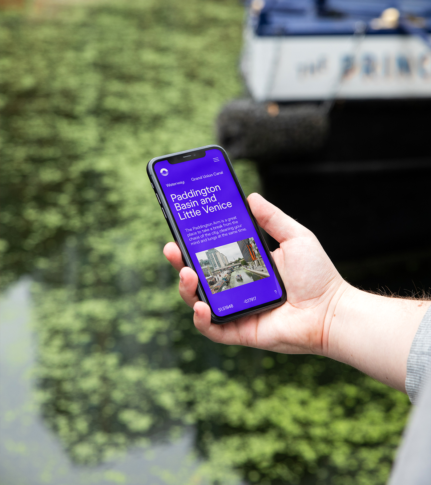
Visual Identity Systems
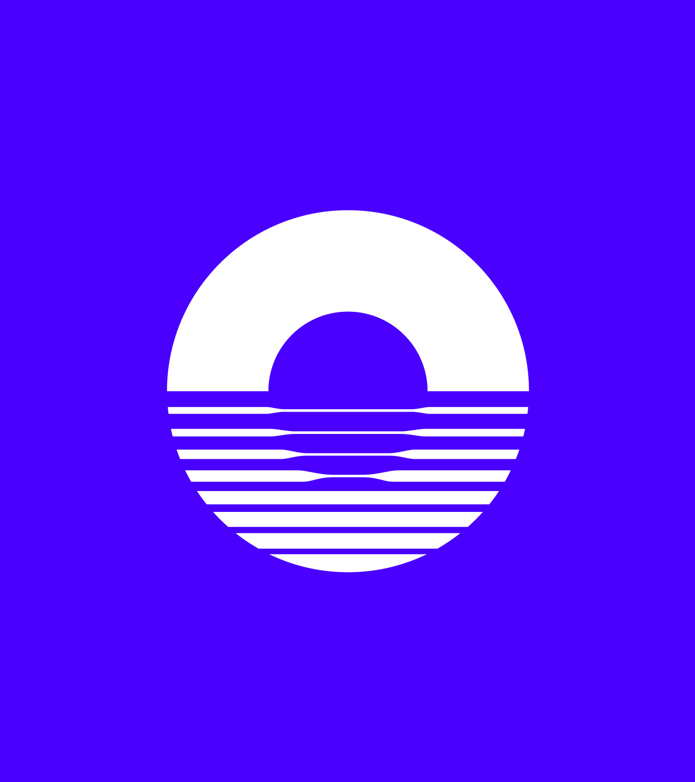
Symbol and Mark Development
Verbal Identity and Messaging
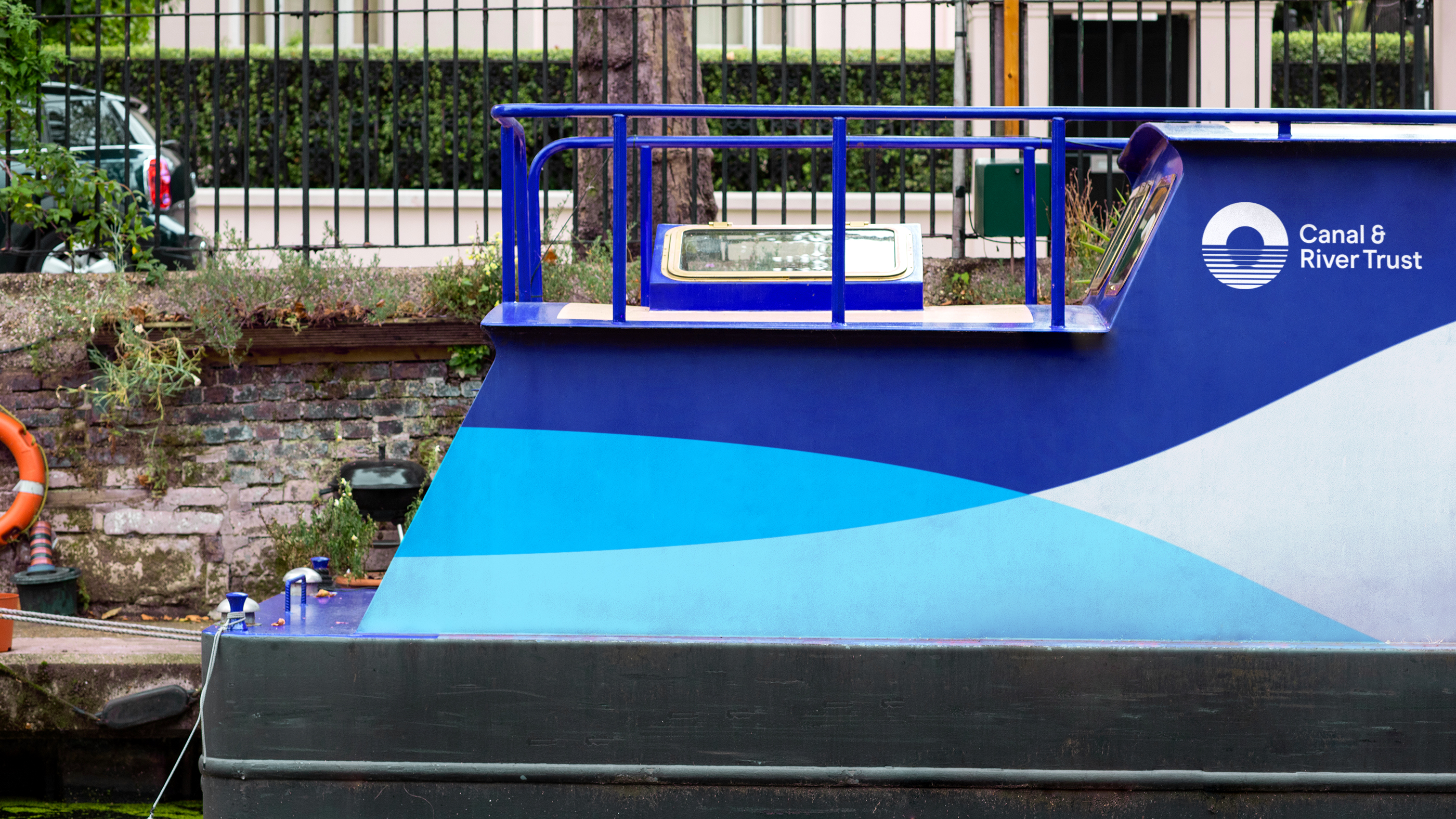
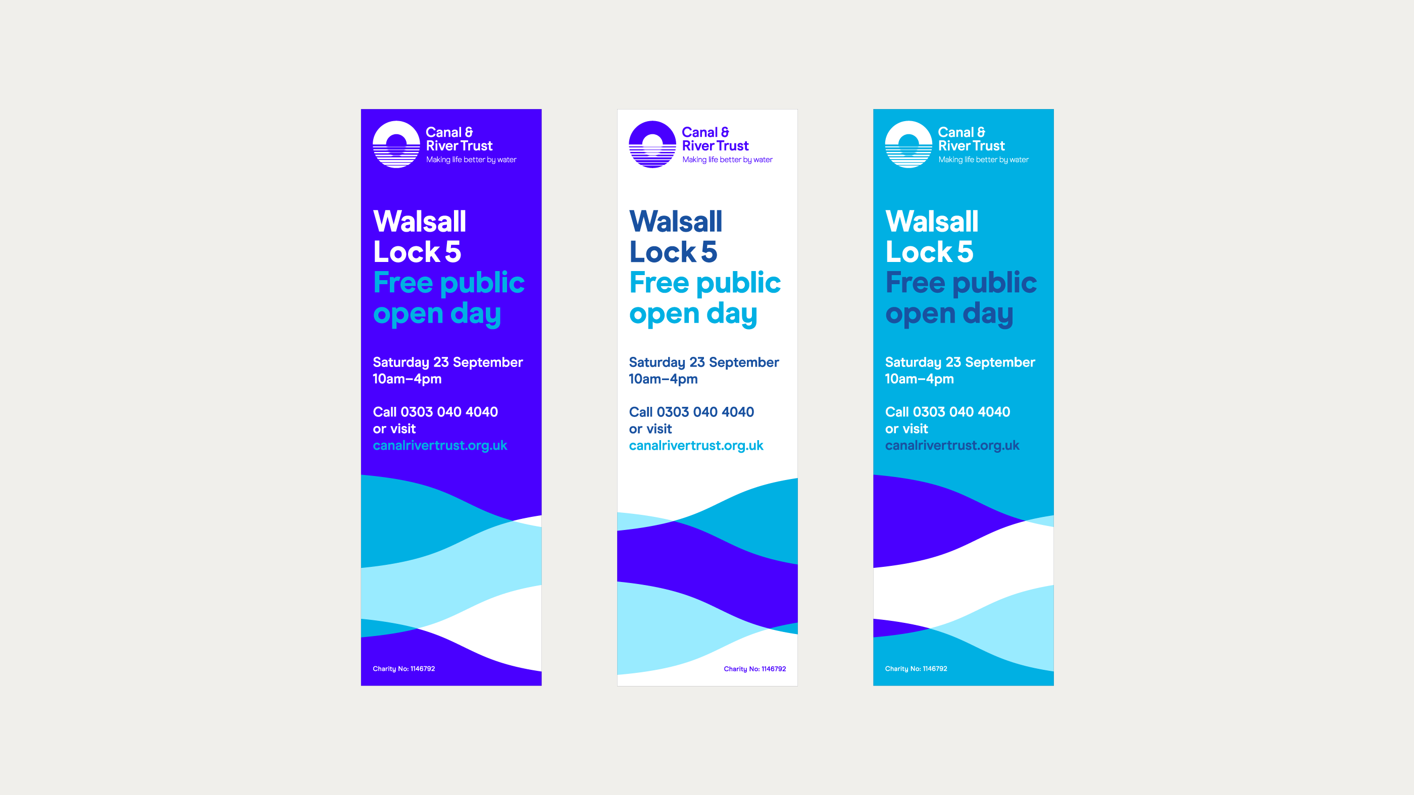
Colour Systems
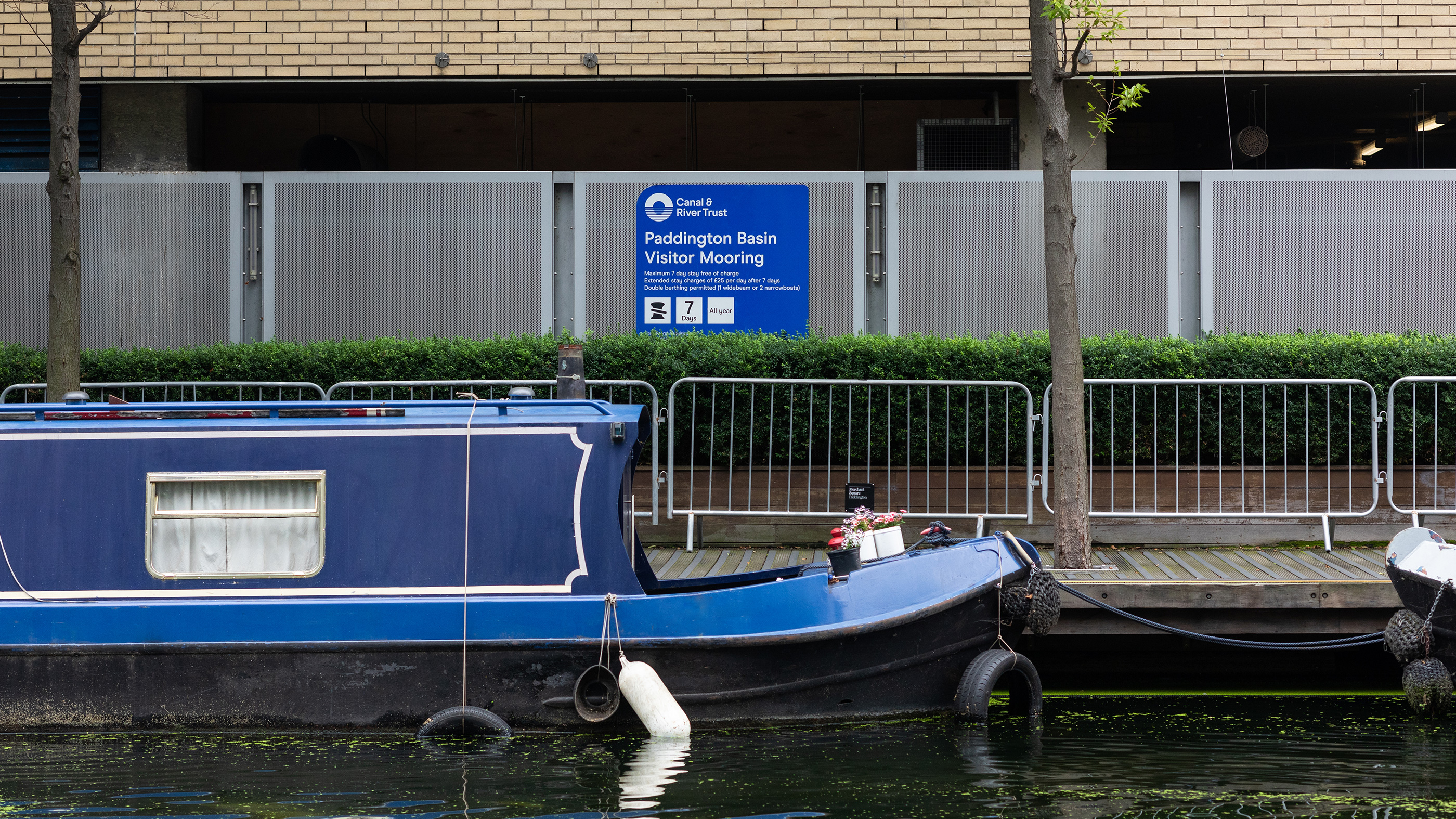
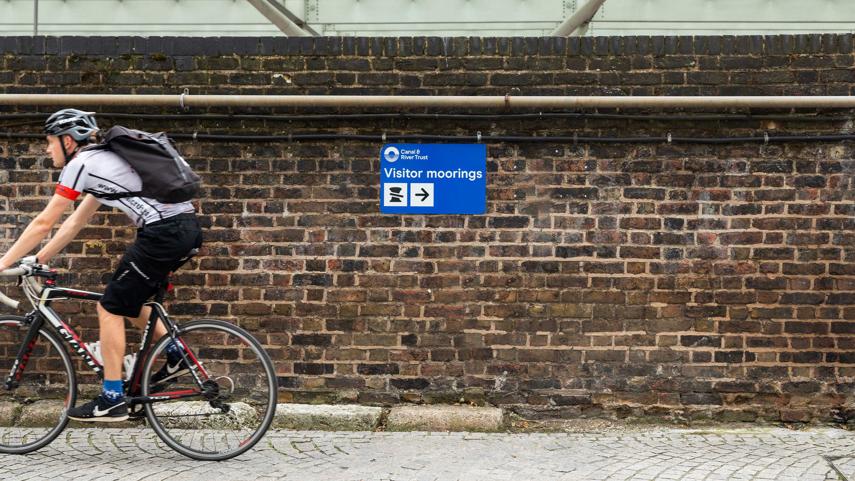
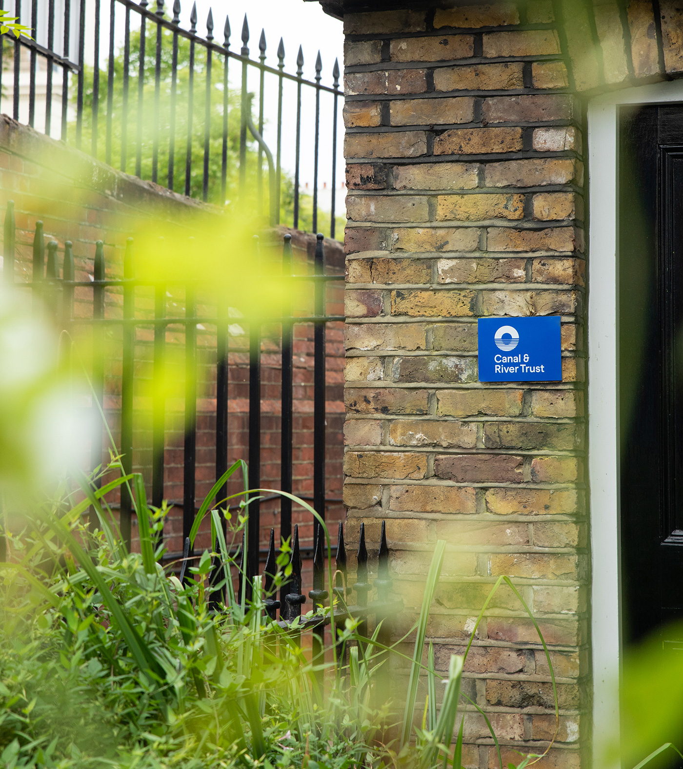
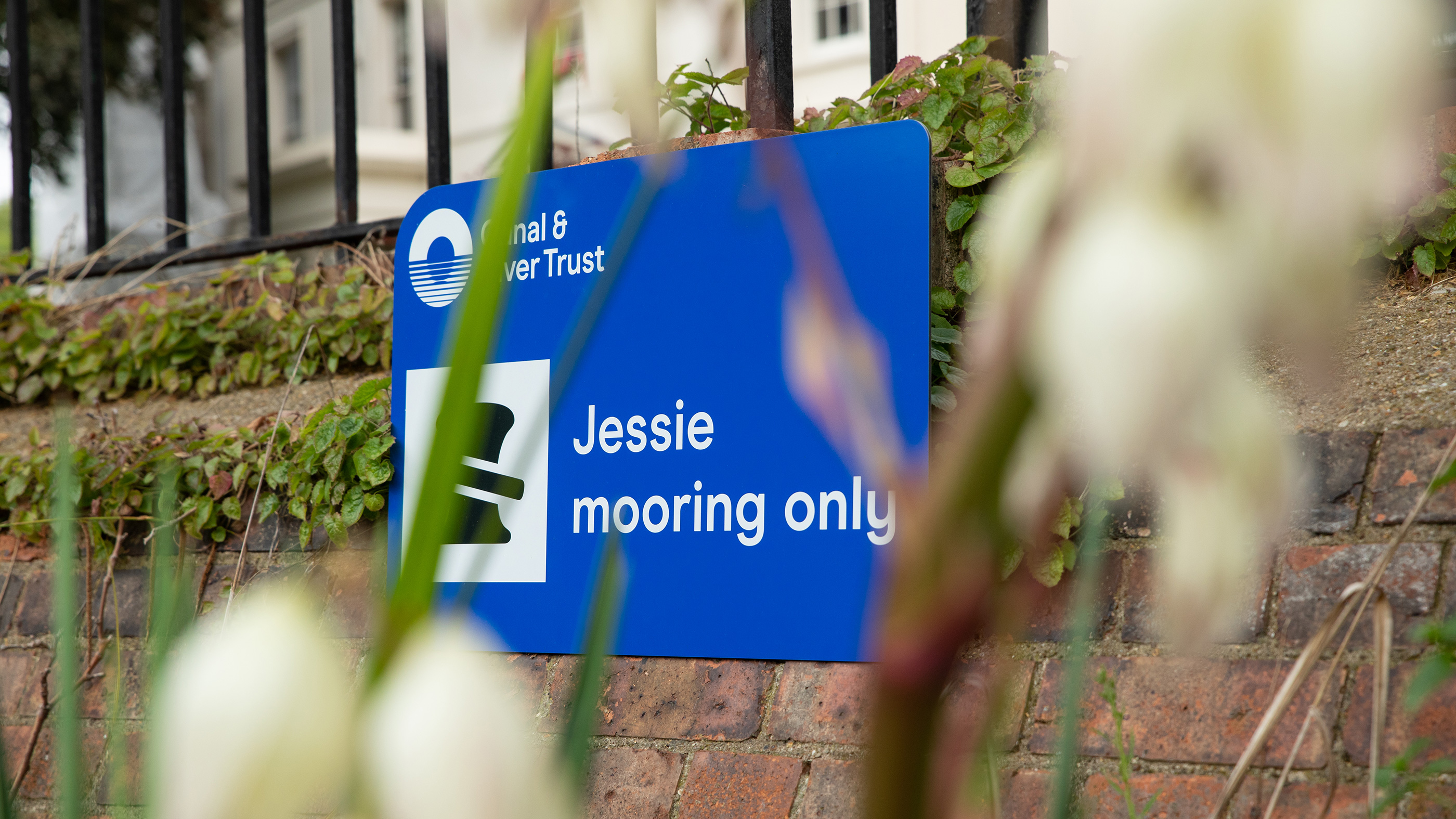
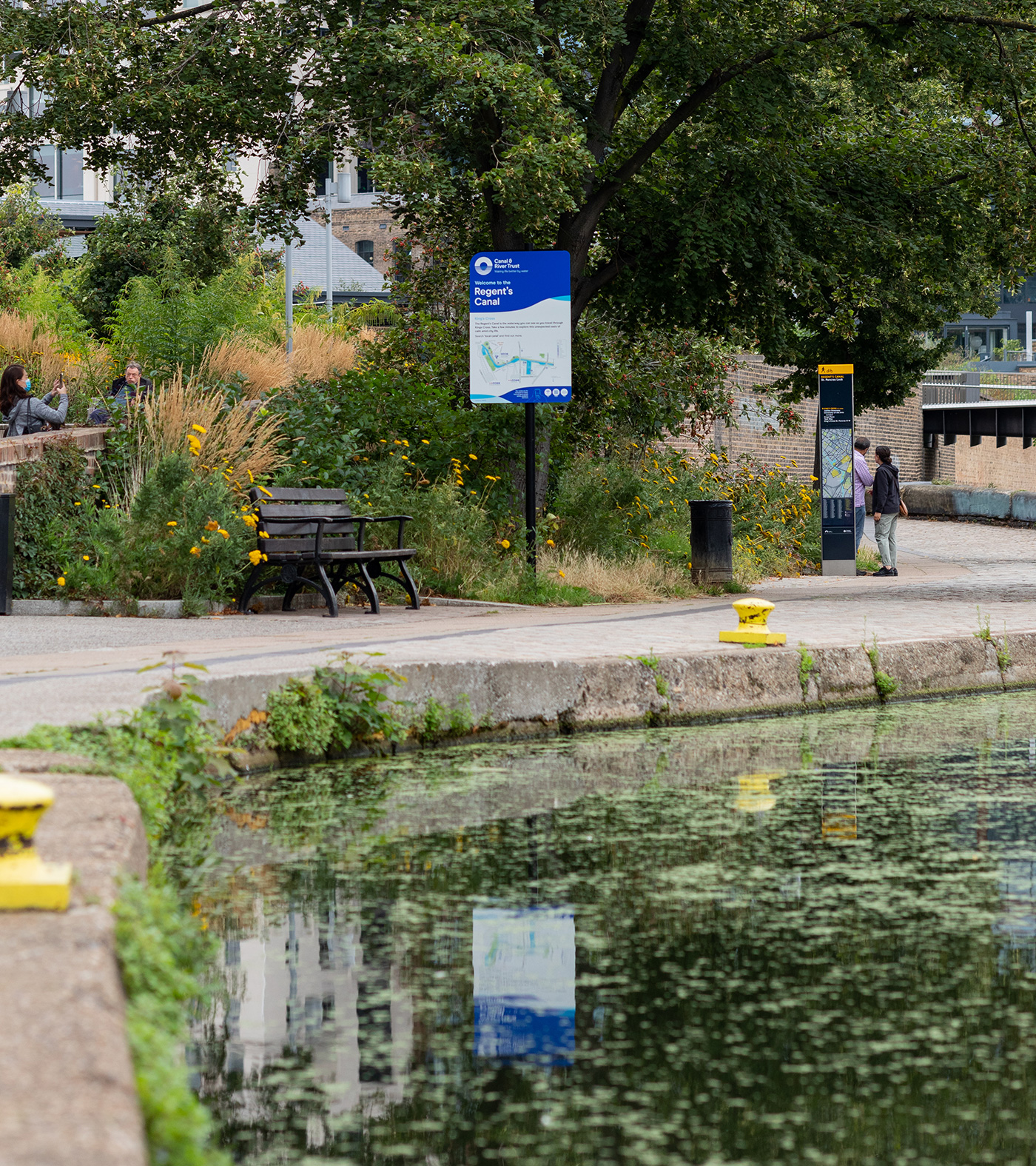
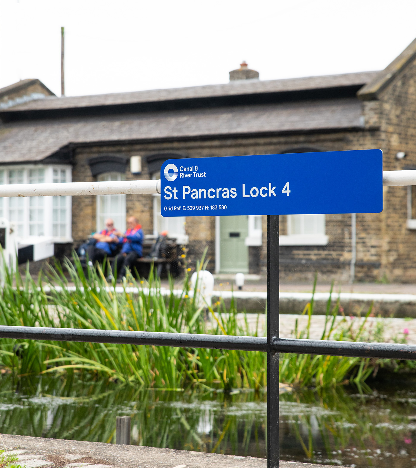
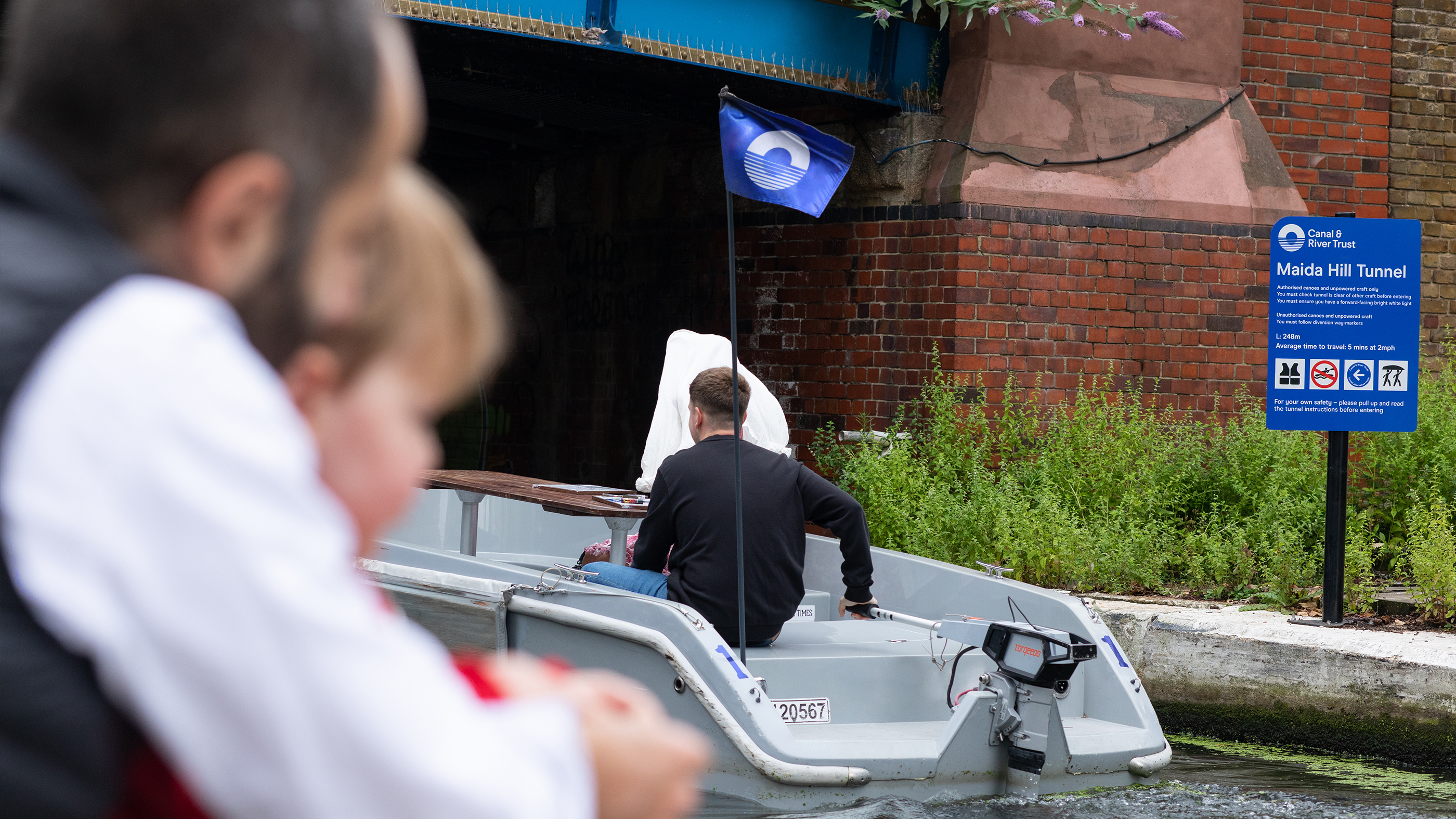
Environmental and Signage
Toggle
BRIEF
The Canal & River Trust is the charity responsible for 2,000 miles of inland waterways across England and Wales. They asked us to create an identity that captured the unique, positive feeling of being by the water. The core challenge was to move away from the stereotypical “chocolate box” imagery of narrowboats and locks to create a brand that feels relevant to a modern, diverse audience.
WORK
We moved the brand toward a more evocative and inclusive positioning. By establishing a benchmark of clarity for such a vast physical network, we ensured the Trust could communicate its role as a guardian of both nature and human wellbeing. We avoided the literal to focus on the emotional, creating a strategy that highlights the waterways as vital “blue and green” spaces that belong to everyone.
PLAY
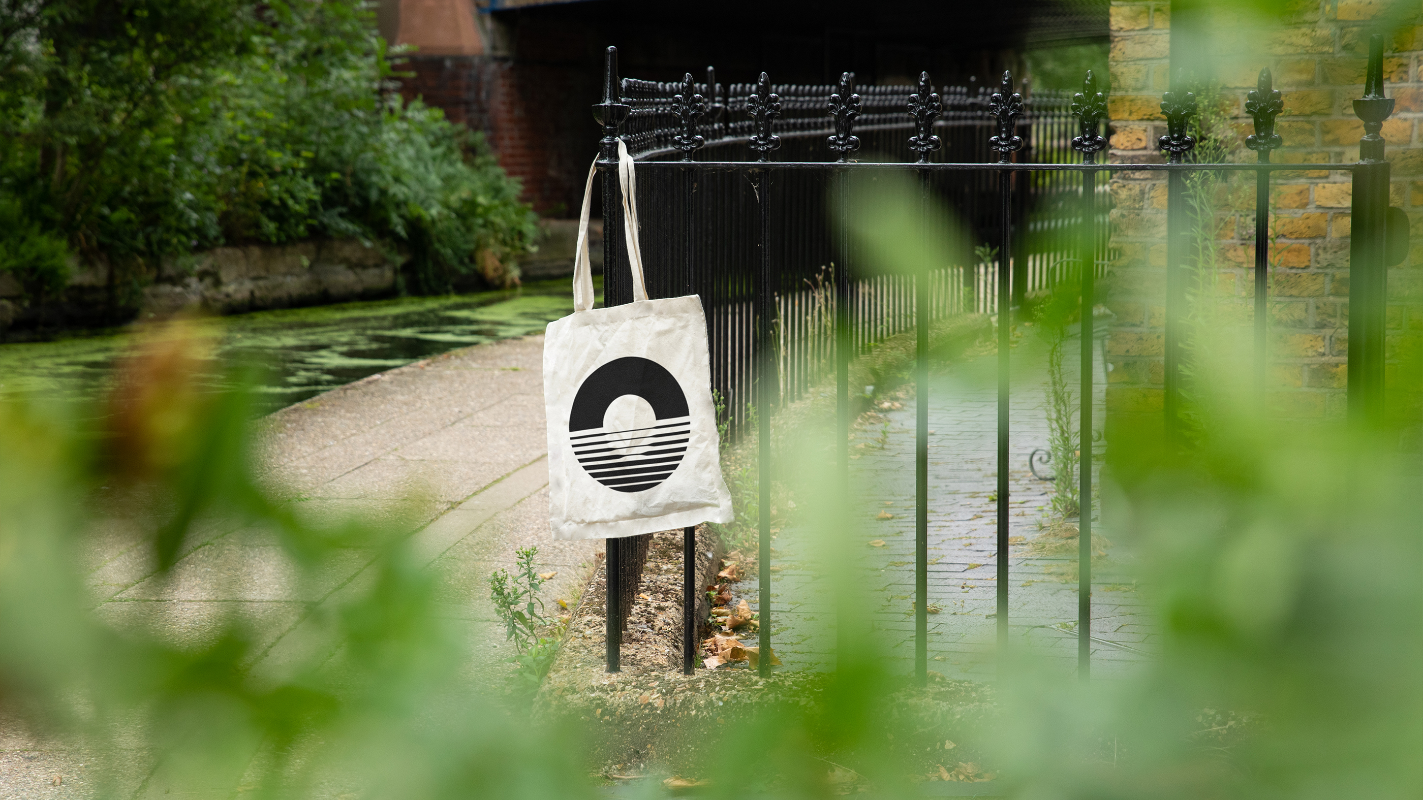
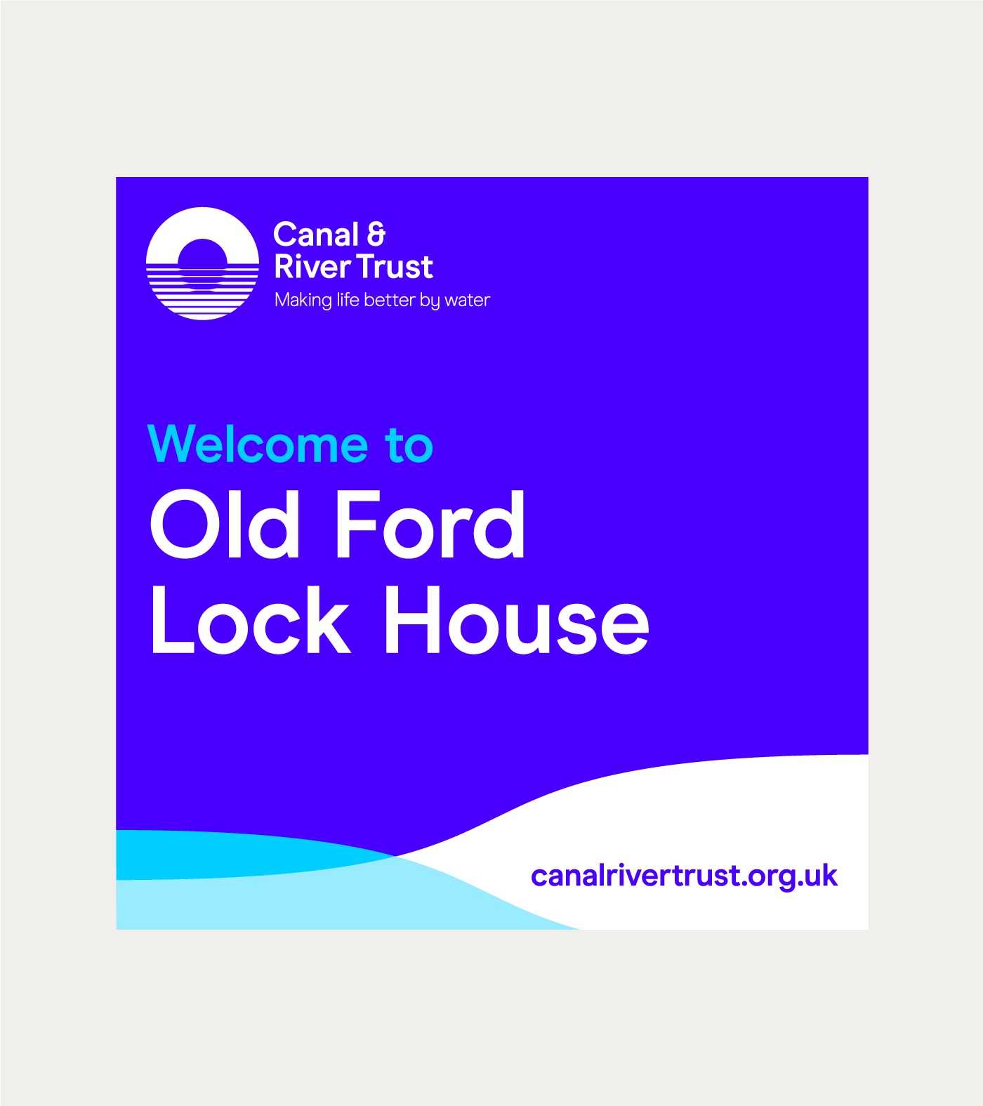
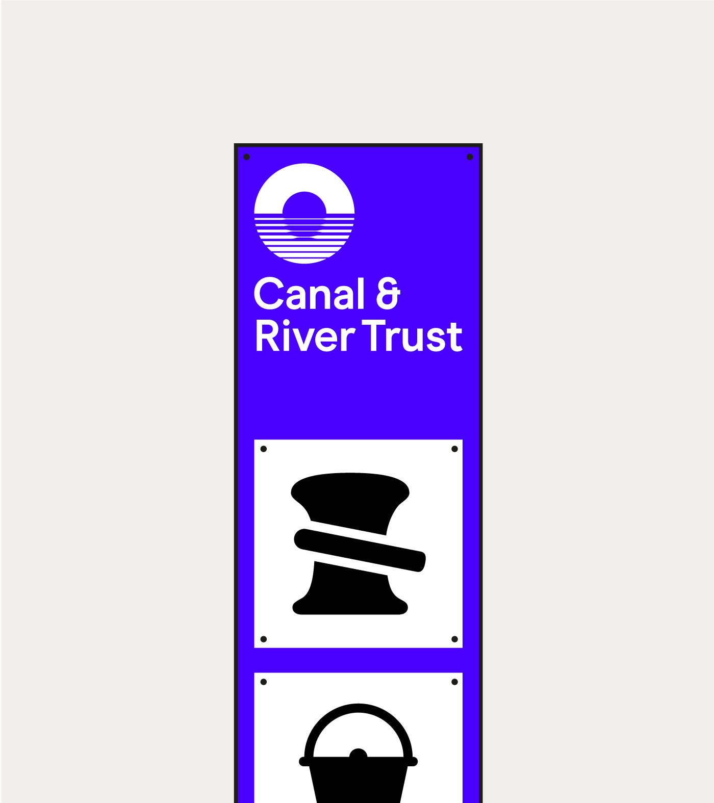
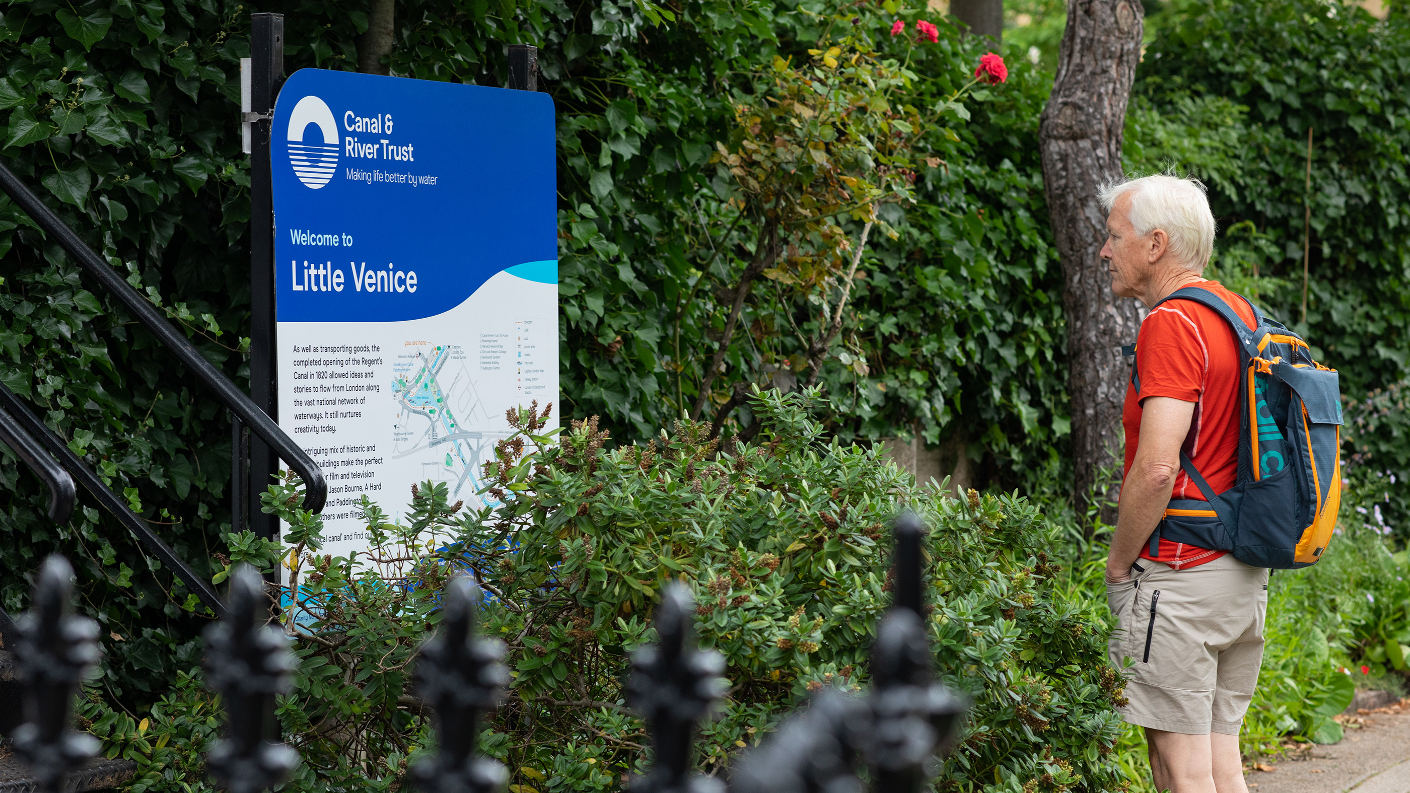
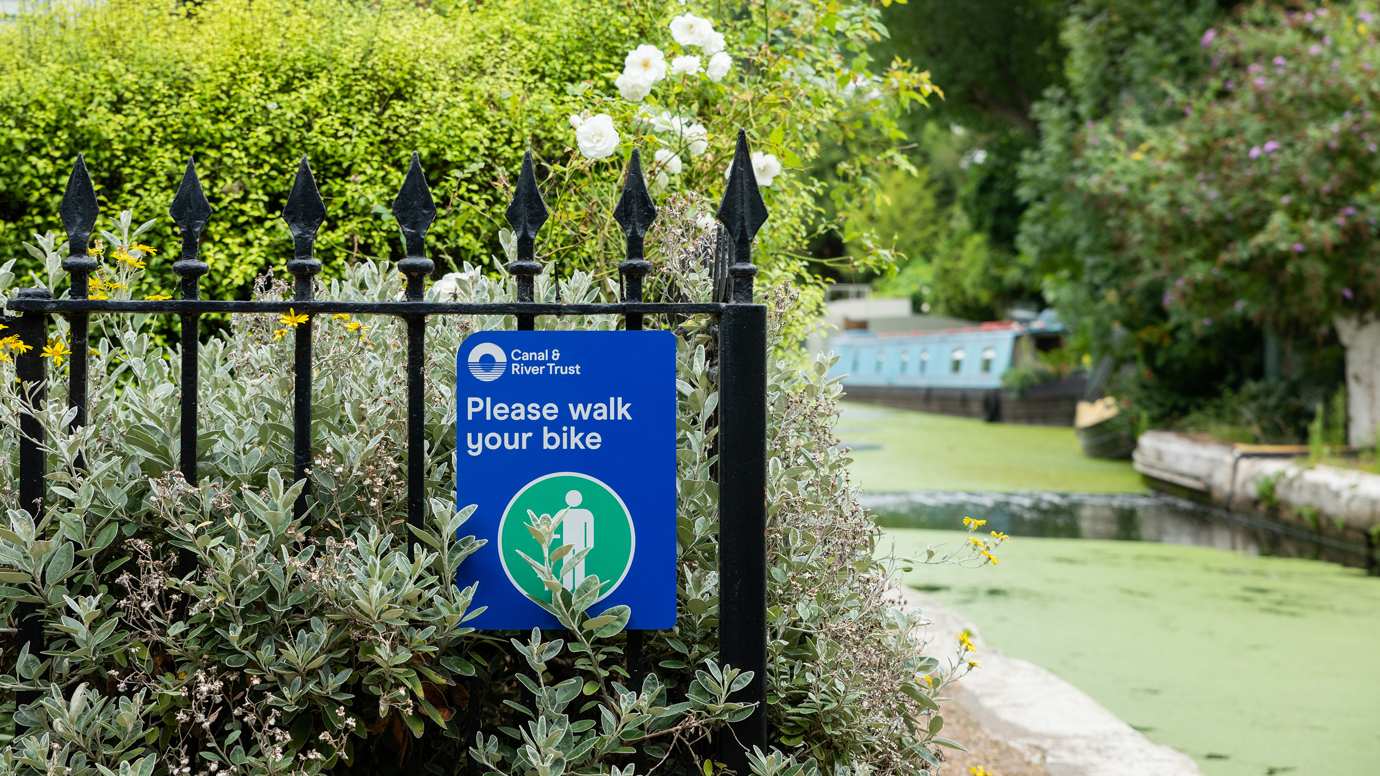
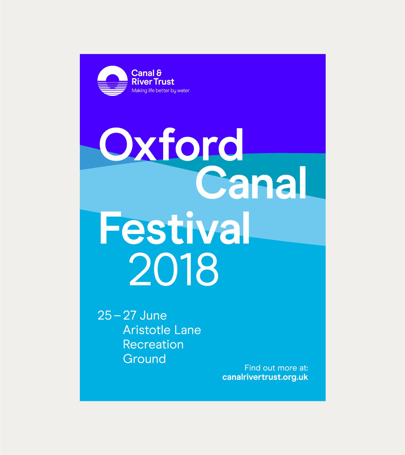
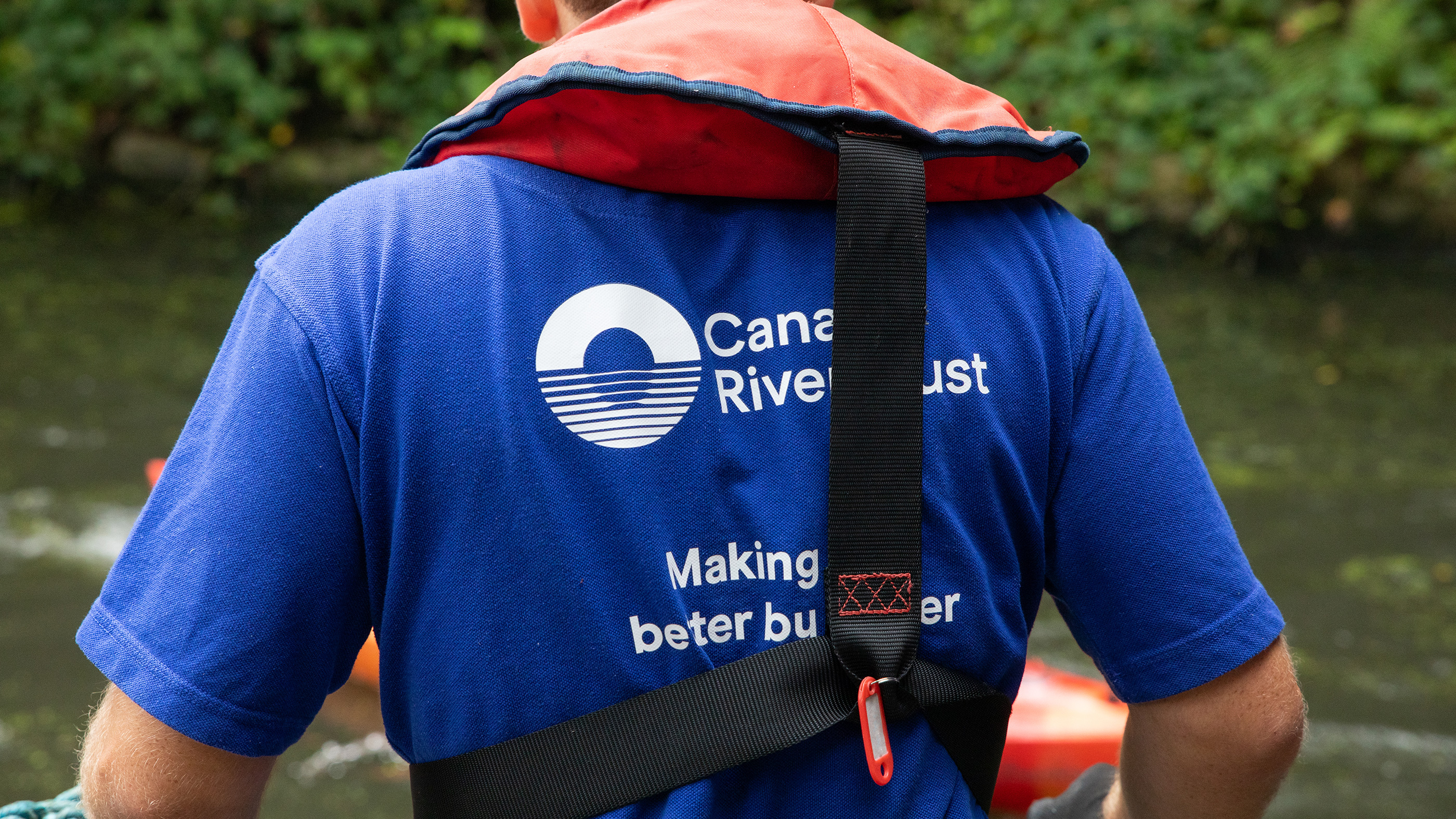
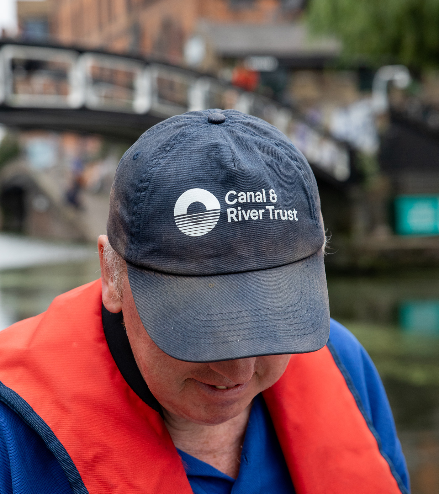
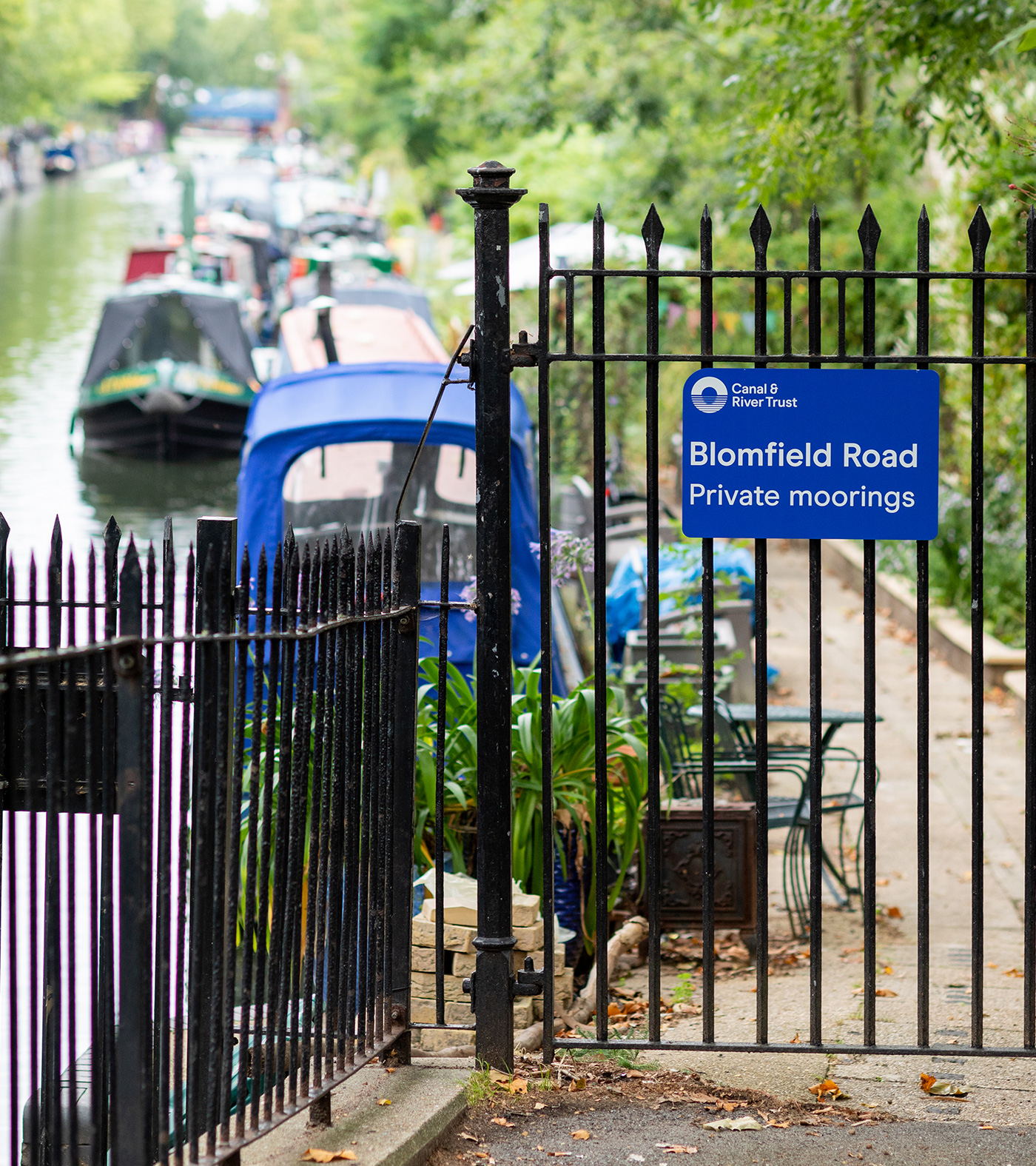
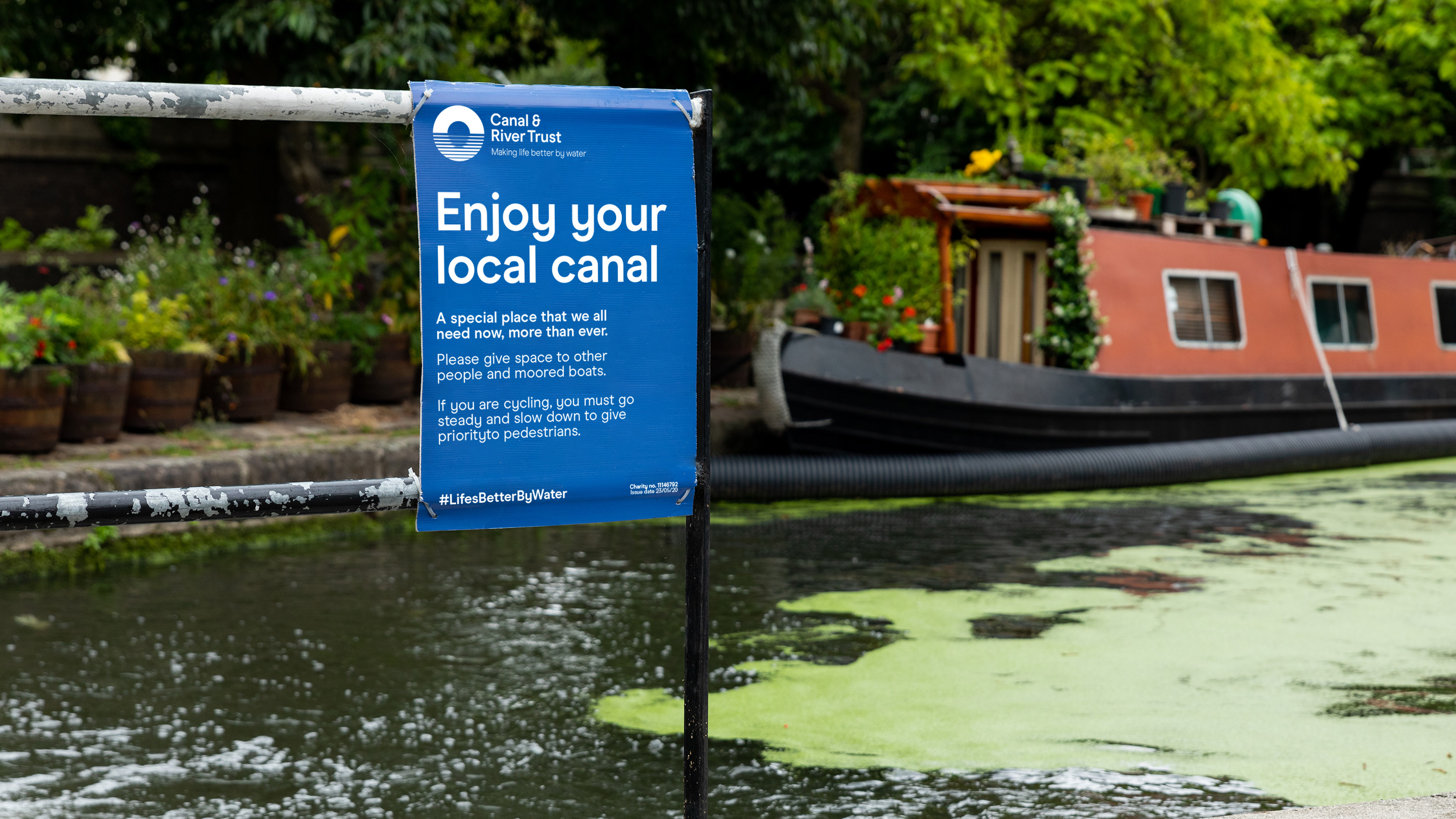
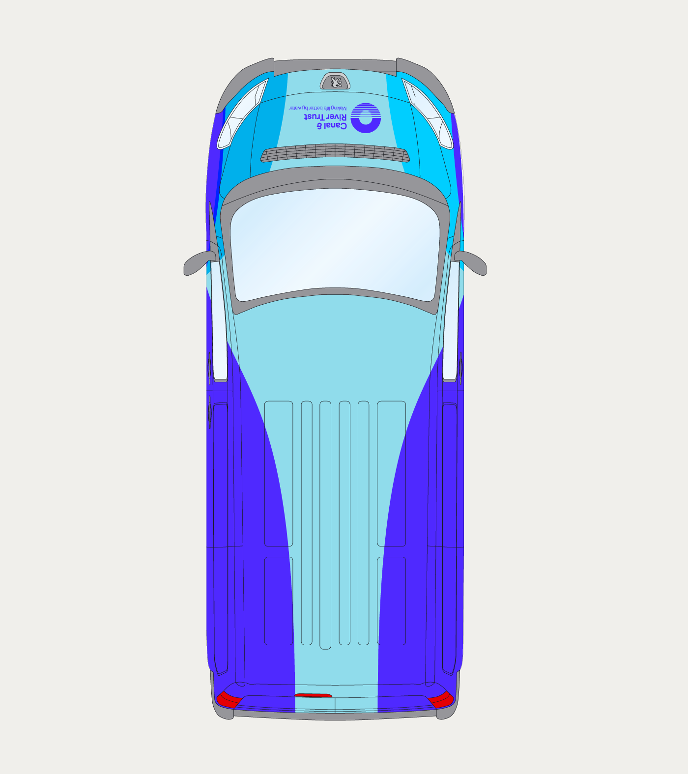
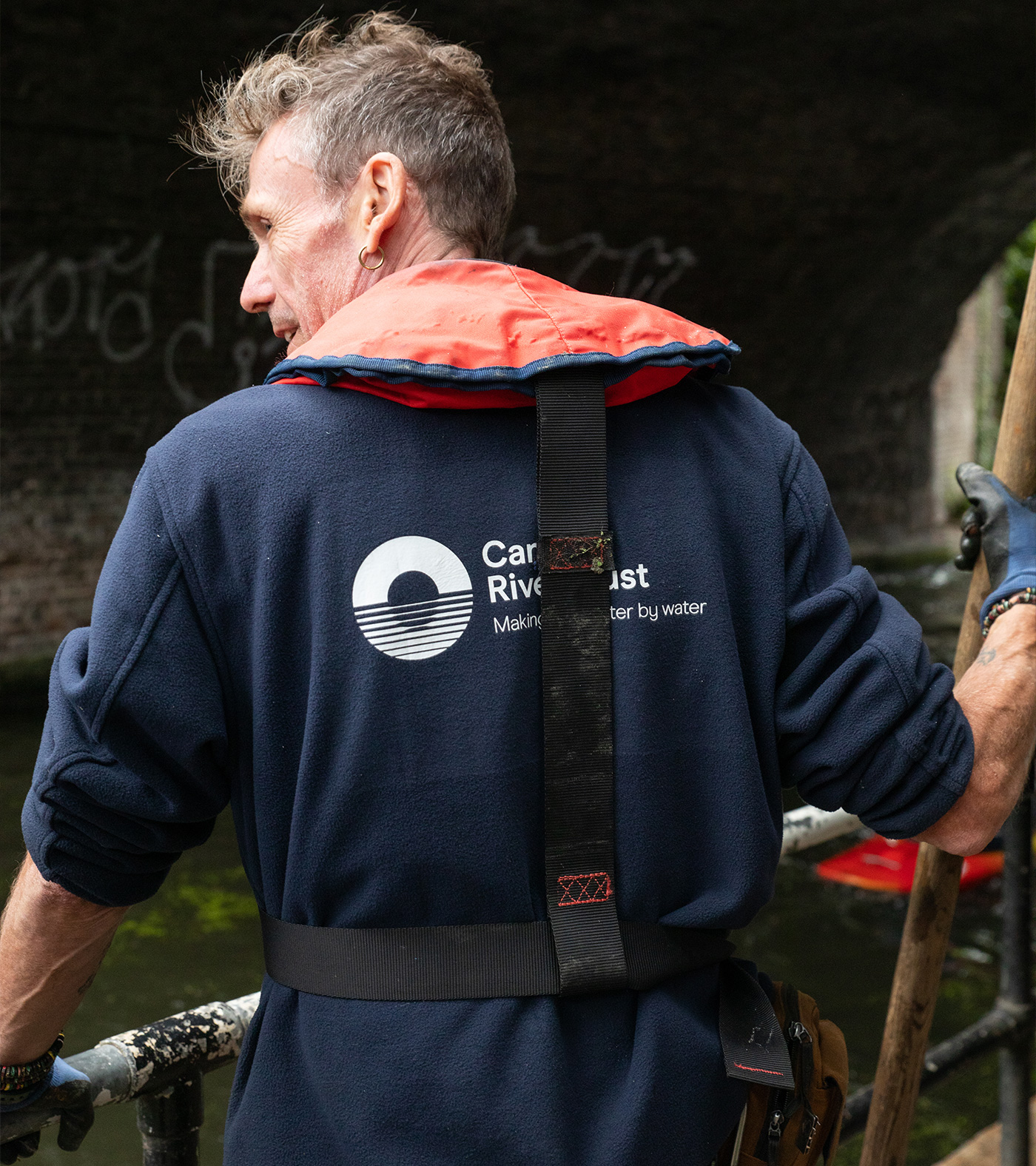
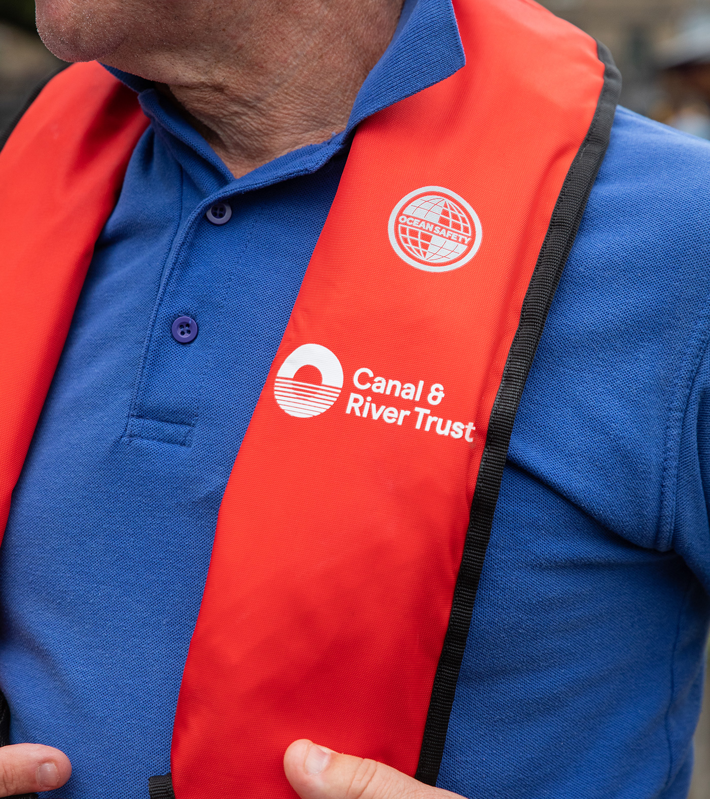
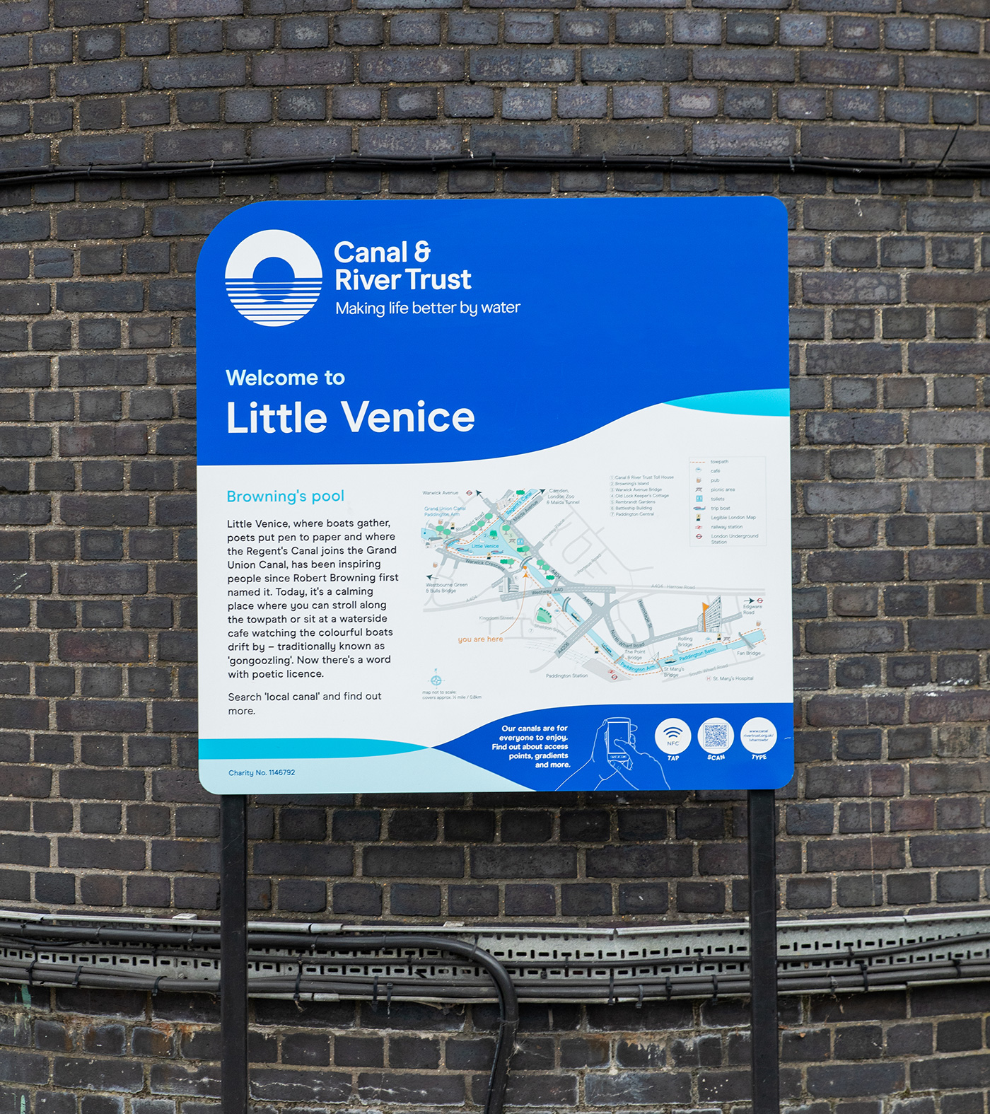
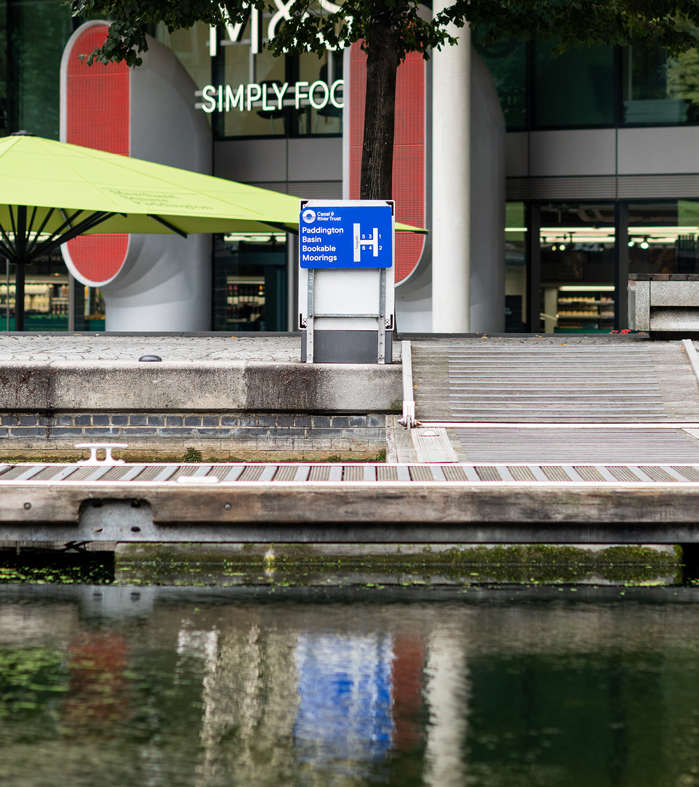
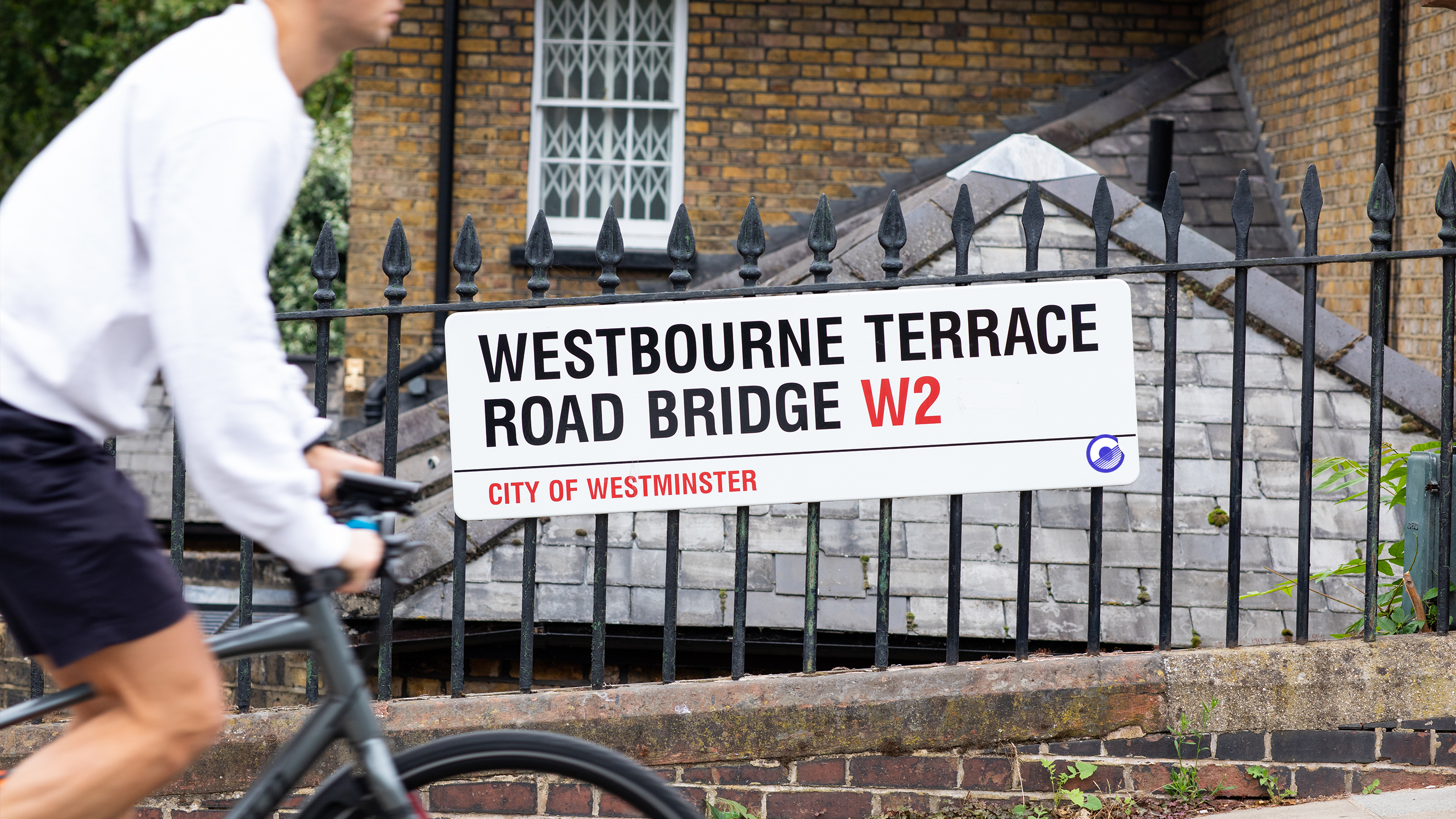
The visual solution is centred on the “Reflection Symbol”a graphic device that simultaneously references water ripples and the silhouettes of the iconic bridges found across the network. We introduced a flexible palette of nature-inspired colours, allowing the brand to feel as vibrant and varied as the environment it protects. Since the rollout, the Trust has seen an 87% visitor satisfaction rate, proving that a sophisticated design shift can lead to tangible growth and public connection.
Toggle
Canal & River Trust
- Brand Strategy and Positioning
- Visual Identity Systems
- Symbol and Mark Development
- Verbal Identity and Messaging
- Colour Systems
- Environmental and Signage
BRIEF
The Canal & River Trust is the charity responsible for 2,000 miles of inland waterways across England and Wales. They asked us to create an identity that captured the unique, positive feeling of being by the water. The core challenge was to move away from the stereotypical “chocolate box” imagery of narrowboats and locks to create a brand that feels relevant to a modern, diverse audience.
WORK
We moved the brand toward a more evocative and inclusive positioning. By establishing a benchmark of clarity for such a vast physical network, we ensured the Trust could communicate its role as a guardian of both nature and human wellbeing. We avoided the literal to focus on the emotional, creating a strategy that highlights the waterways as vital “blue and green” spaces that belong to everyone.
PLAY
The visual solution is centred on the “Reflection Symbol”a graphic device that simultaneously references water ripples and the silhouettes of the iconic bridges found across the network. We introduced a flexible palette of nature-inspired colours, allowing the brand to feel as vibrant and varied as the environment it protects. Since the rollout, the Trust has seen an 87% visitor satisfaction rate, proving that a sophisticated design shift can lead to tangible growth and public connection.