Unfolding a Global Icon
Toggle
Brompton is the world’s most famous folding bike brand. But as the brand expanded from a cult design favourite into a global presence across Europe and Asia, its identity faced fragmentation and a corporate clinical tone. The visual system needed to transition from a localised manufacturing aesthetic into a highly scalable, digital-first platform, providing a unified voice across retail, online, dealers, CRM, and advertising while driving long-term customer lifetime value.
Toggle
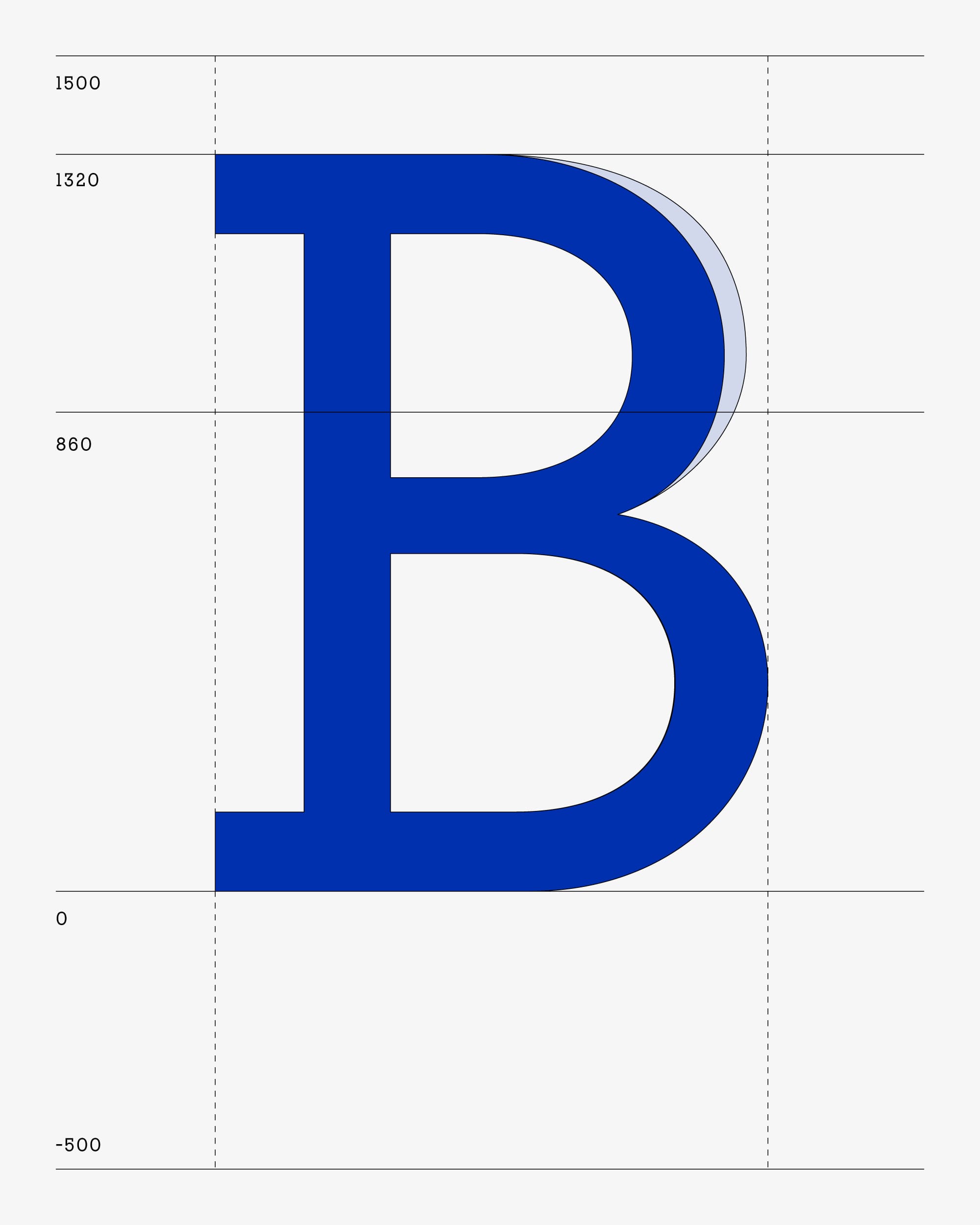
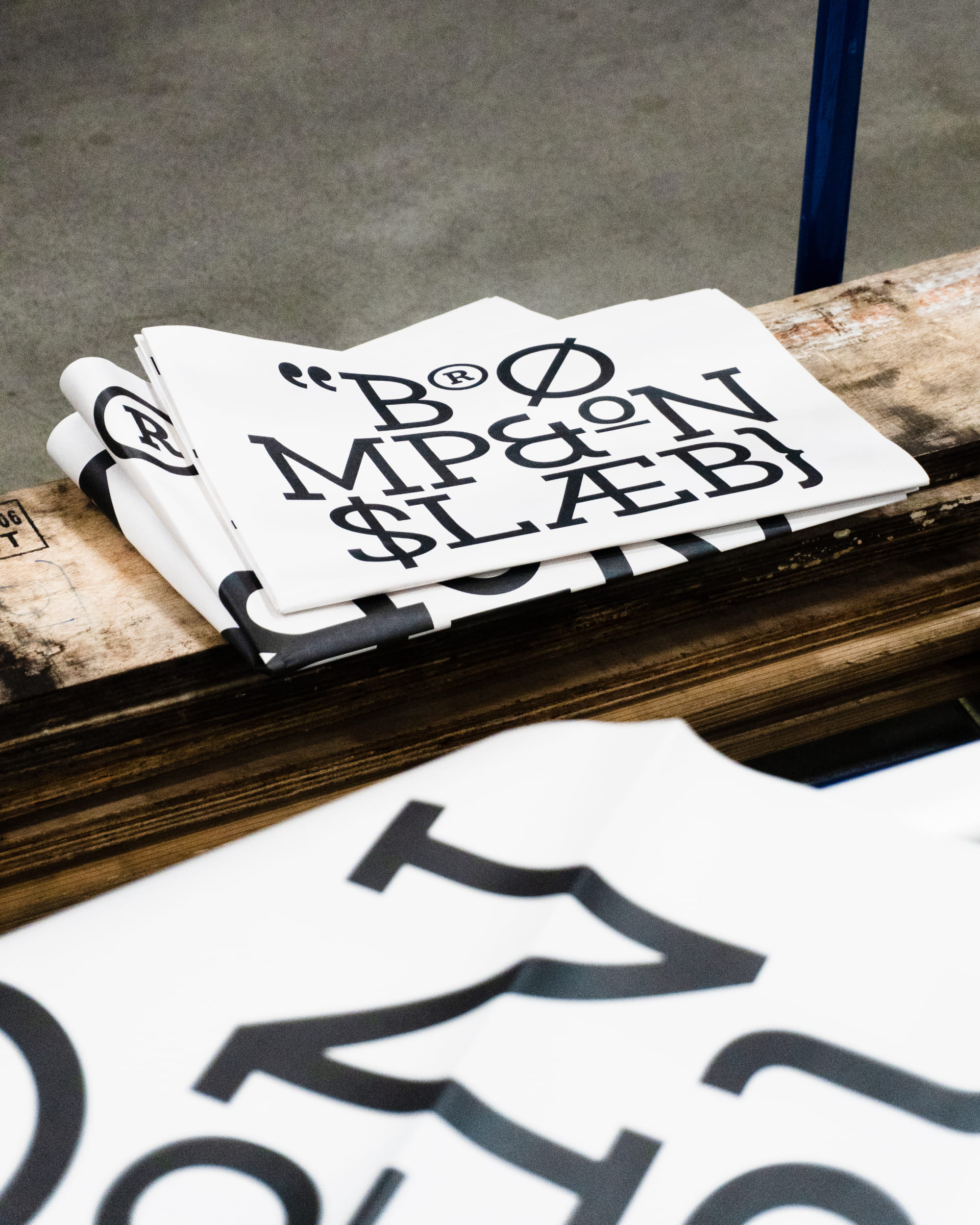
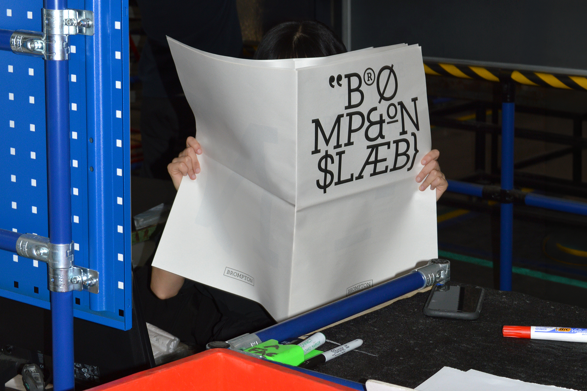
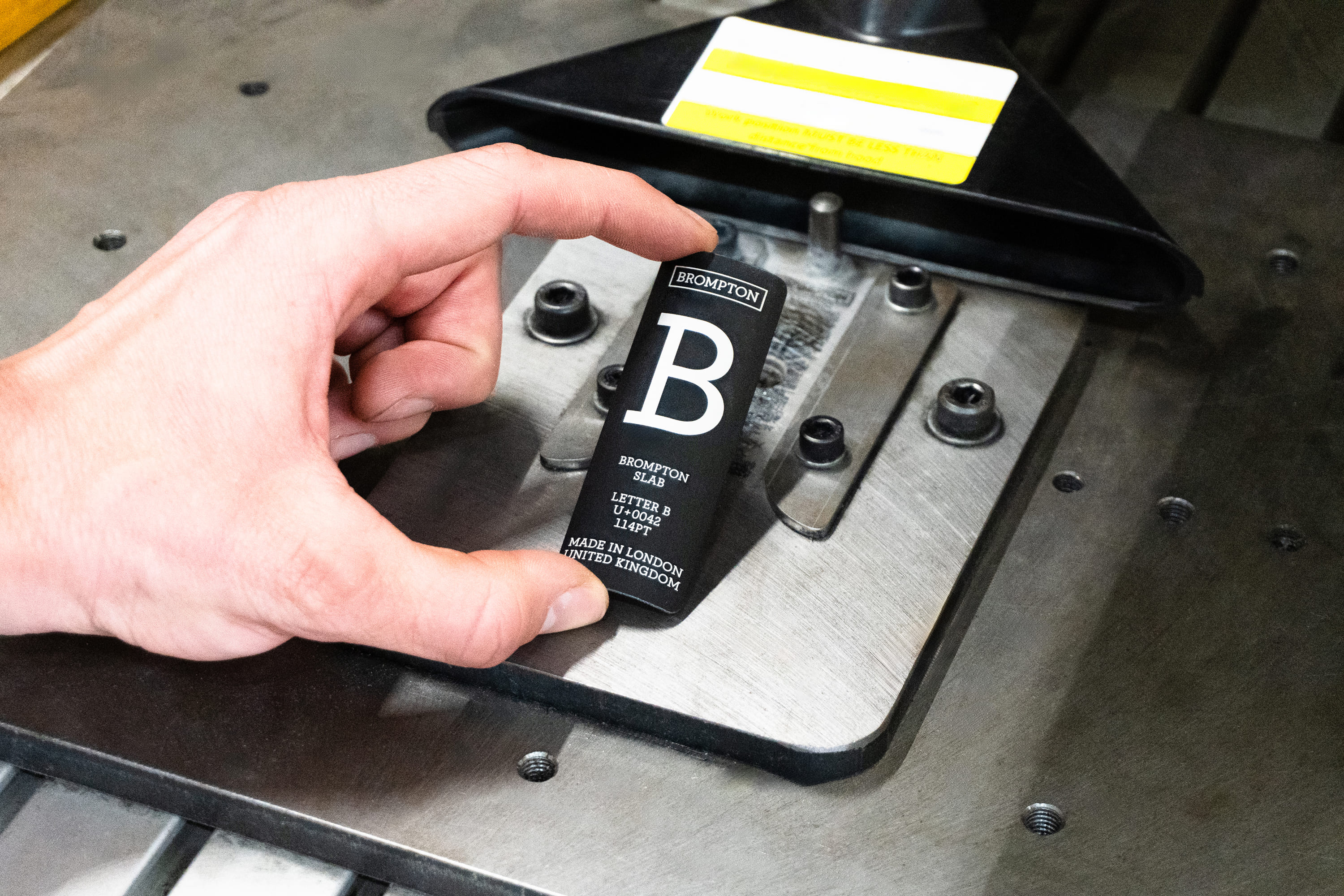
Custom Font: Brompton Slab
Toggle
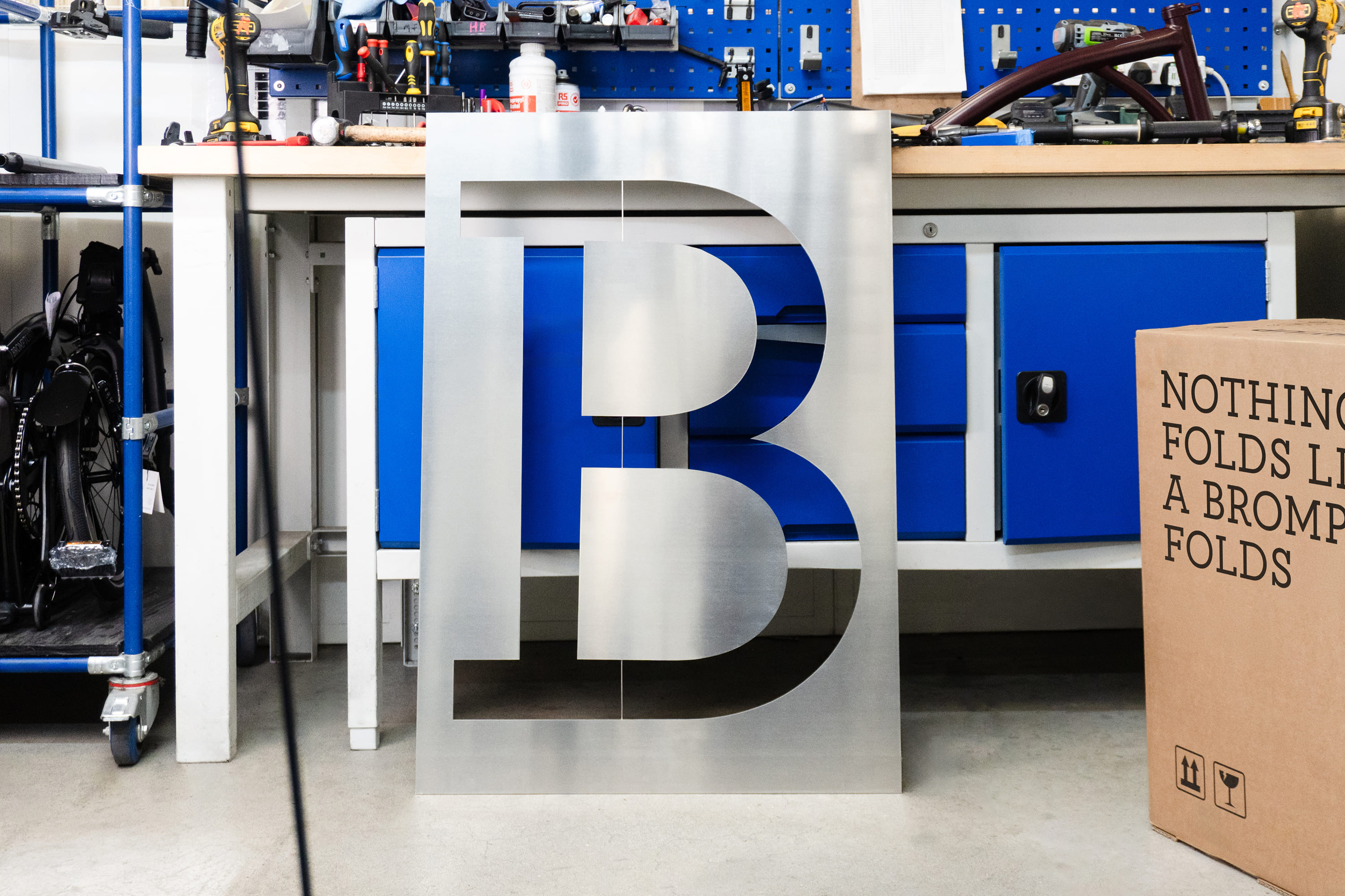
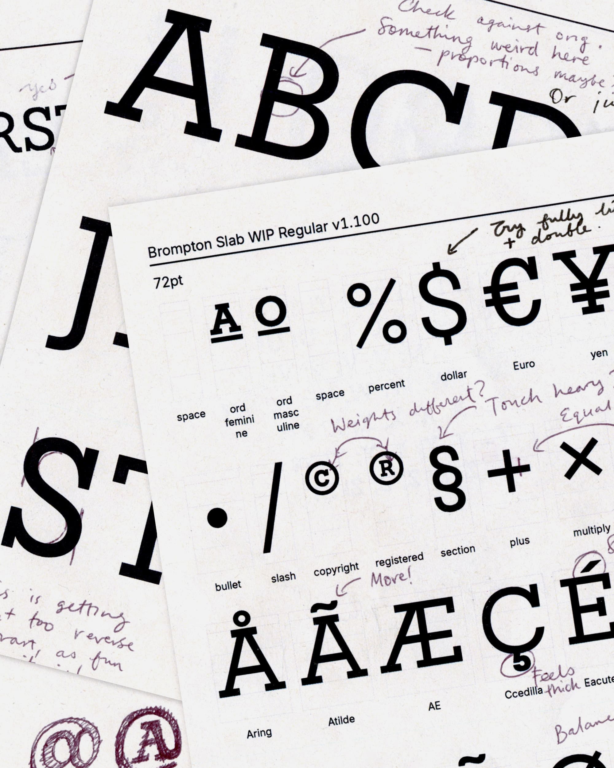
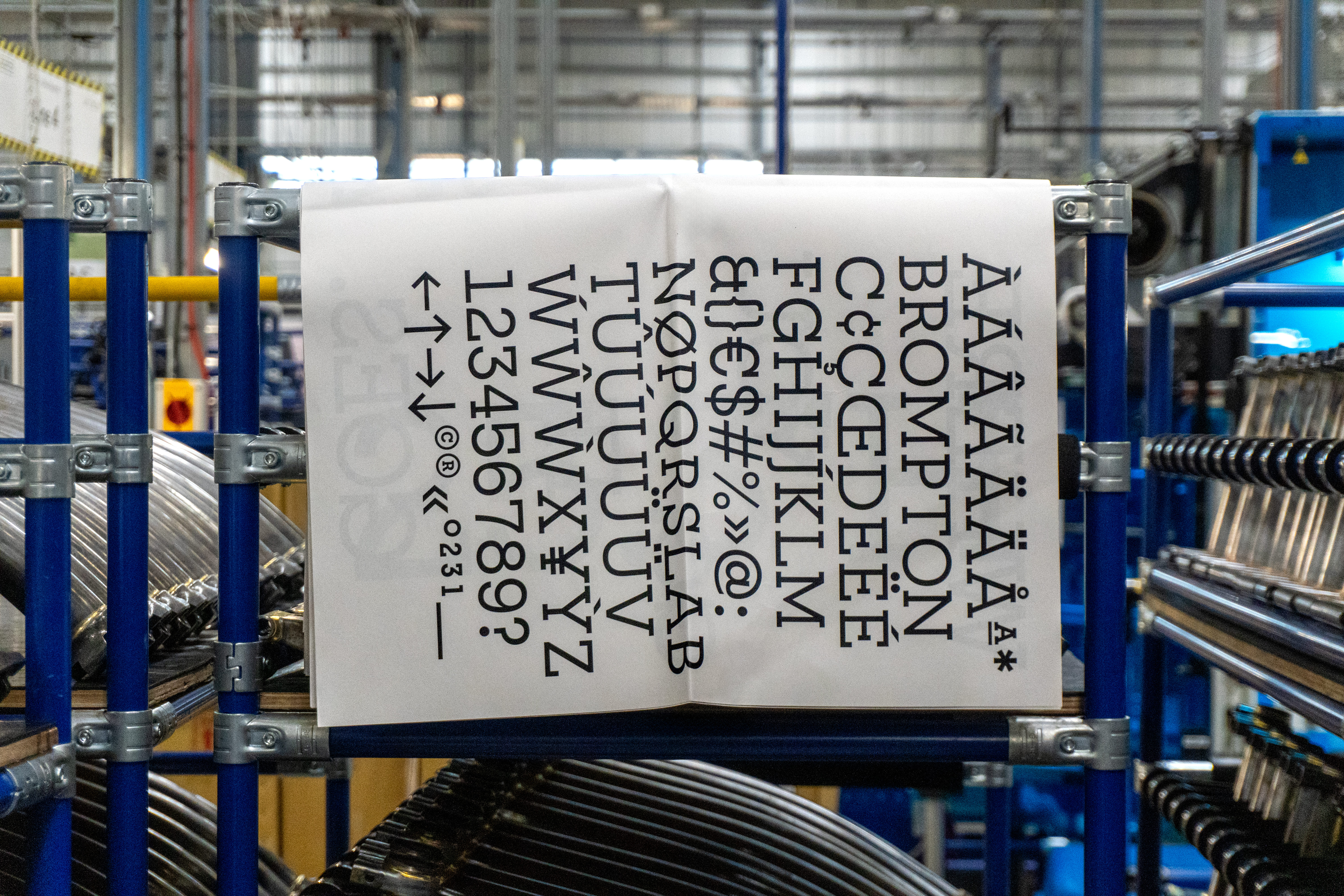
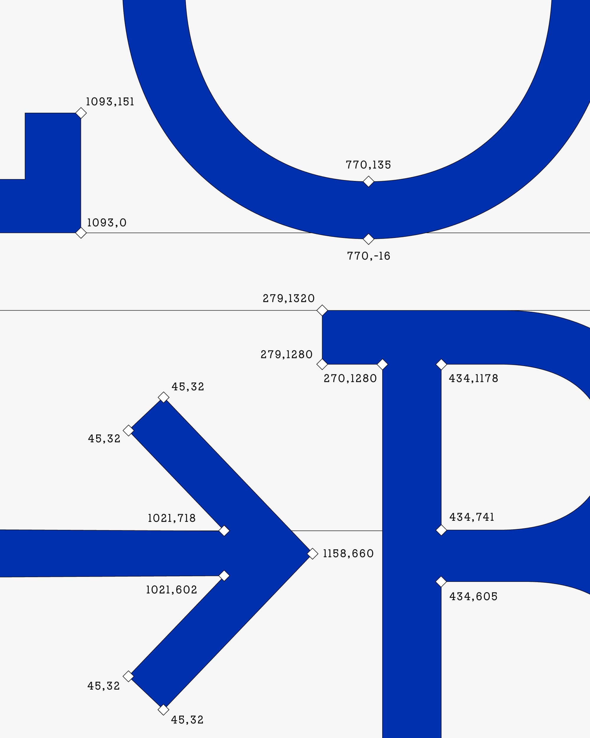
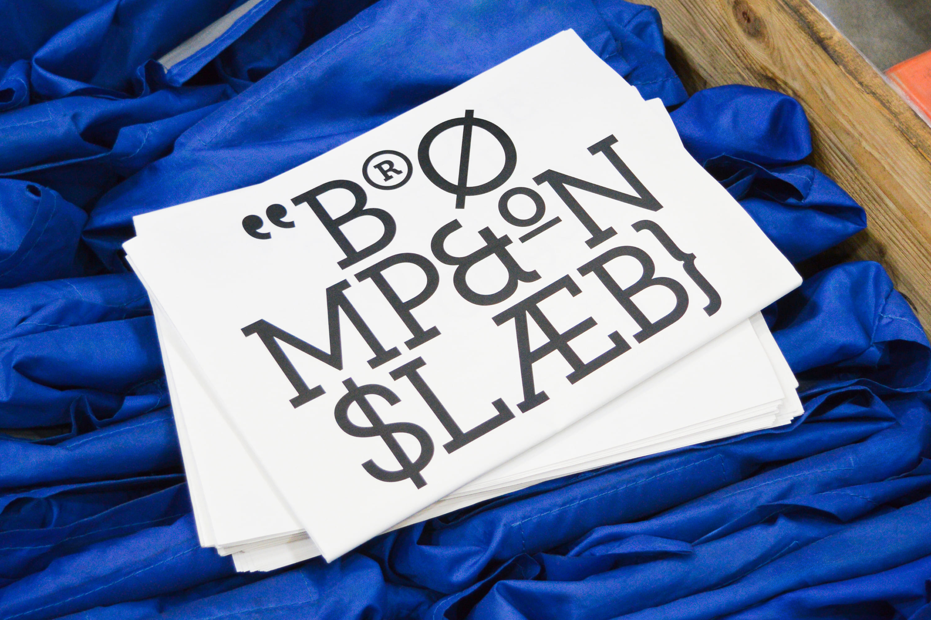
We chose not to mess with the core Brompton logo or its beloved triptych symbol; both have been around since the brand’s inception and are as structurally sound as the bike frame itself. However, the original logotype had never been built into a full alphabet, leaving internal teams without essential punctuation marks or characters for international markets.
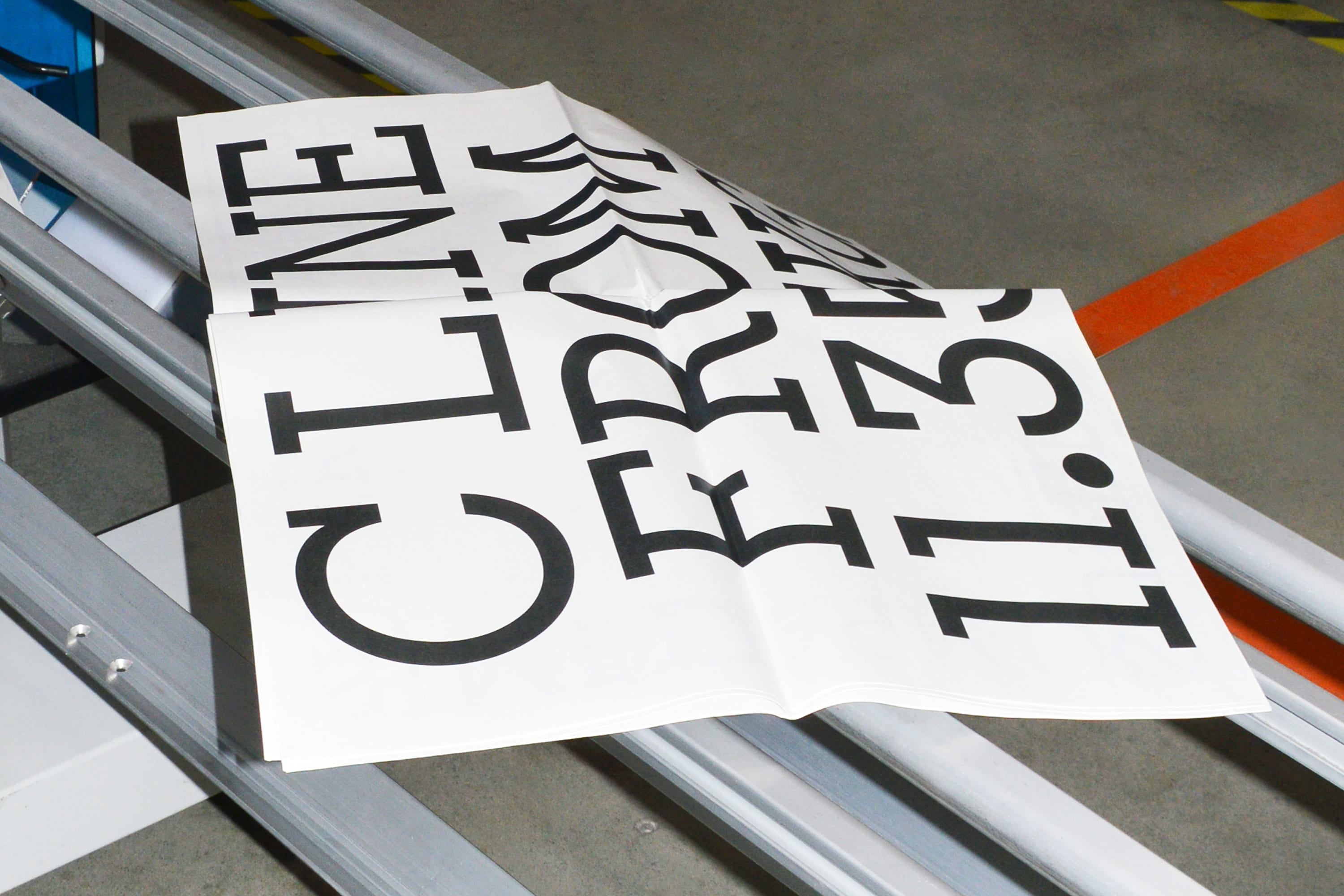
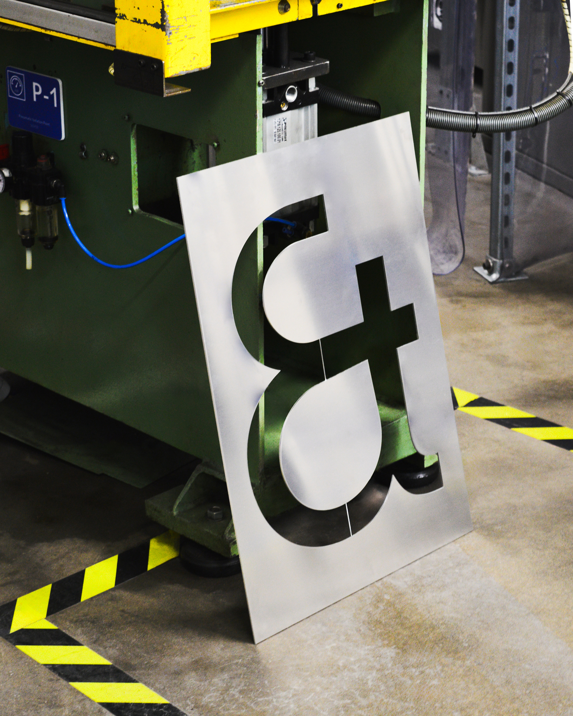
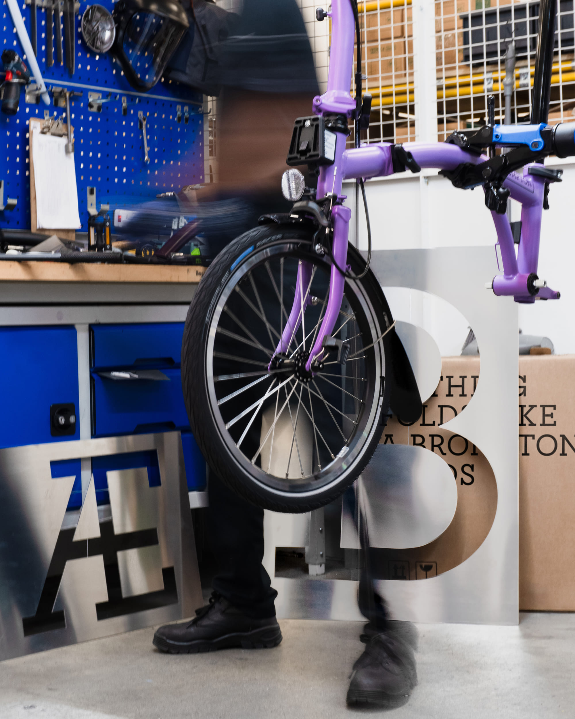
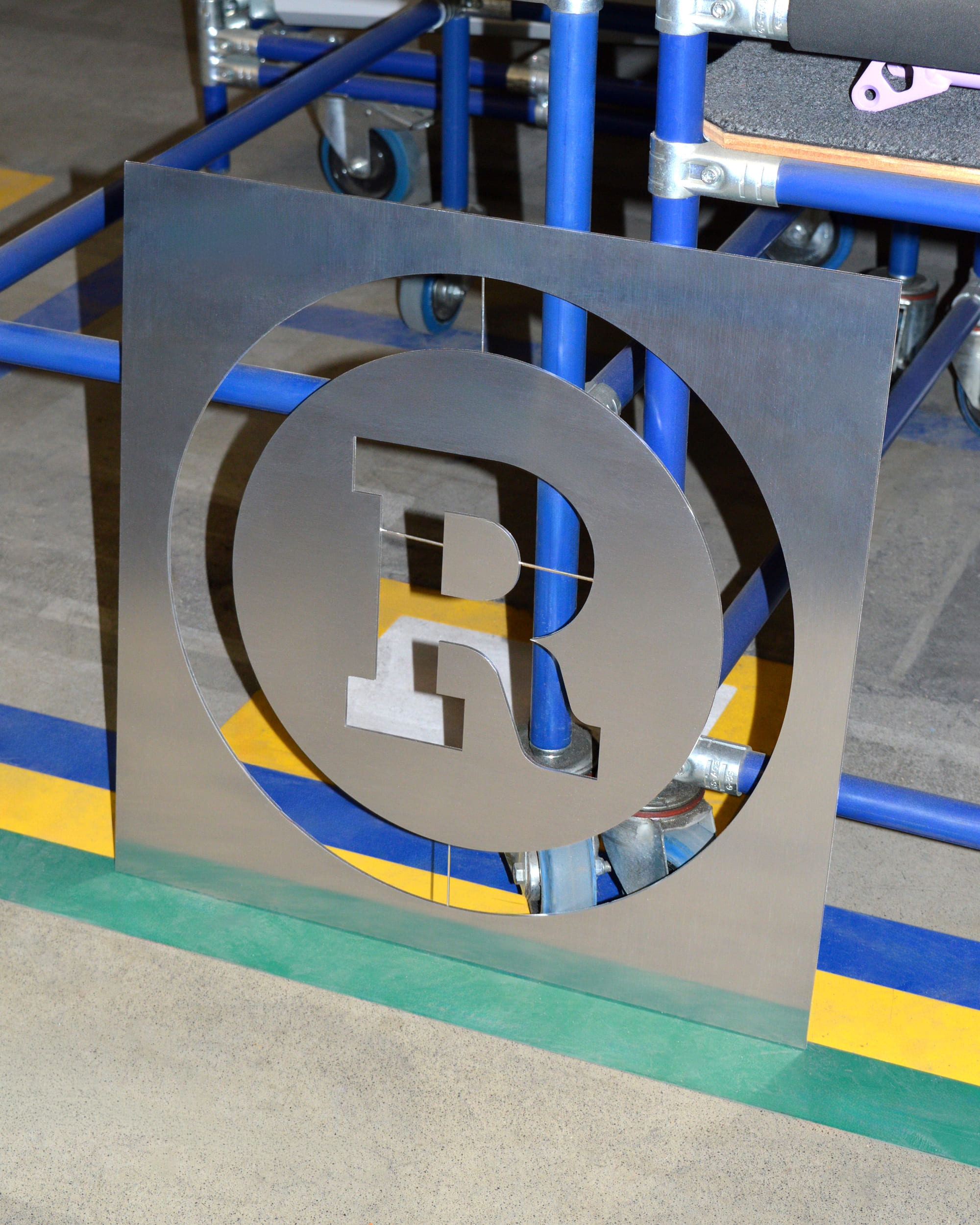
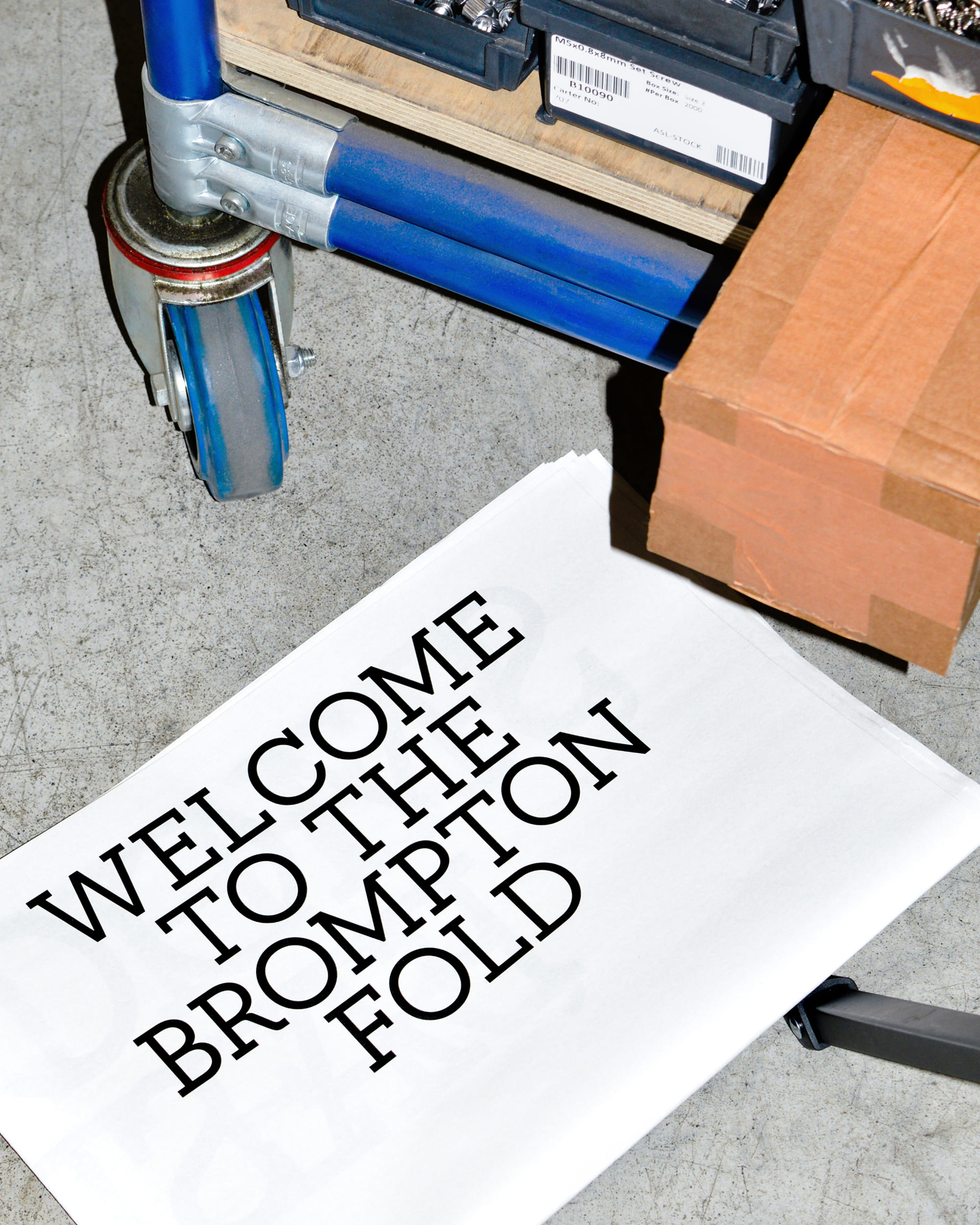
We obsessed over the nitty-gritty details to expand the logo’s geometry into a full character set equipped for global languages, subtly adjusting parameters like the ‘O’ to ensure long-form legibility. To launch the typeface, we collaborated with Brompton’s creative team to cut large metal letters directly from the factory floor, staging a shoot that linked the engineered type directly back to the machinery and handwriting that crafts the bikes.
Toggle

Strategy: Life Unfolded
Toggle
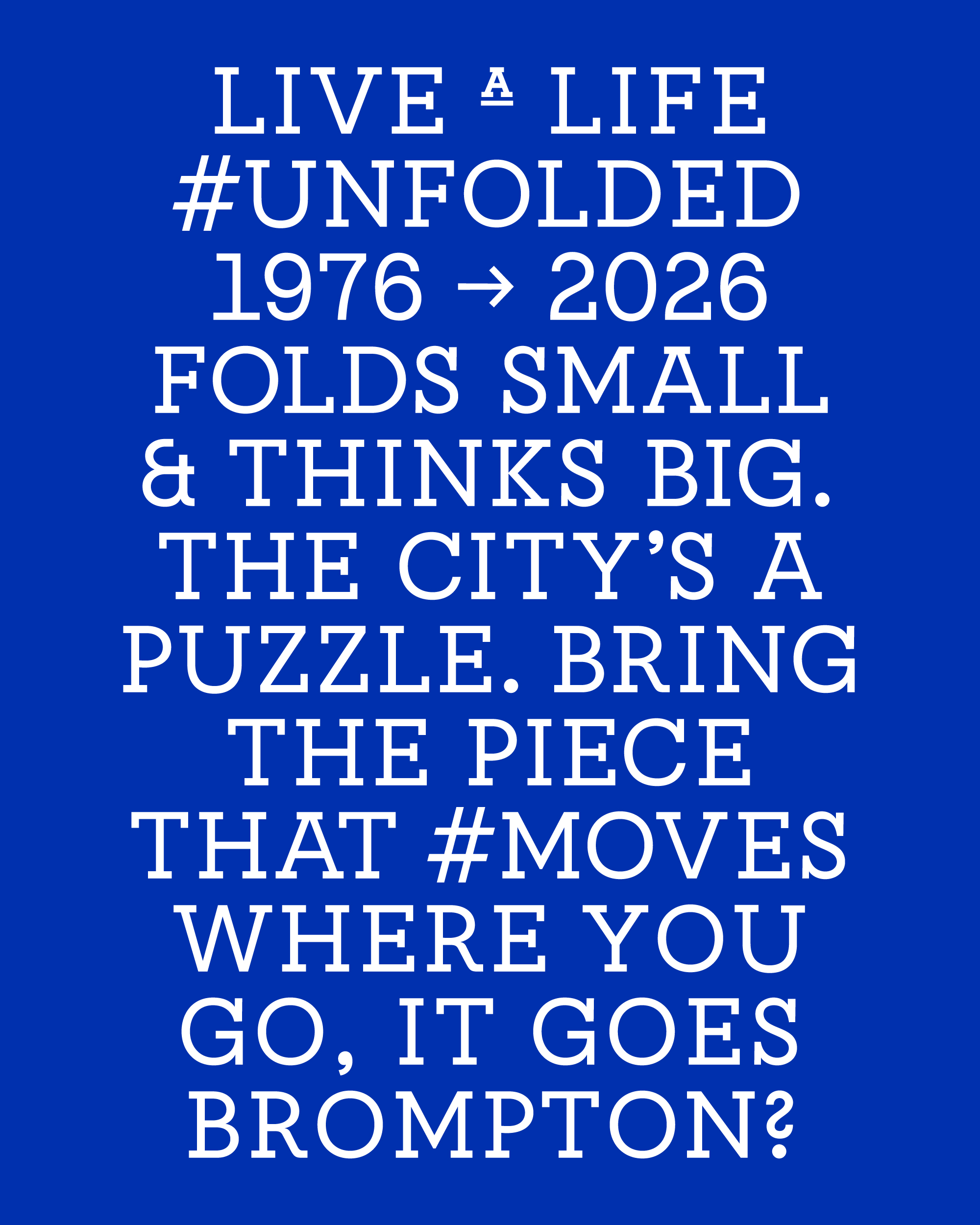
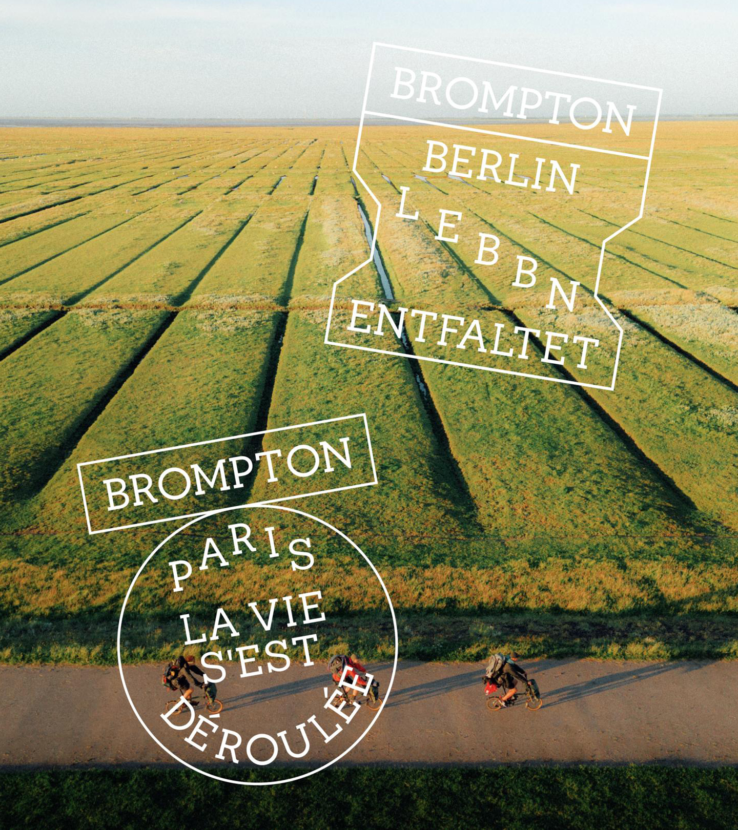
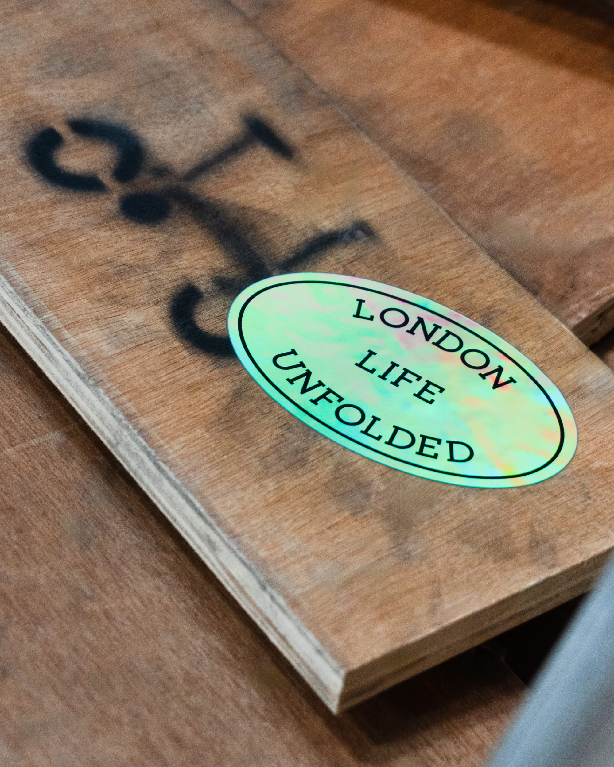
While society promises optimisation, Brompton’s engineering excellence powers something greater: transformation. Andrew Ritchie created the bike back in 1970 to feel like a “magic carpet for the city,” an ethos rooted in joy, curiosity, and urban freedom. Working closely with Brompton’s leadership, we built the global platform around a singular strategic truth: Life Unfolded.
This acts as the structural glue holding the brand together strategically, visually, and tonally. The system functions as an open canvas for self-expression, giving riders the freedom to unfold their city in front of them and shift from a closed, functional state into an expressive, community-driven narrative.
Toggle
Built to Move
Toggle
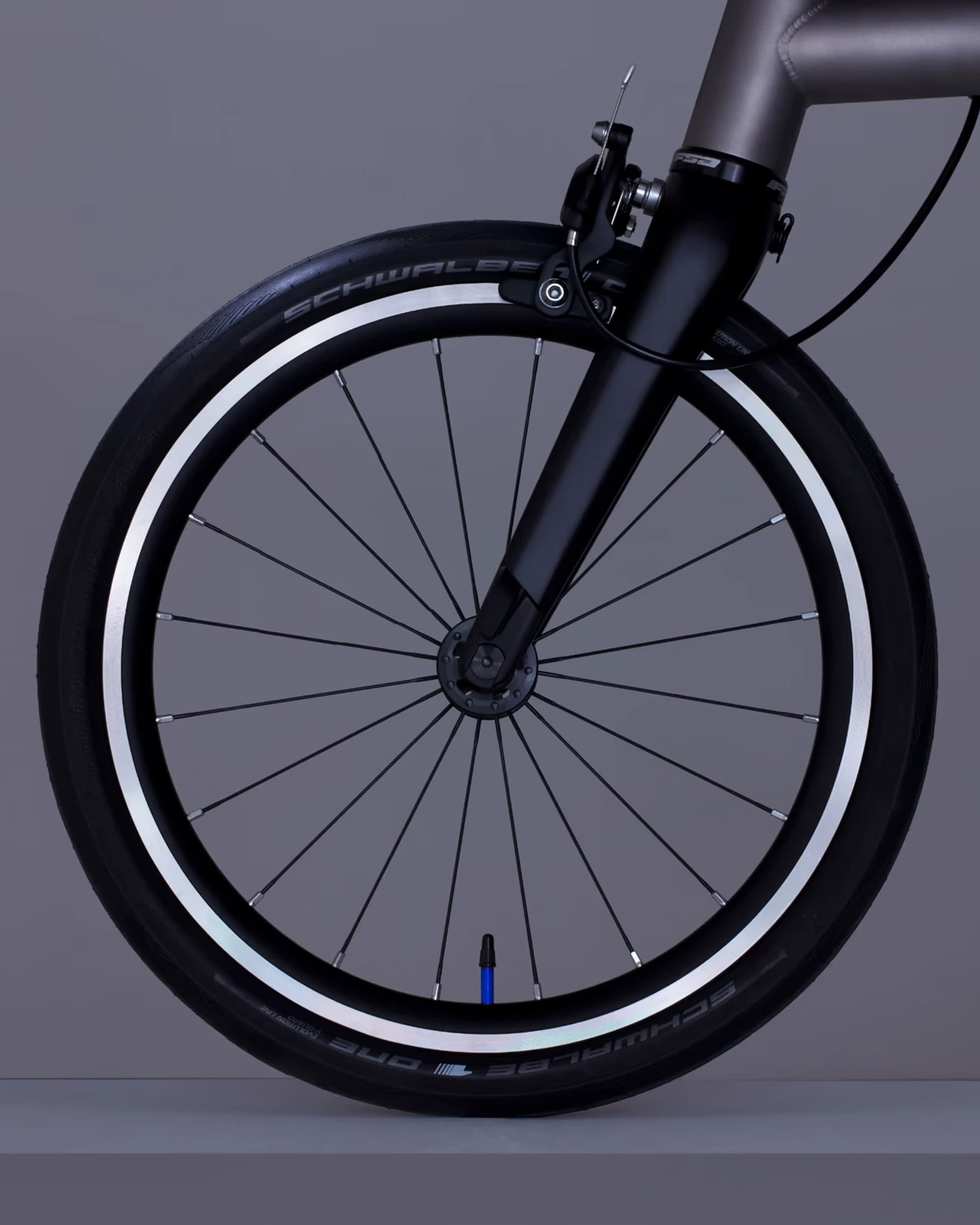
Moving bike, moving brand. Because the Brompton is built on motion, it required a brand identity that moves with it. The motion architecture embraces the quick, mechanical “final flick” of the rear wheel before a rider takes off. This motion is split by mechanical gears to match studio playfulness with engineering logic, shifting from smooth “3-speed” UI transitions to dynamic, multi-layered “12-speed” editorial layouts for digital channels and social media. The primary visual asset is a modular graphic framework derived from the geometric volume of a folded Brompton box logo, expanding outward to allow content and journeys to unfold across the motion grid.
Toggle
Colour
Toggle
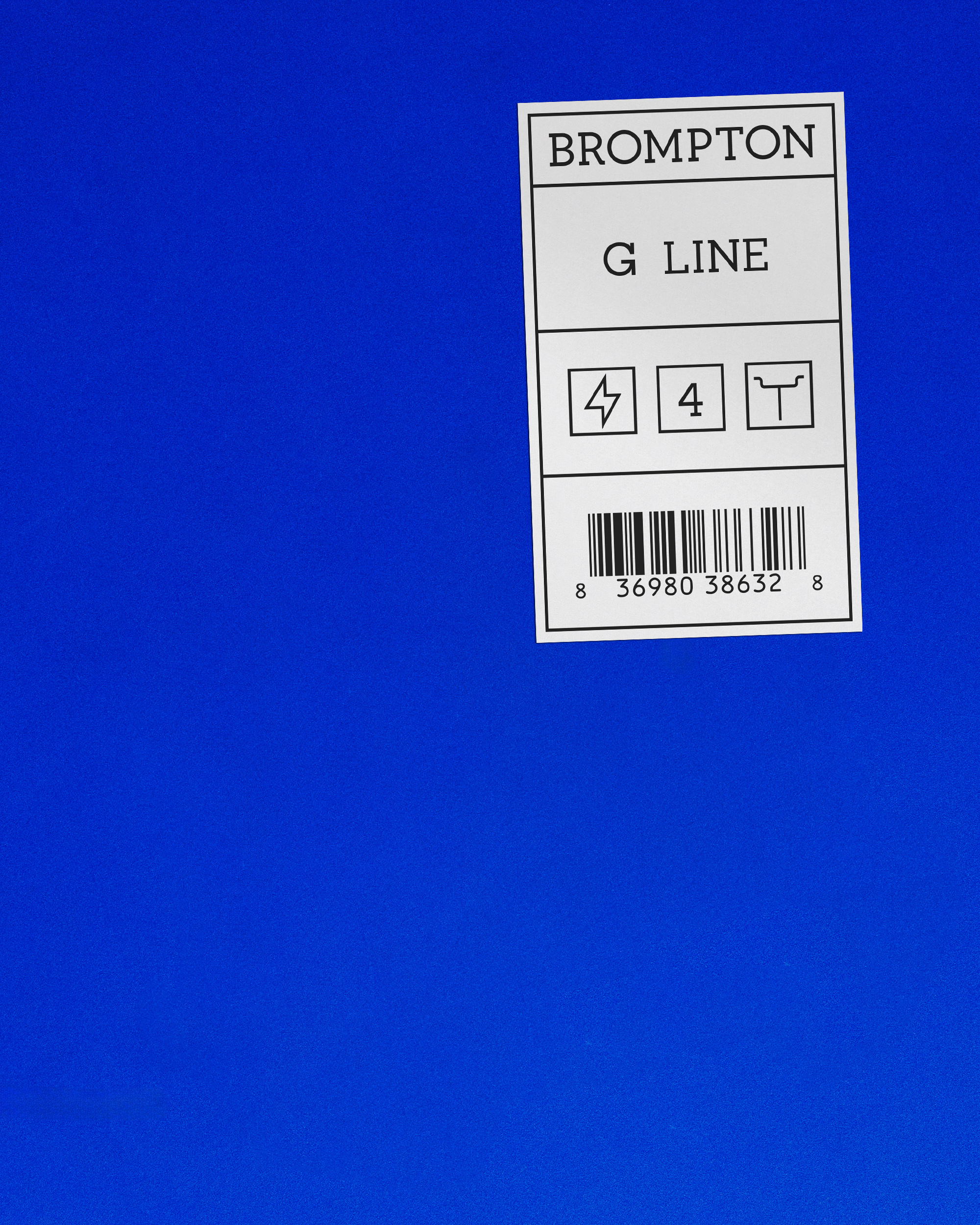
We locked in a defining, proprietary signature colour: Brompton Blue. Inspired by a factory visit flooded with clean, industrial blues, this high-visibility, urban hue functions as a solid, memorable anchor that links every digital button, physical asset, and piece of retail signage together. While the core brand remains strictly blue, the system is designed to adapt, shifting to custom colour palettes when Brompton launches limited-edition collaborations with partners like Palace, Barbour, or the Tour de France.
Toggle
Tone of Voice
Toggle
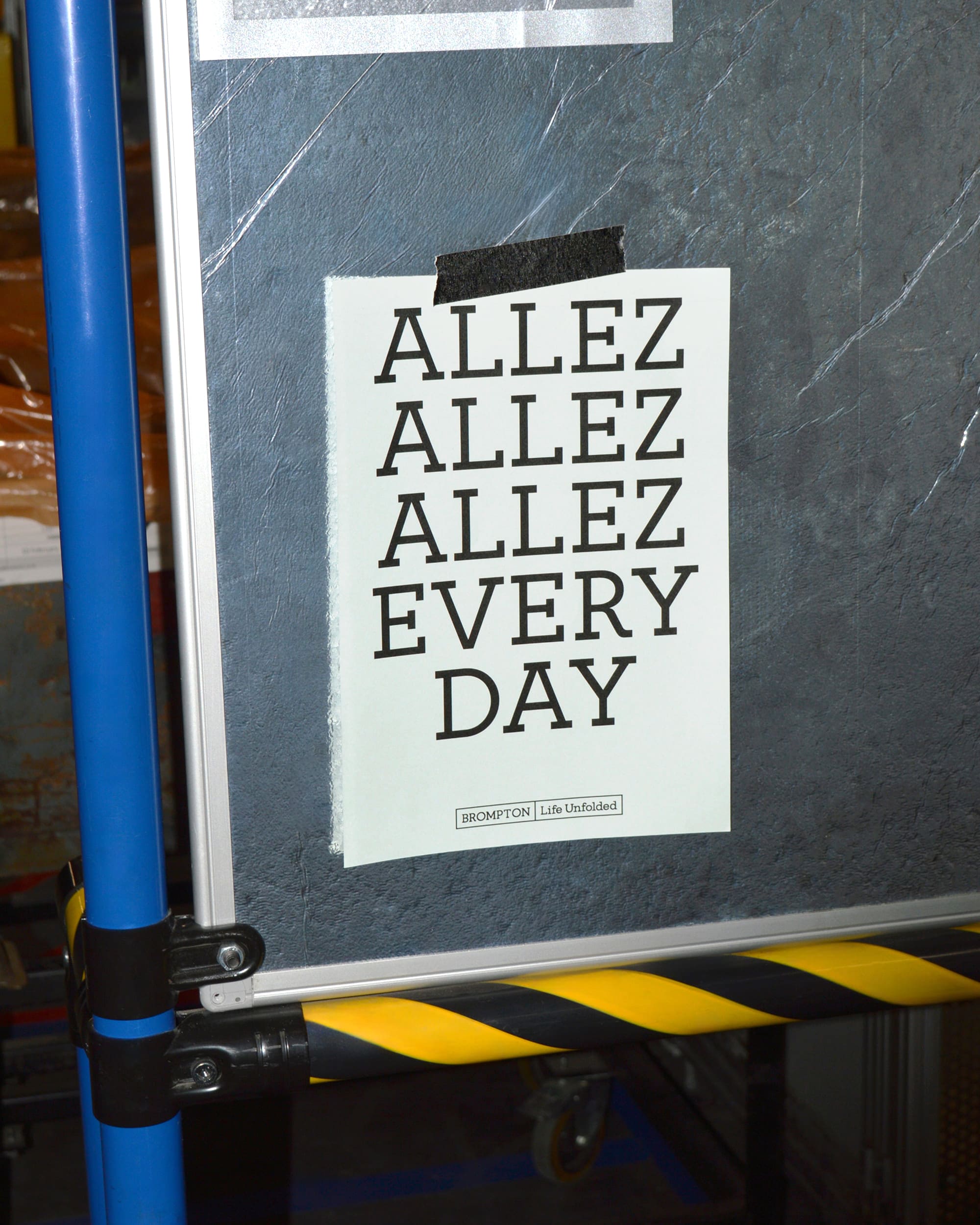
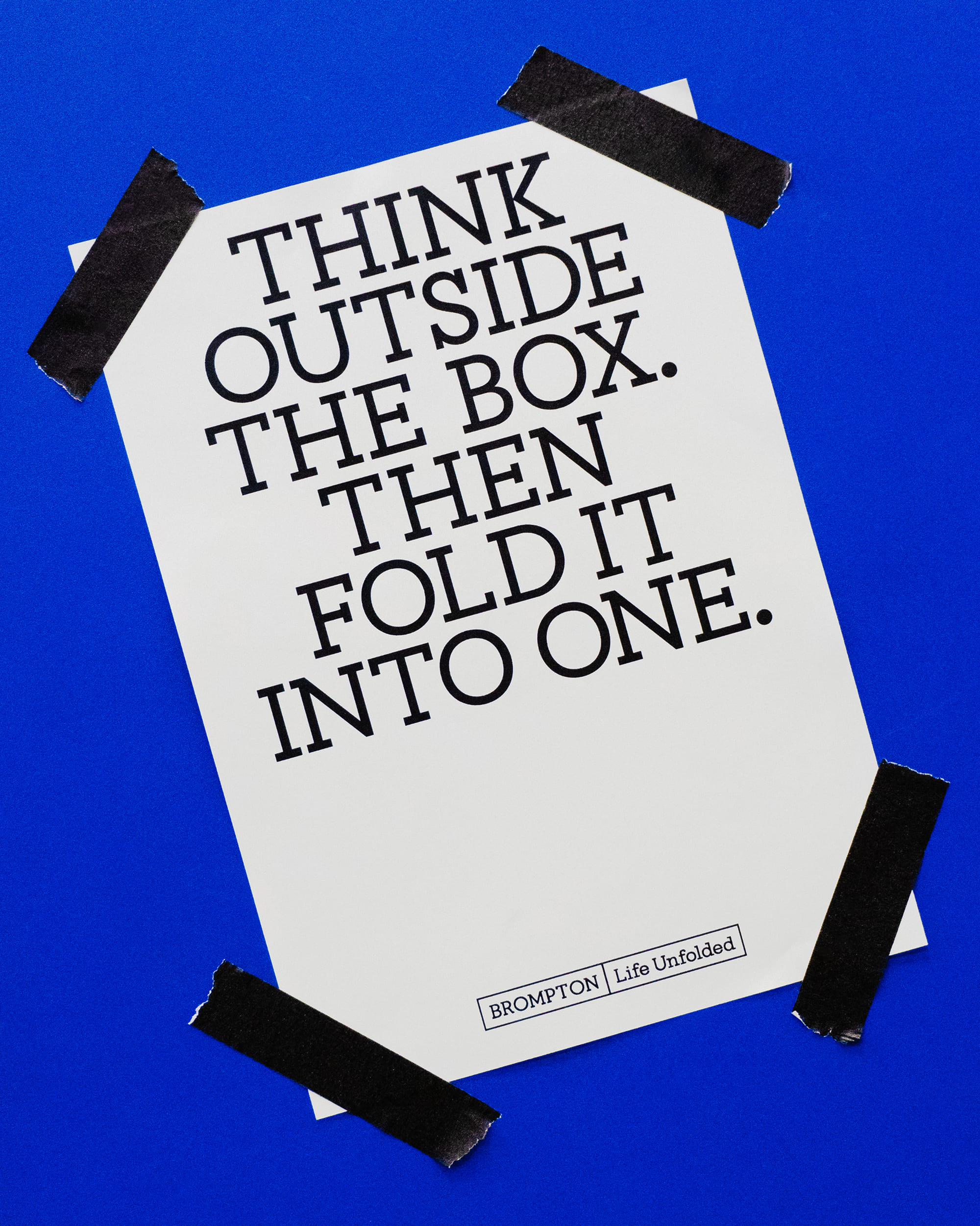
The verbal identity shifts the brand away from corporate optimisation and toward a welcoming community language. Anchored by the sign-off “Welcome to the Fold,” the tone balances technical engineering precision with a warm, conversational wit. It speaks directly to the individual, framing the bike not as a commuter appliance, but as a co-pilot in discovering joy, a canvas for self-expression, and a badge of belonging.
Toggle
Summary
Toggle
By marrying industrial engineering with digital flexibility, we transformed Brompton’s fragmented communications into a cohesive, global brand world. Grounded in the strategic foundation of Life Unfolded, we delivered a custom typeface, motion principles inspired by the bike’s mechanics, and a unified signature palette anchored by Brompton Blue. The result is a scalable, digital-first system that equips this iconic British brand to connect with diverse audiences worldwide while staying completely true to its London factory roots.
Toggle
Brompton
- Bike
Brompton is the world’s most famous folding bike brand. But as the brand expanded from a cult design favourite into a global presence across Europe and Asia, its identity faced fragmentation and a corporate clinical tone. The visual system needed to transition from a localised manufacturing aesthetic into a highly scalable, digital-first platform, providing a unified voice across retail, online, dealers, CRM, and advertising while driving long-term customer lifetime value.
By marrying industrial engineering with digital flexibility, we transformed Brompton’s fragmented communications into a cohesive, global brand world. Grounded in the strategic foundation of Life Unfolded, we delivered a custom typeface, motion principles inspired by the bike’s mechanics, and a unified signature palette anchored by Brompton Blue. The result is a scalable, digital-first system that equips this iconic British brand to connect with diverse audiences worldwide while staying completely true to its London factory roots.