


18 Camels
Poster
2020
SCOPE
Bespoke Typography and Systems
Visual Identity Systems
Verbal Identity and Messaging
Art Direction
Toggle
BRIEF
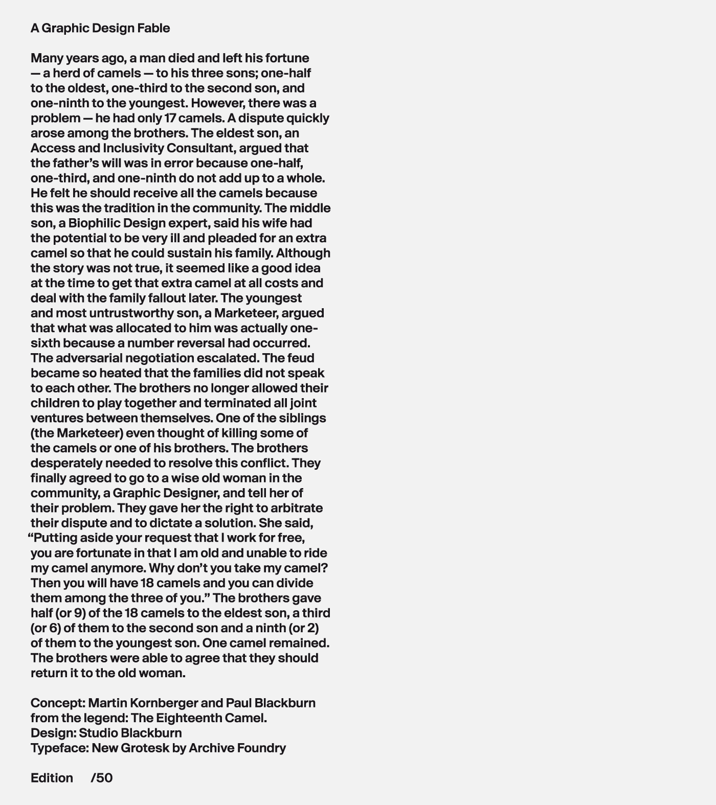
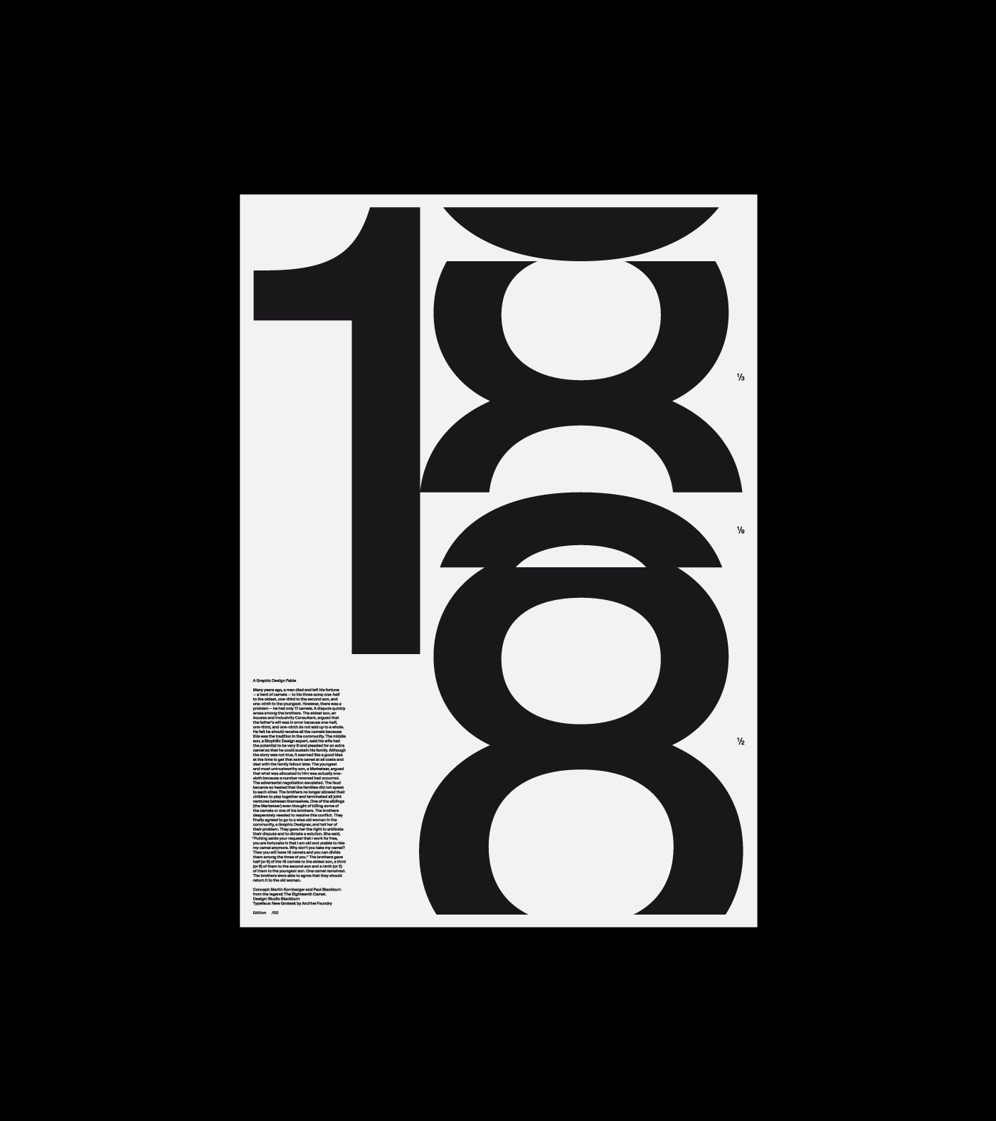
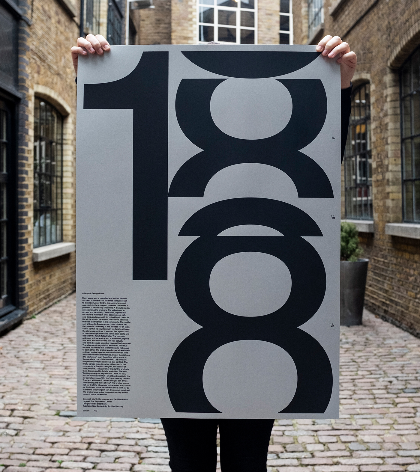
Archive Foundry invited us to showcase their new typeface, New Grotesk. Rather than a standard specimen, we wanted to create something with narrative weight. We partnered with Martin Kornberger to adapt “The Eighteenth Camel” a legend about three sons, a disputed inheritance of 17 camels, and the wisdom of a third-party mediator.
WORK
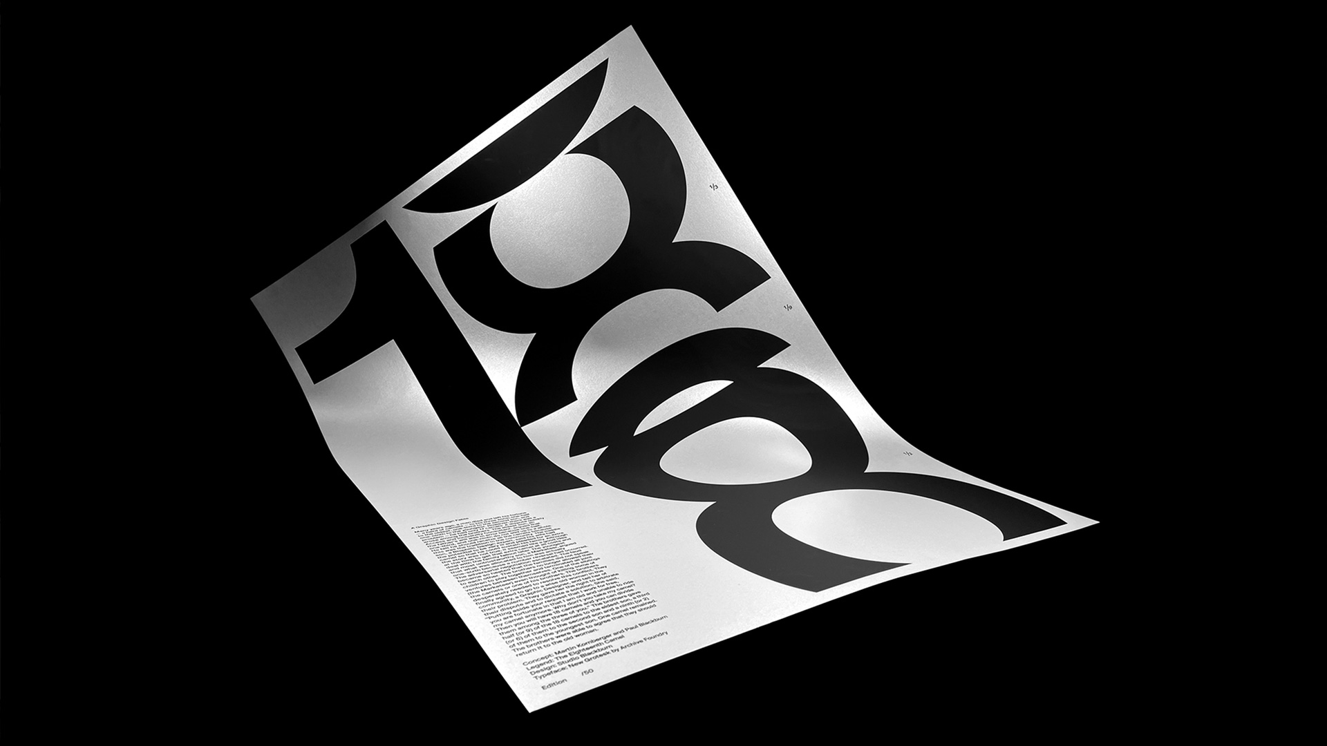
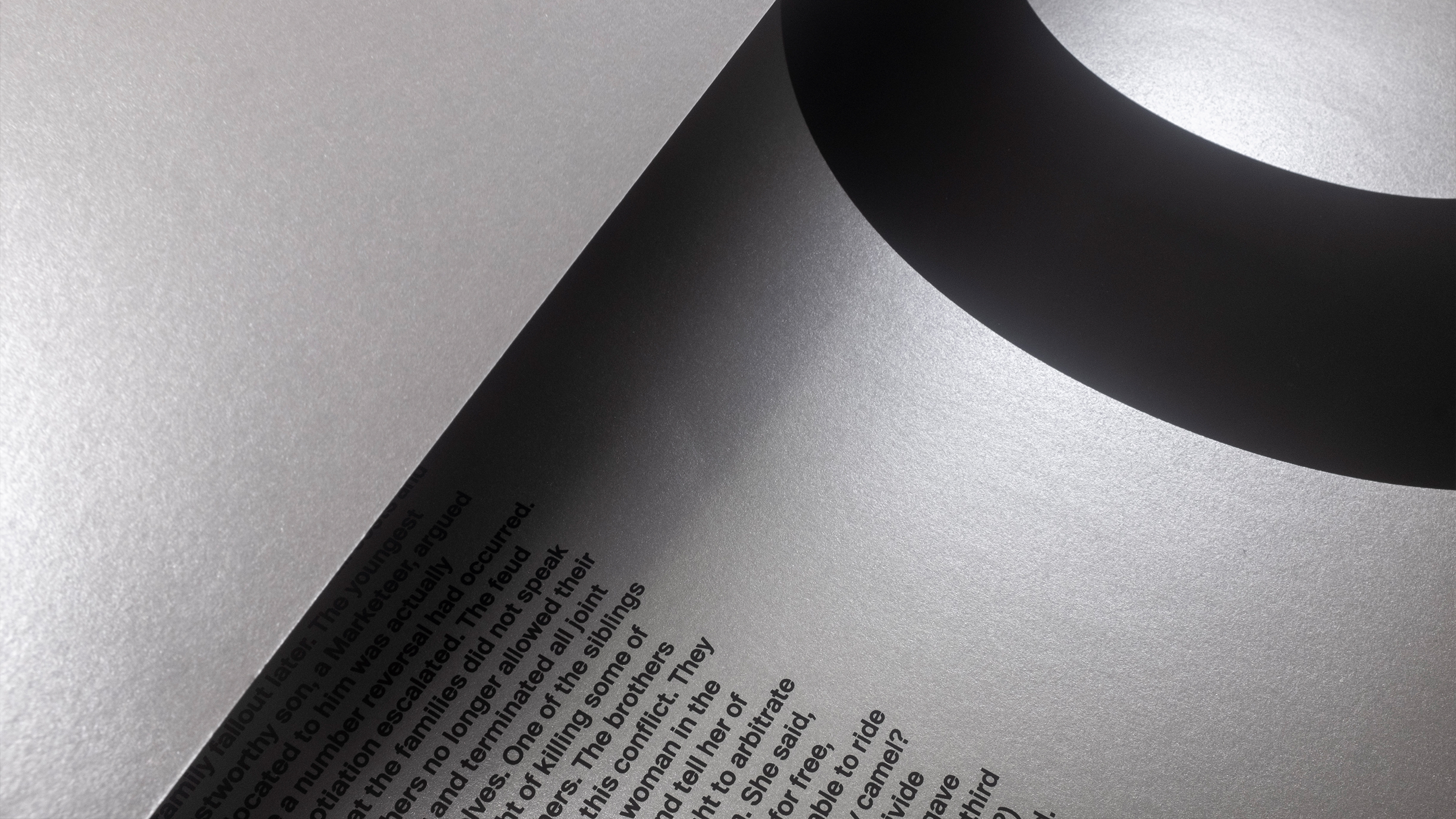
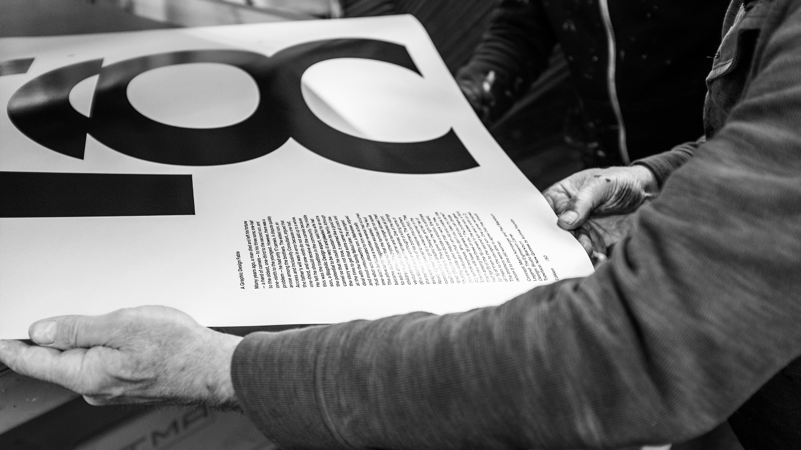
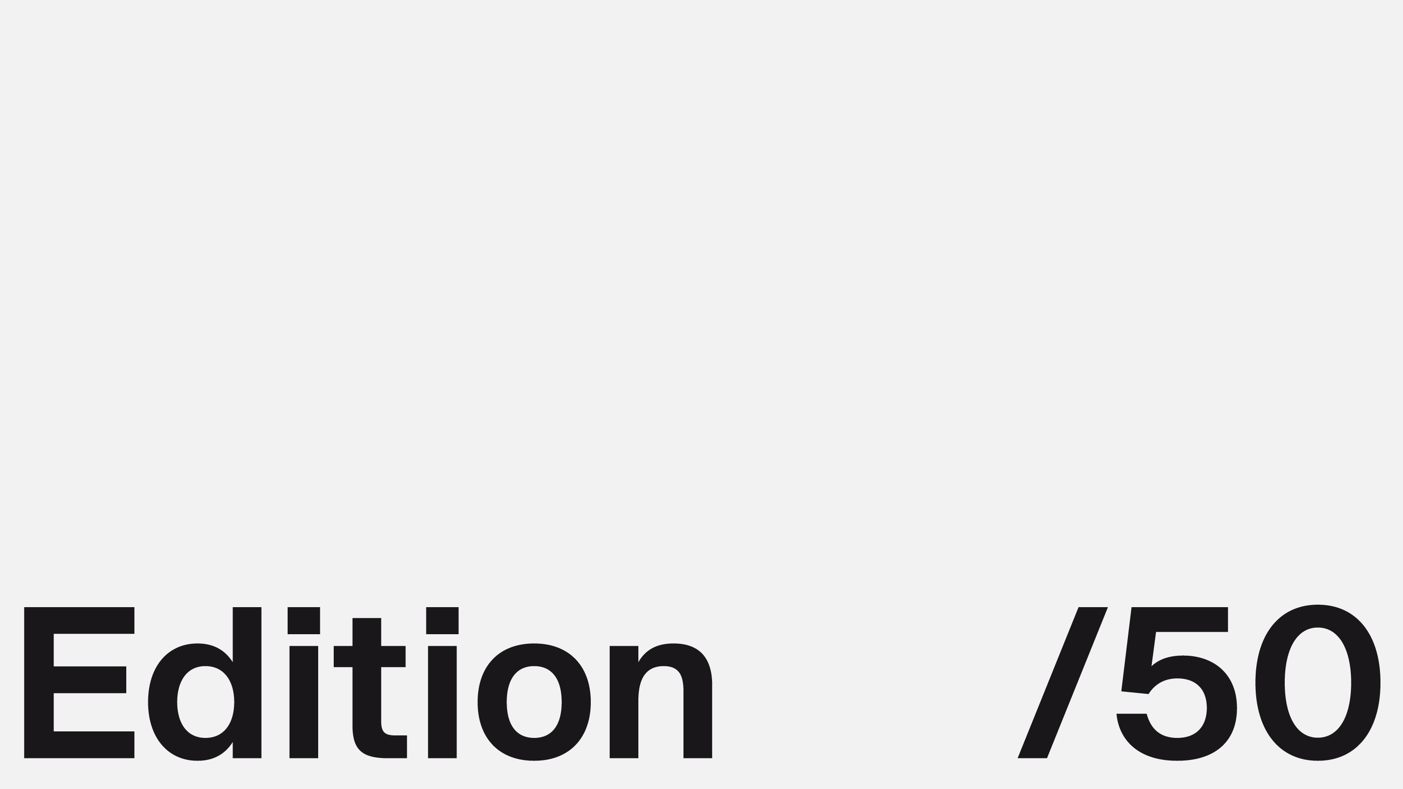
The puzzle dictates that 17 camels cannot be divided by 1/2, 1/3, and 1/9. By introducing an 18th camel, the math suddenly resolves: the sons receive 9, 6, and 2 camels respectively, leaving one camel—the mediator’s—to be returned. We treated the typography with the same mathematical precision, using the strictly limited edition A1 poster to prove that design is often the “extra camel” needed to resolve complex human friction.
PLAY
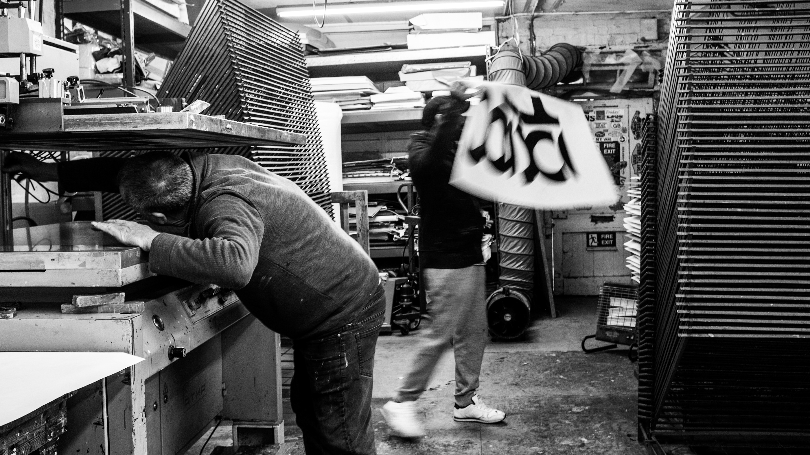
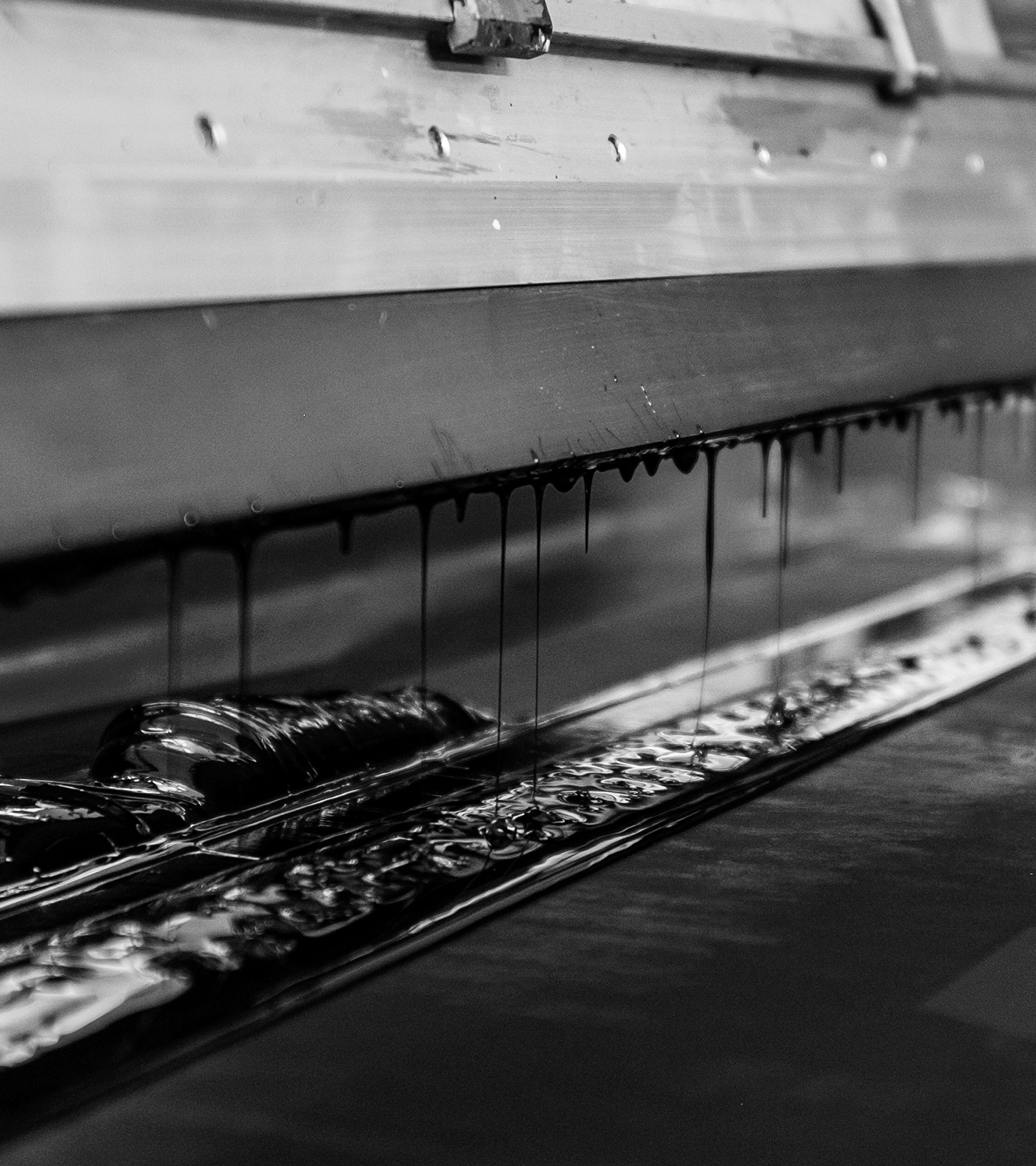
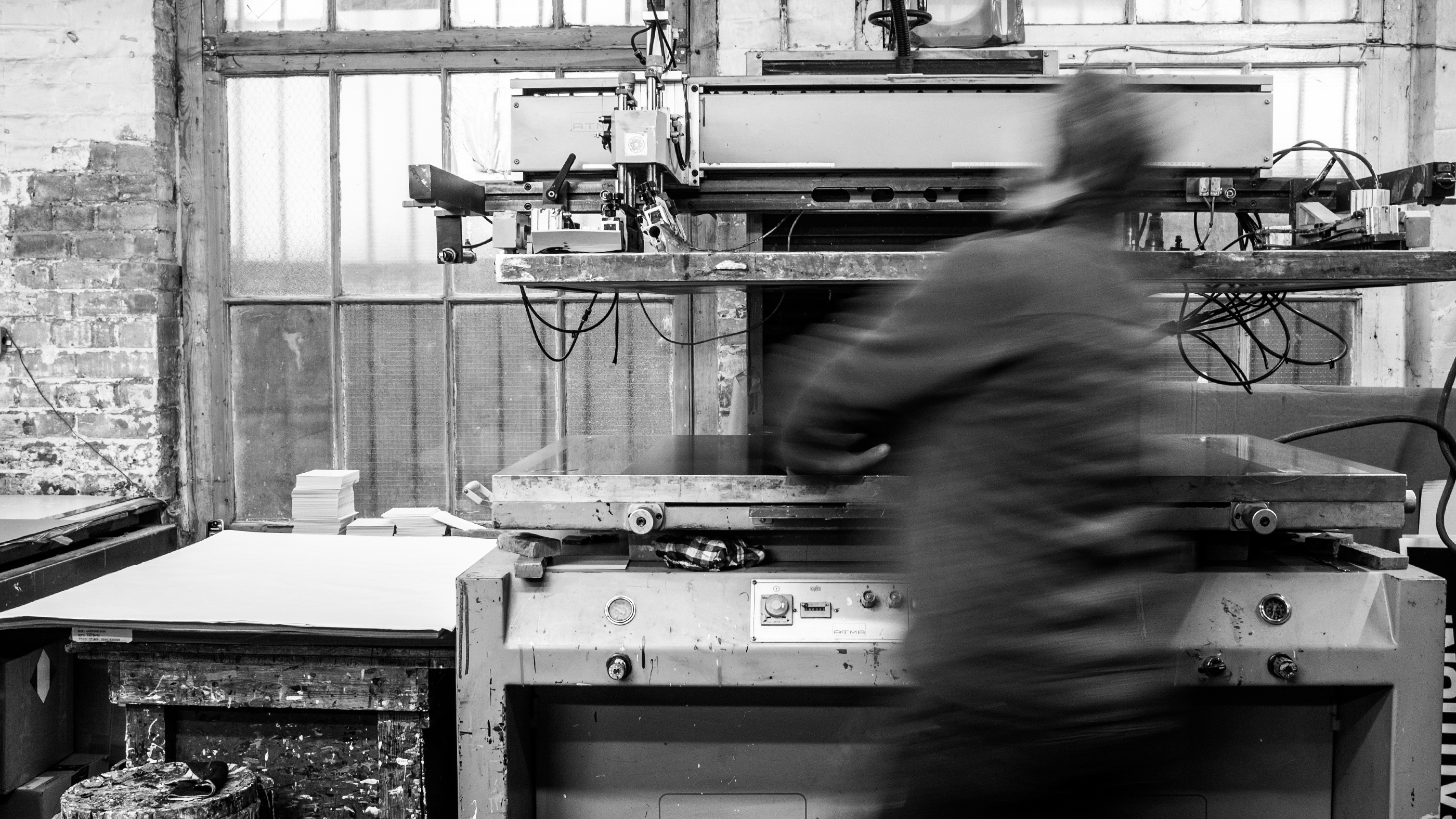
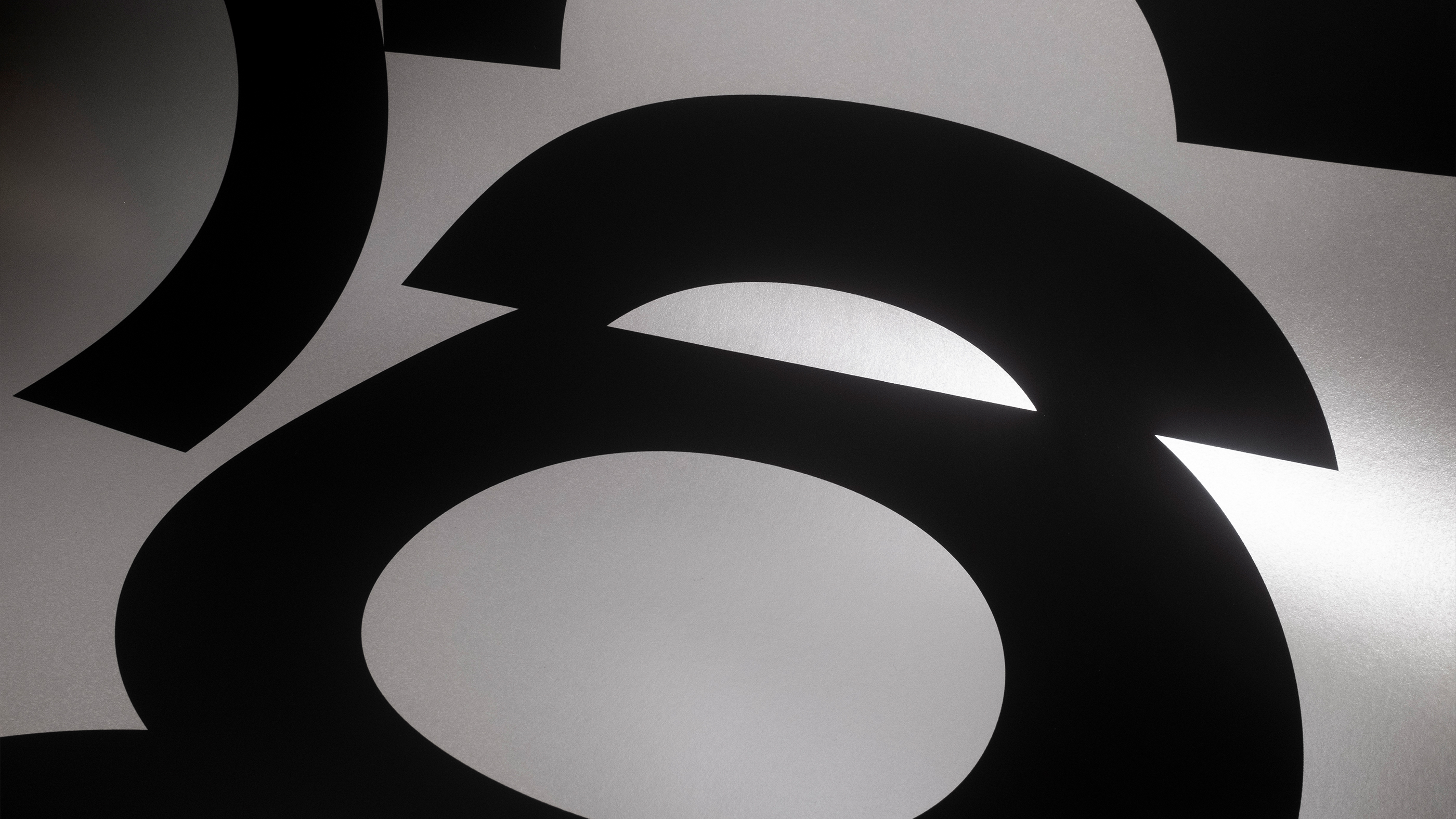
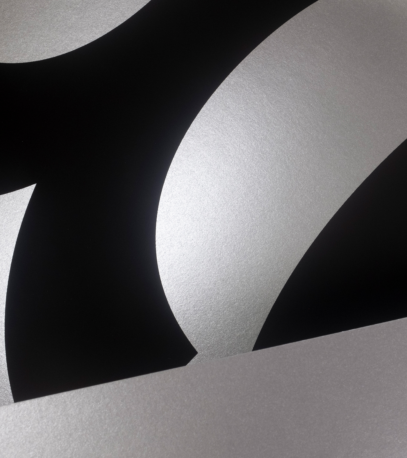
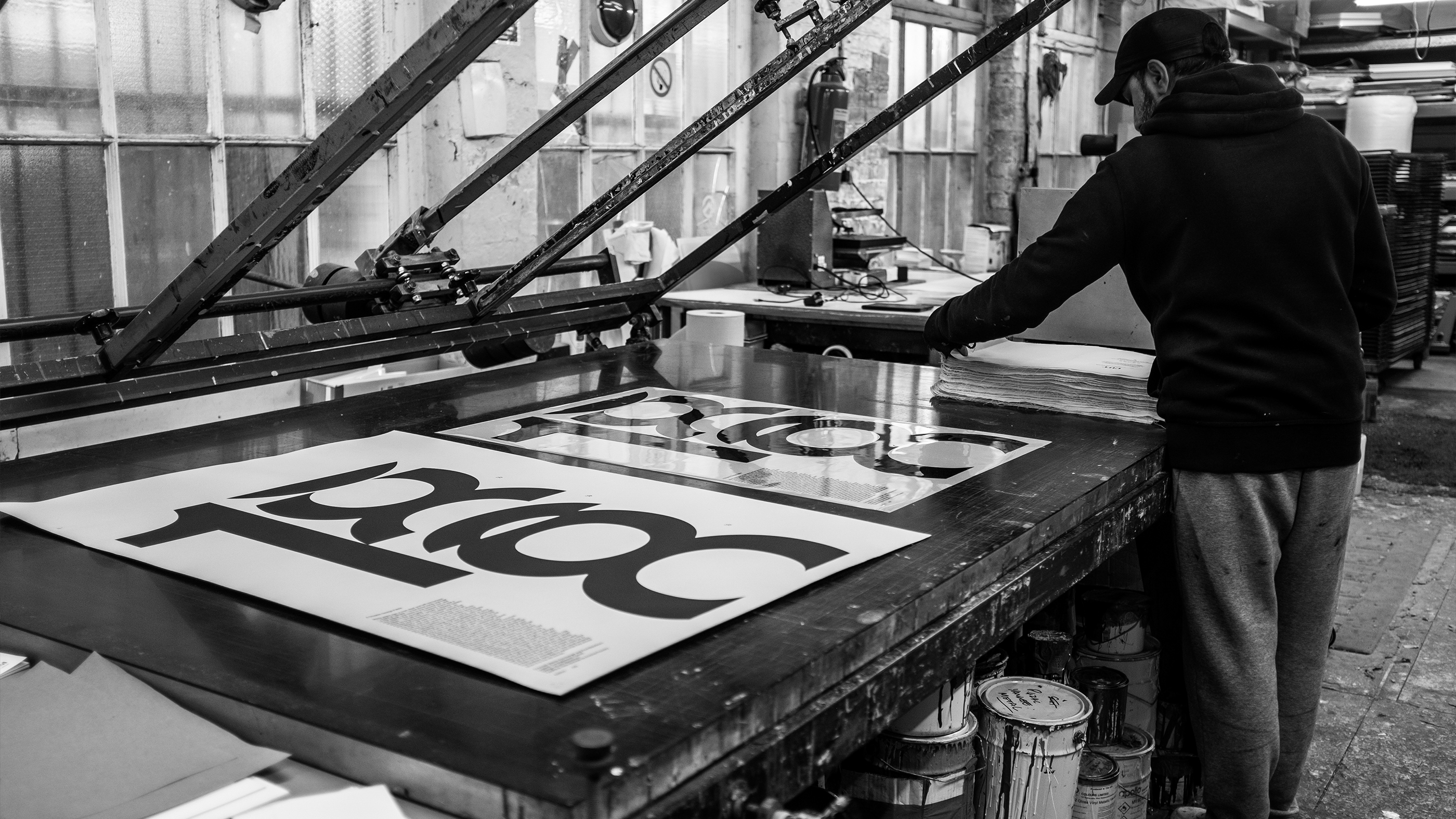
We reimagined the three sons as industry caricatures: an Access and Inclusivity Consultant, a Biophilic Design expert, and a “untrustworthy” Marketeer. The Graphic Designer plays the role of the wise arbiter. Screen-printed in a single black ink, the poster is a self-aware nod to the industry—right down to the “stolen” concept credit. It is a celebration of the “New Grotesk” typeface and the power of a well-told fable.
Toggle
18 Camels
- Bespoke Typography and Systems
- Visual Identity Systems
- Verbal Identity and Messaging
- Art Direction
BRIEF
Archive Foundry invited us to showcase their new typeface, New Grotesk. Rather than a standard specimen, we wanted to create something with narrative weight. We partnered with Martin Kornberger to adapt “The Eighteenth Camel” a legend about three sons, a disputed inheritance of 17 camels, and the wisdom of a third-party mediator.
WORK
The puzzle dictates that 17 camels cannot be divided by 1/2, 1/3, and 1/9. By introducing an 18th camel, the math suddenly resolves: the sons receive 9, 6, and 2 camels respectively, leaving one camel—the mediator’s—to be returned. We treated the typography with the same mathematical precision, using the strictly limited edition A1 poster to prove that design is often the “extra camel” needed to resolve complex human friction.
PLAY
We reimagined the three sons as industry caricatures: an Access and Inclusivity Consultant, a Biophilic Design expert, and a “untrustworthy” Marketeer. The Graphic Designer plays the role of the wise arbiter. Screen-printed in a single black ink, the poster is a self-aware nod to the industry—right down to the “stolen” concept credit. It is a celebration of the “New Grotesk” typeface and the power of a well-told fable.SCOPEBespoke Typography and SystemsVisual Identity SystemsVerbal Identity and MessagingArt Direction