Less is More.
More or Less
Blog — Sage Logotype Modernisation
21.09.21
As part of our global rebrand for Sage, we were asked to propose a modernisation of their logotype.
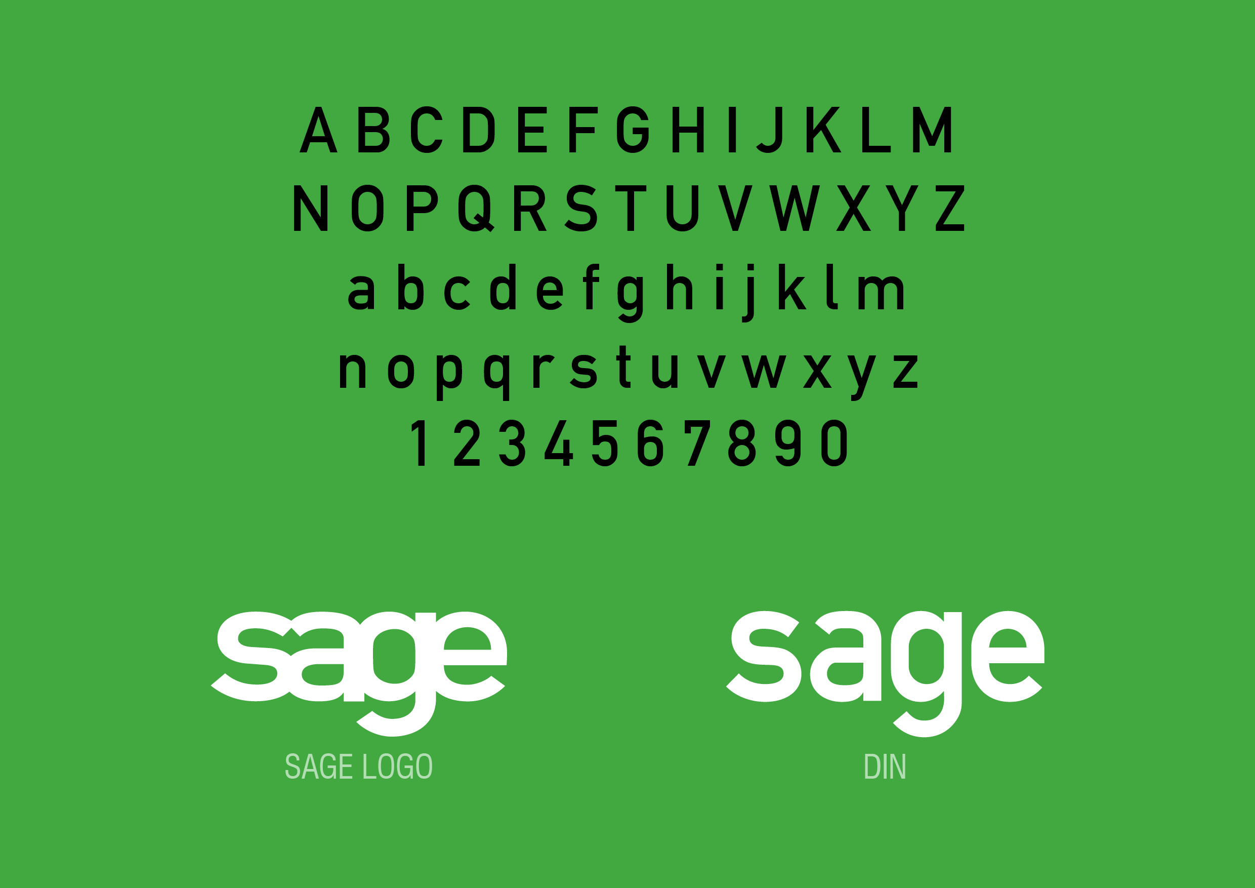
We discovered that the original Sage logo was based on DIN, a typeface originally designed for German roadways in the early thirties. DIN, when displayed at its correct height and width, was intended to be highly legible.
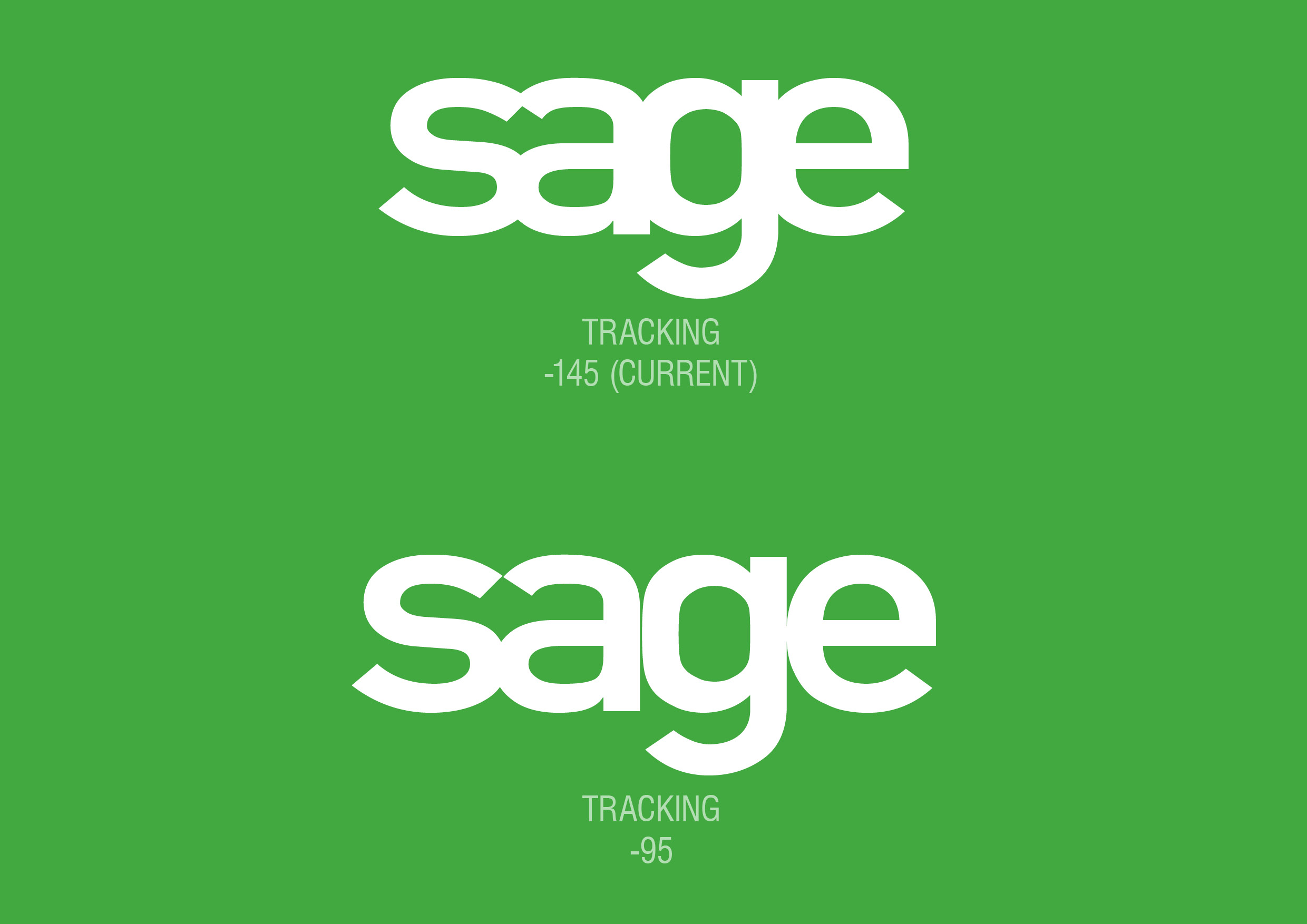
The Sage logotype at the time had very tight tracking, causing the letters to crash into each other. When we loosened the tracking we still encountered problems of some letters overlapping and others creating very narrow letterspaces.


Refinement
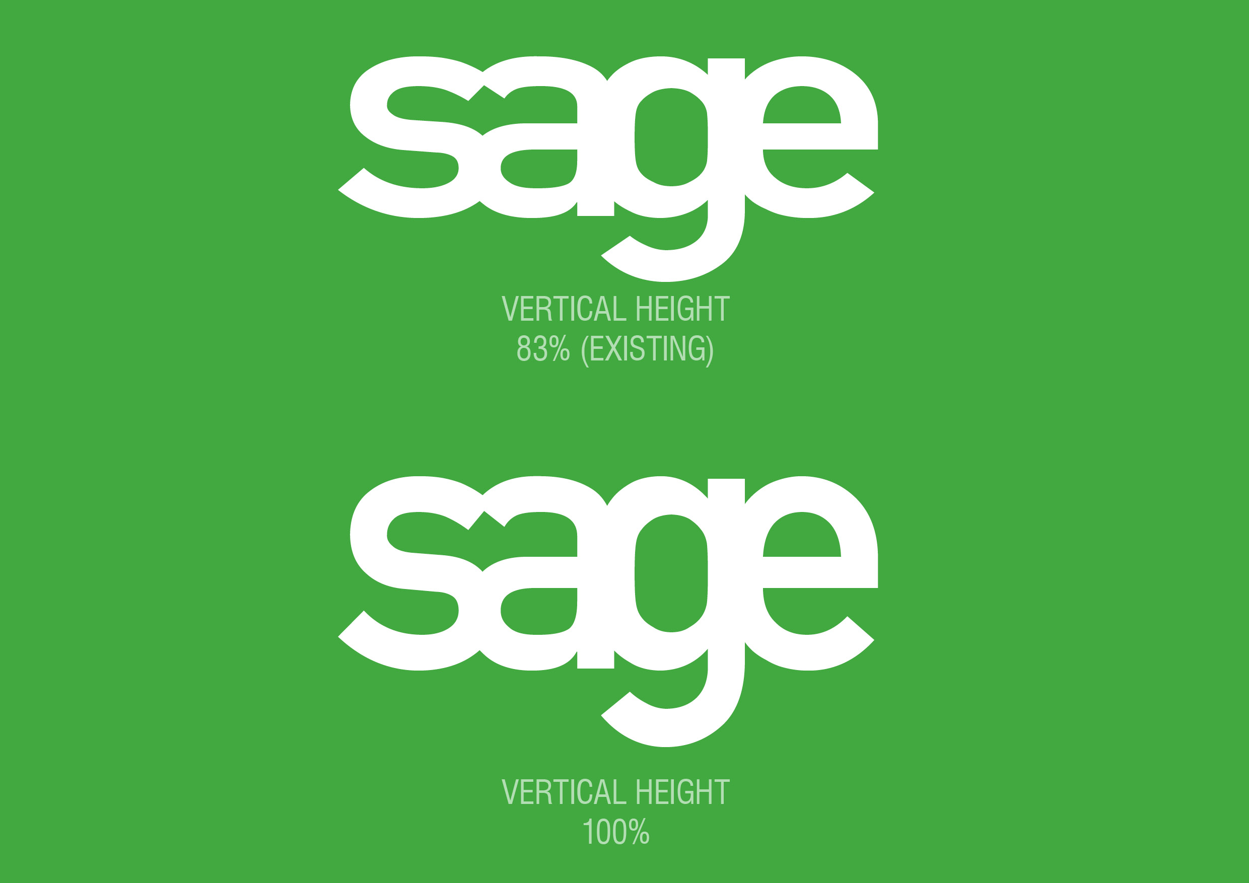
The logotype also had vertically compressed letters. When we put the letters back to their correct height it resulted in a logotype that looked too narrow and squashed because of the tight tracking.
Our simple solution was to propose that the optimum way to modernise the logo was to both loosen the tracking and to decompress the letter height to the one originally intended.